Overview
Overview
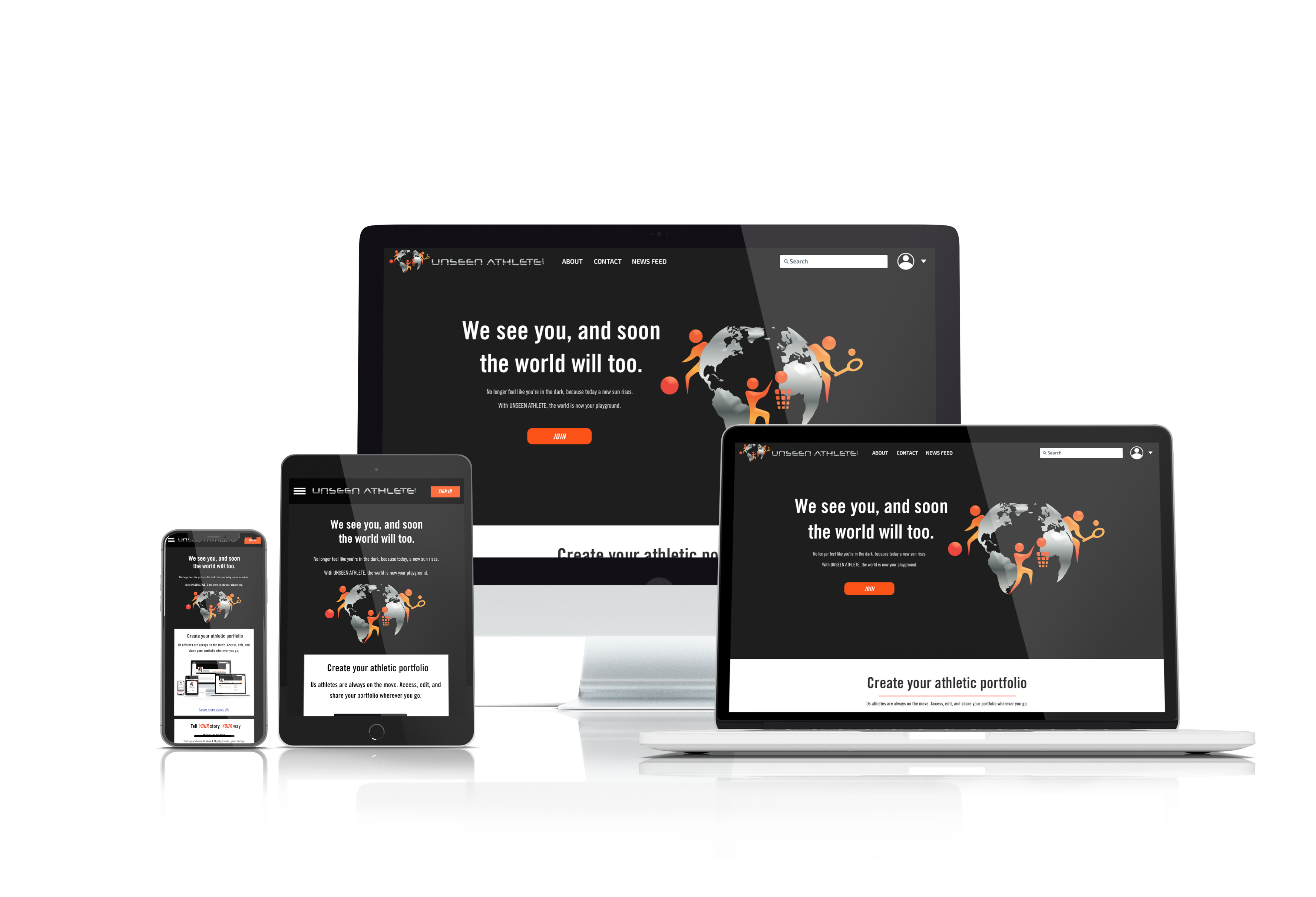
Unseen Athlete is a website that is meant to help athletes gain recognition. It is both a social media platform and a news website. Our UX and UI team worked with Unseen Athlete to deliver a modern responsive website that allows athletes to connect with coaches, talent scouts, as well as each other, while also providing news about the athletes featured on the website.
As one of the UI designers on the team, my job was to create a style for the brand and to ensure that the website not only looks good, but fulfills the client's business goals. The clients provided us with many assets from a previous design, and we used their logo and stuck to a similar colour scheme due to their preferences.
Unseen Athlete is a website that is meant to help athletes gain recognition. It is both a social media platform and a news website. Our UX and UI team worked with Unseen Athlete to deliver a modern responsive website that allows athletes to connect with coaches, talent scouts, as well as each other, while also providing news about the athletes featured on the website.
Research
Research
Gut Test
Gut Test
We conducted a gut test with our clients to find out what they like and dislike in apps. We had approximately 20 different designs in total, and the clients had up to 20 seconds to decide whether they liked each one.
We conducted a gut test with our clients to find out what they like and dislike in apps. We had approximately 20 different designs in total, and the clients had up to 20 seconds to decide whether they liked each one.
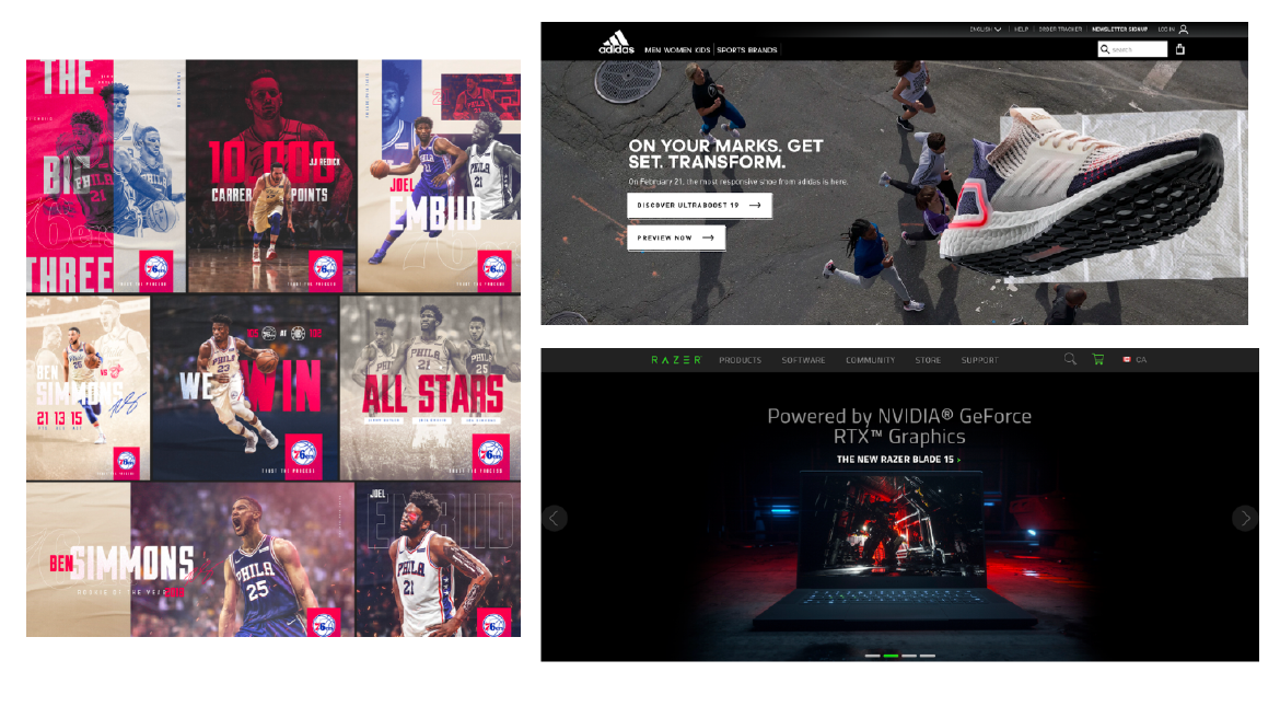
Our clients liked these designs the best. All of these had relatively dark backgrounds with colours that stood out. This meant that for our own designs, we should also have dark backgrounds with contrasting colours.
Our clients liked these designs the best. All of these had relatively dark backgrounds with colours that stood out. This meant that for our own designs, we should also have dark backgrounds with contrasting colours.
The Design Process
The Design Process
The Why—Design Inception
The Why—Design Inception
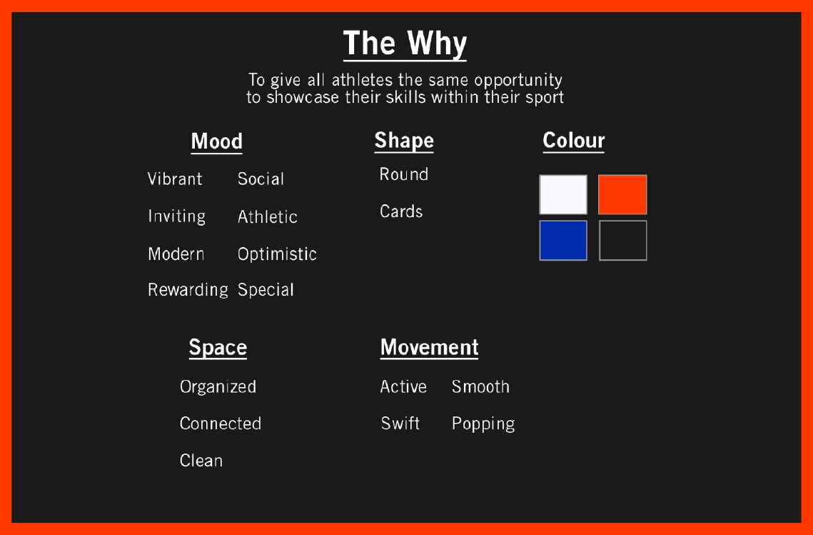
We settled on a central reason for the project: to give all athletes the same opportunity to showcase their skills within their sport.
With the Why figured out, we were able to move on to the mood, space, colour, shape, and movement.
We settled on a central reason for the project, i.e. the Why. It was to give all athletes the same opportunity to showcase their skills within their sport.
With the Why figured out, we were able to move on to the mood, space, colour, shape, and movement.
Style Tile & Brand Guideline
Style Tile & Brand Guideline
We split off into three different directions so that the clients can be given a choice. We wanted to find out if the clients really would prefer a dark theme with a significant amount of orange. We also wanted the clients to have a choice between orange and primary green, which is an especially vibrant colour that would definitely stand out on a black(ish) background).
We split off into three different directions so that the clients can be given a choice. We wanted to find out if the clients really would prefer a dark theme with a significant amount of orange. We also wanted the clients to have a choice between orange and primary green, which is an especially vibrant colour that would definitely stand out on a black(ish) background).
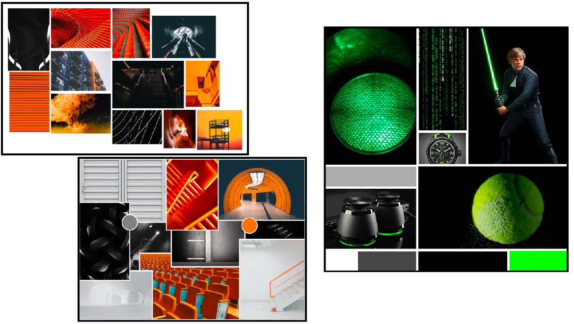
The mood boards led to three separate style tiles:
The mood boards led to three distinctly different style tiles:
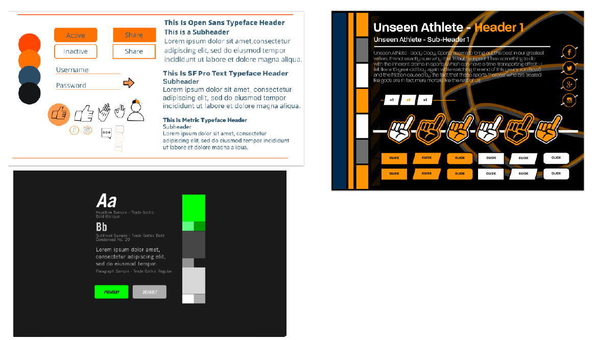
In the end, the clients picked out elements from all three mood boards. They preferred the reddish orange from the white/orange mood board and they also really liked dark backgrounds. While the green did indeed look enticing, orange won out in the end. However, they did choose to go with Trade Gothic, which is as typeface associated with athletics (seen on the Nike website) and featured on the green style tile.
In the end, the clients picked out elements from all three mood boards. They preferred the reddish orange from the white/orange mood board and they also really liked dark backgrounds. While the green did indeed look enticing, orange won out in the end. However, they did choose to go with Trade Gothic, which is as typeface associated with athletics (seen on the Nike website) and featured on the green style tile.
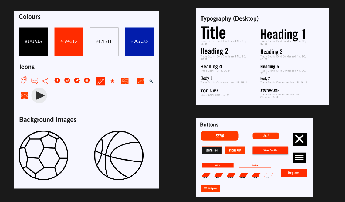
In addition to Trade Gothic, we decided to use Exo for certain parts such as the top nav. It pairs quite well with Trade Gothic.
In addition to Trade Gothic, we decided to use Exo for certain parts such as the top nav. It pairs quite well with Trade Gothic.
User Testing
User Testing
Wireframes
Wireframes
We added colours and graphics to the mid-fi prototypes to create hi-fi prototypes. We did run into a few hurdles along the way - the biggest one was that we had to do the hi-fi screens on a reduced timeline. Thankfully we were all quite efficient at choosing colours, drawing up icons, etc. and we were able to hand the project in on time.
We added colours and graphics to the mid-fi prototypes to create hi-fi prototypes. We did run into a few hurdles along the way -- the biggest one was that the mid-fi screens were late, so we had less time to do the hi-fi screens. Thankfully we were all quite efficient at choosing colours, drawing up icons, etc. and we were able to finish the project on time.
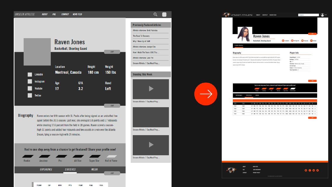
For the hi-fi prototypes, we removed the sidebar in order to reduce clutter. The sidebar features can be found on other pages anyway, and it was both distracting and unnecessary for the user to see unrelated articles and videos on an athlete's profile page.
Usability Testing
Usability Testing
We conducted a series of tests for various pages and made changes accordingly.
We conducted a series of tests for various pages and made changes accordingly.
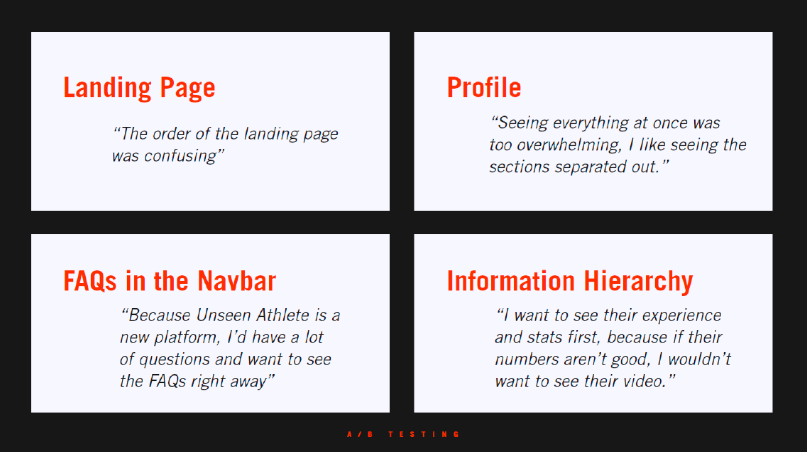
We used A/B testing for these pages, and incorporated the more popular version in our final prototypes. Of particular note is the profile page. It was due to testing results that the tabs (experience/statistics/media) was ordered that way.
Of particular note is the profile page. It was due to testing results that the tabs (experience, statistics, and media) were ordered that way.
Conclusion
Conclusion
The highlight of this project for me was crunch time towards the end. While our clients were always friendly and easy to talk to and the presentation went off without a hitch, it was on the day before the presentation that the team's UI designers came together and hammered out all the details in the hi-fi prototypes with incredible efficiency. While it certainly wasn't an easy experience, we discovered that we work in similar styles and that we could get quite a lot of work done fairly quickly as a team.
The app was well-received by the client, so with any luck, it will translate into satisfied users who actually use it to connect with talent scouts, coaches, and each other to advance their careers.
For future projects, I would like to create more interesting graphics with bold colours. I also enjoyed working with the dark colour palette, so I would like to take it a step further next time with a true dark theme.
The highlight of this project for me was crunch time towards the end. While our clients were always friendly and easy to talk to and the presentation went off without a hitch, it was on the day before the presentation that the team's UI designers came together and hammered out all the details in the hi-fi prototypes with incredible efficiency. While it certainly wasn't an easy experience, we discovered that we work in similar styles and that we could get quite a lot of work done fairly quickly as a team.
The app was well-received by the client, so with any luck, it will translate into satisfied users who actually use it to connect with talent scouts, coaches, and each other to advance their careers.
For future projects, I would like to create more interesting graphics with bold colours, and perhaps with a true dark theme rather than what amounts to a dark-coloured frame.
Further Info
Further Info
Case Study
Other Works


Copyright 2021 Luke Yin. All rights reserved.
