Overview
Overview
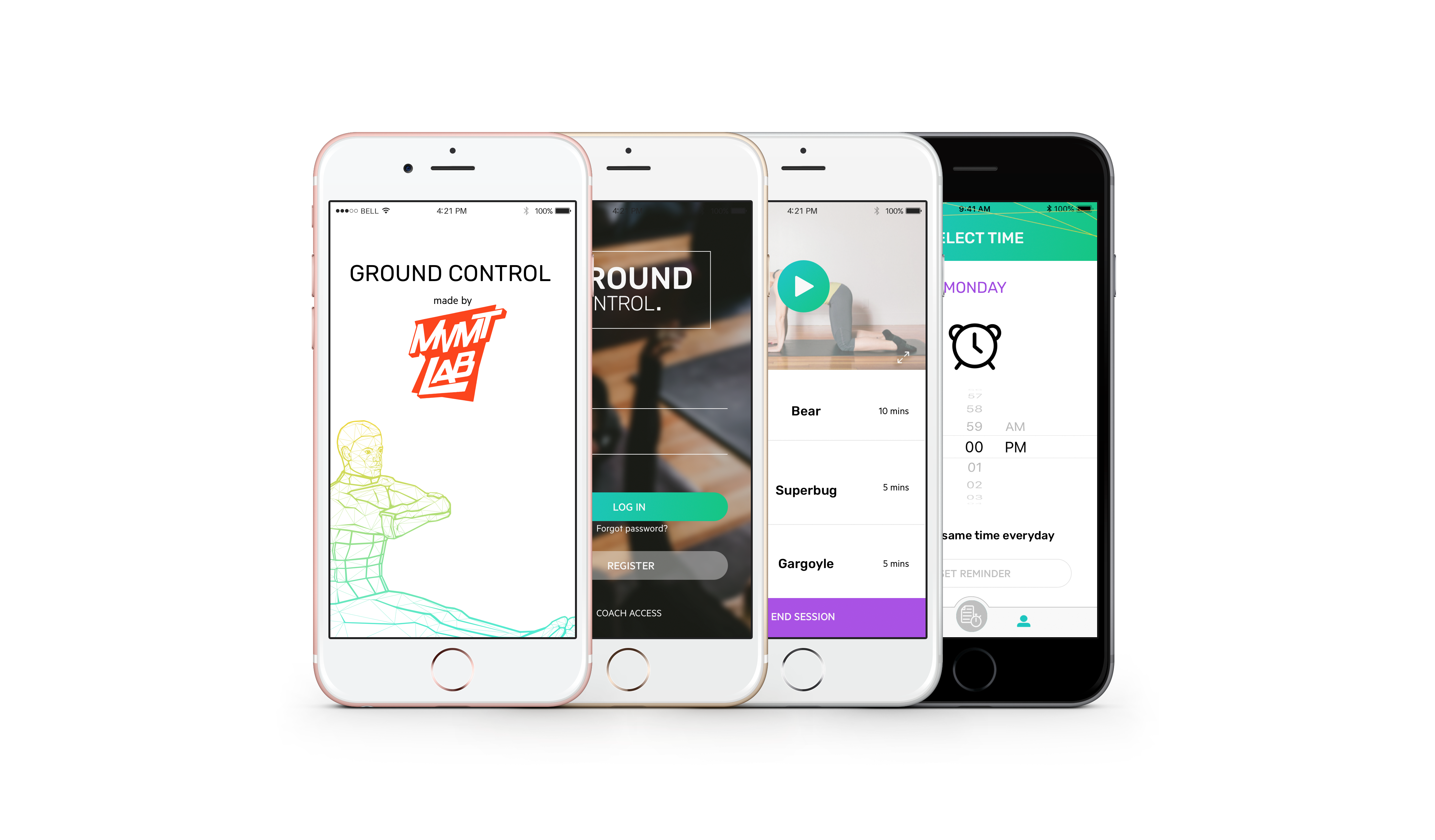
MVMTLAB is a sports performance clinic that helps injured athletes recover while also learning about their bodies. Unlike other similar clinics, it uses neuroplasticity to help with recovery. This is important because many people continue to feel pain (and cannot perform as well) after physical recovery. Our UX and UI team worked with MVMTLAB to deliver their project goal: an app that helps users practice the same exercises that were taught in class, in the form of a 30-day challenge.
MVMTLAB is a sports performance clinic that helps injured athletes recover while also learning about their bodies. Unlike other similar clinics, it uses neuroplasticity to help with recovery. This is important because many people continue to feel pain (and cannot perform as well) after physical recovery. Our UX and UI team worked with MVMTLAB to deliver their project goal: an app that helps users practice the same exercises that were taught in class, in the form of a 30-day challenge.
As one of the UX designers on the team, my role was to conduct research, design a user flow, wireframes, etc. and eventually create a clickable prototype. After testing with clickable prototypes, the updated mid-fi prototypes were handed over to the UI designers. Testing was conducted with hi-fi prototypes as well before handing the project off to the developers.
As one of the UX designers on the team, my role was to conduct research, design a user flow, wireframes, etc. and eventually create a clickable prototype. The clickable prototype was then handed over to the UI designers.
Design Process
Design Process
The project was split in to 4 segments:
The project was split in to 4 segments:
- Research (week 1)
- Planning (week 2)
- Design (week 3)
- Testing (week 3)
Research
Research
Research Goals
Research Goals
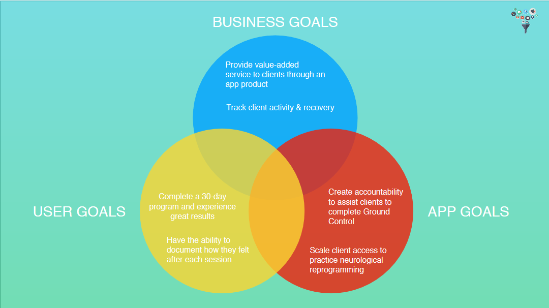
After the kick-off meeting with our client, we split the goals into business goals, app goals, and user goals:
After the kick-off meeting with our client, we split the goals into business goals, app goals, and user goals:
Research Methods
Research Methods
We used the following research methods for this project:
We used the following research methods for this project:
- Competitive analysis
- Survey
- Interviews
- Contextual inquiry
- Gut test (UI)
These methods helped us gather data for the planning stage.
Competitive Analysis
Comparative Analysis
For competitive analysis, we looked at various similar apps that helped users exercise. While MVMTLAB has no direct competitors due to its basis in neurological reprogramming, there are apps that are similar in other ways (e.g. by offering a 30-day challenge).
For comparative analysis, we looked at various similar apps that helped users exercise. While MVMTLAB has no direct competitors due to its basis in neurological reprogramming, there are apps that are similar in other ways (e.g. by offering a 30-day challenge).
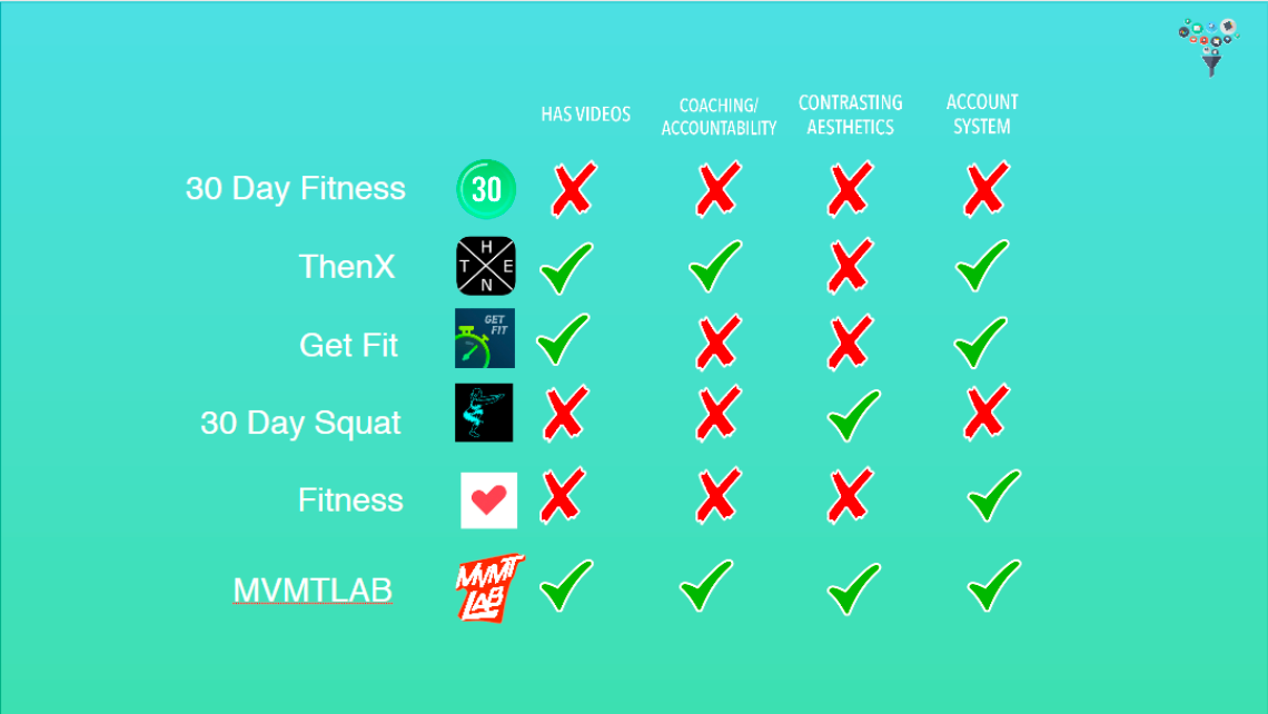
We looked at 5 other apps: 30 Day Fitness, ThenX, Get Fit, 30 Day Squat, and Fitness
As we found out through our competitive analysis, none of the competitors had all 4 features (videos, coaching/accountability, contrasting aesthetics, and an account system). And so MVMTLAB will have all 4.
Survey
Survey
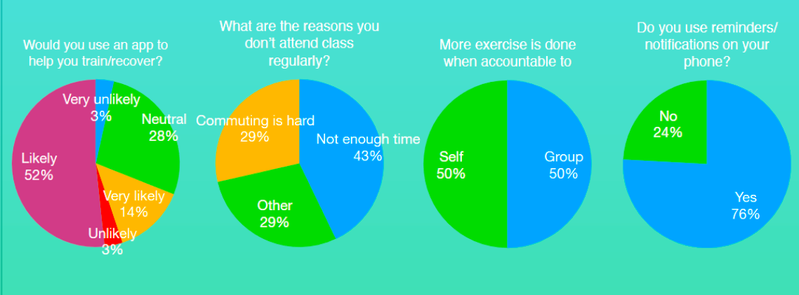
We conducted a survey that targeted people who were active, many of whom were current or previous customers of MVMTLAB. A total of 29 people were surveyed, with some questions focusing on those who answered a previous question in a certain way (e.g. answer question 5 if you answered “yes” for question 4). The survey helped us determine user demographics, which phone OS to design for, as well as how the app would function.
Here are some of the results from the survey:
Interviews
Interviews
We interviewed 4 current and previous customers of MVMTLAB: Sion, Joanie, Lisa, and Nicole. They were all interested in using an app to help them with MVMTLAB exercises. Some had issues with accountability — they would be less motivated to do these exercises if they were not reminded. Others had trouble making it to classes at MVMTLAB, and would very much prefer to be given directions at home.
Below are some quotes from the interviews:
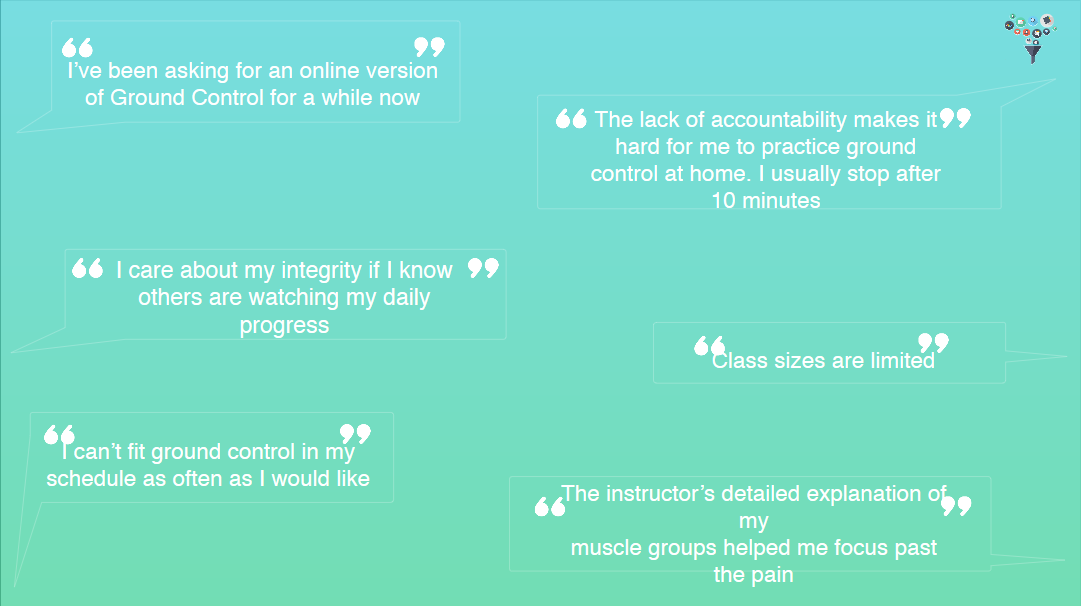
Contextural Inquiry
Contextural Inquiry
We went to MVMTLAB to talk to our clients and to get a feel of what their clinic was like. Here are our findings:
- Different parts of the clinic had different aesthetics, though the building’s brick structure was mostly exposed.
- Their logo had gone through multiple iterations, though the different versions could still be found throughout the clinic.
- There was quite a bit of graffiti art too, and the place (as well as their website) felt both youthful and retro at the same time.
We tried to incorporate these aspects into our app in order to align with their branding.
Affinity Diagram
Affinity Diagram
With the data we gathered, we put together an affinity diagram.
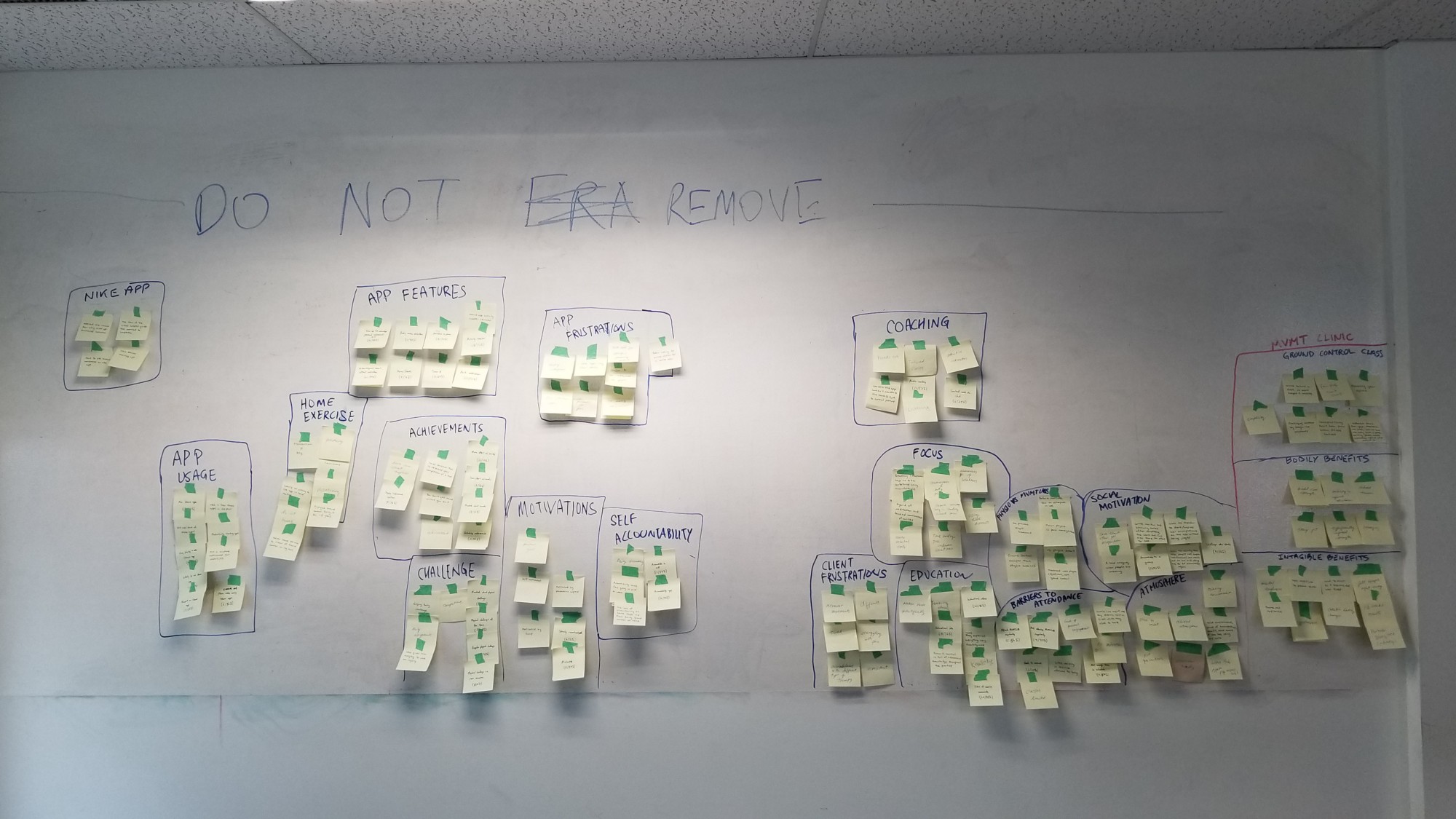
The full affinity diagram
We grouped our observations by category. Here are some more detailed pictures:
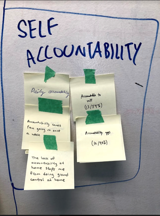
Self accountability: the key to getting things done without outside help
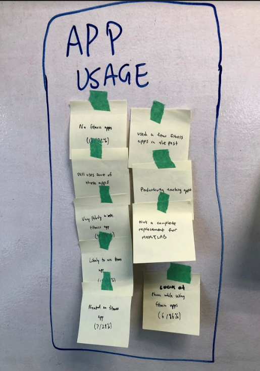
Significant interest in using a fitness app
From the affinity diagram, we were able to clearly see that users desired an app that helped them stay motivated, connect with coaches, etc. which we then used for our planning stage.
Planning
Planning
Using the data we gathered, we put together the following:
Using the data we gathered, we put together the following:
- User persona
- Storyboard
- Feature list
- User flow
User Persona
User Persona
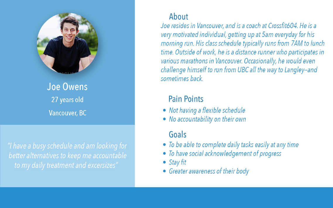
Since the app is meant for MVMTLAB customers, our user persona featured a young man (based on demographics from the survey) from Vancouver who is very active, motivated, and busy.
Since the app is meant for MVMTLAB customers, our user persona featured a young man (based on demographics from the survey) from Vancouver who is very active, motivated, and busy.
Storyboard
Storyboard
Using the user persona, we created a storyboard for Chris Cooper to show how he got to MVMTLAB (and in a position where he would benefit from the app).
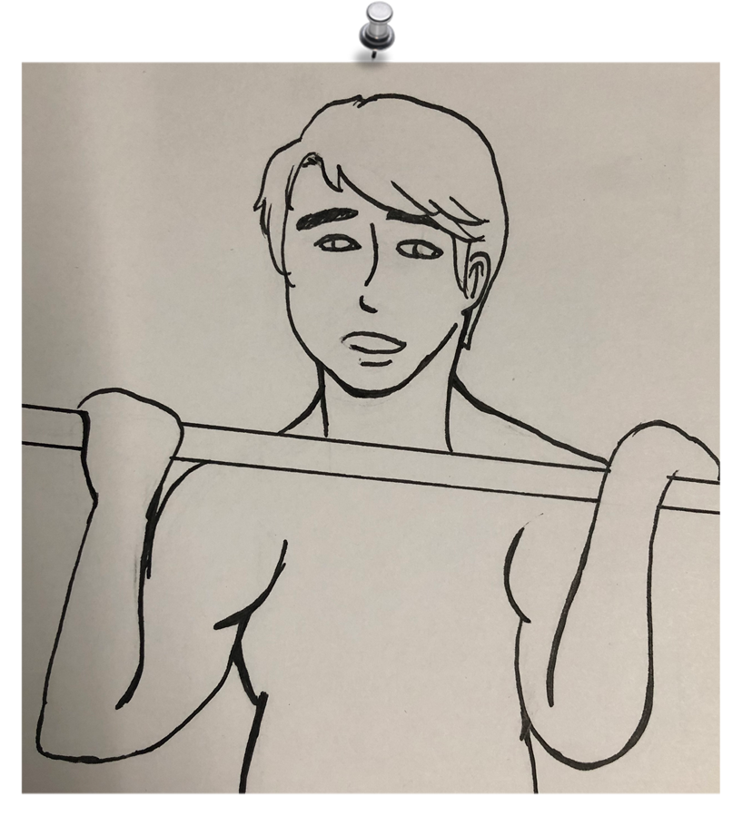
Chris likes to work out.
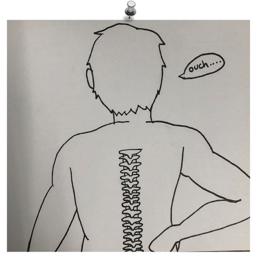
One day, he felt pain in his back after working out.
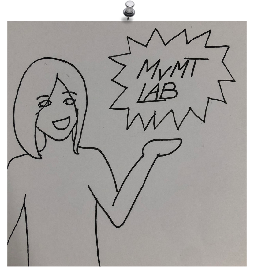
A friend recommended MVMTLAB to him.
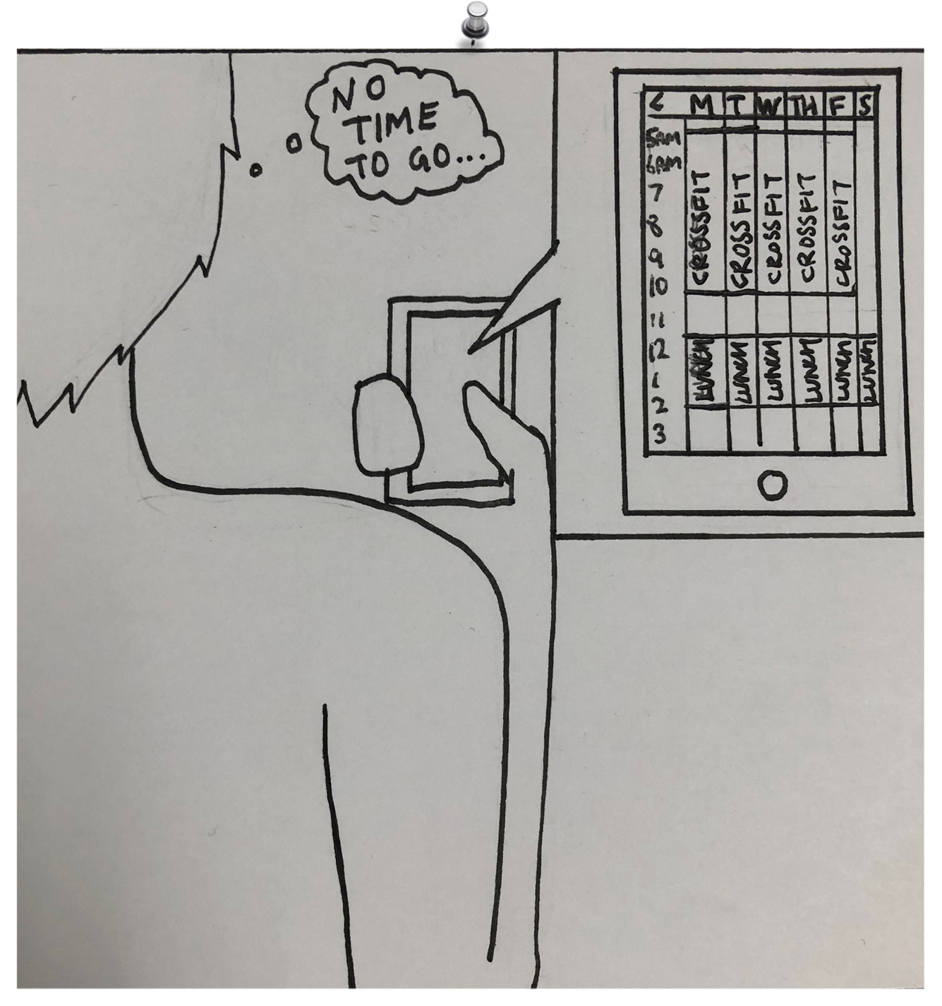
Unfortunately, Chris is very busy and has no time to go to classes at MVMTLAB.
Feature List
Feature List
From the data we collected, we came up with a list of features that the app needed to have.
From the data we collected, we came up with a list of features that the app needed to have.
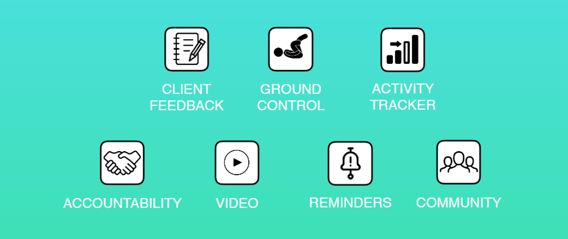
Ground Control is the name of the 30-day challenge. The name was coined by the client and ties in with their classes.
Due to time constraints, not all of these made it into the initial (MVP) version of the app. In particular, the community feature will be added at a later date.
User Flows
User Flows
We created a user flow diagram based on the features we needed.
We created a user flow diagram based on the features we needed.
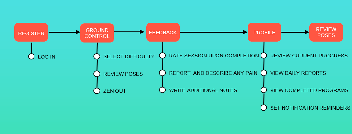
From the user flow diagram, we were able to create wireframes and paper prototypes.
Design
Design
Paper Prototypes
Paper Prototypes
We created paper prototypes individually, then combined them into a finalized version. Here are some of the screens I designed:
We created paper prototypes individually, then combined them into a finalized version. The finalized paper prototype incorporated elements from all the UX designers on the team:
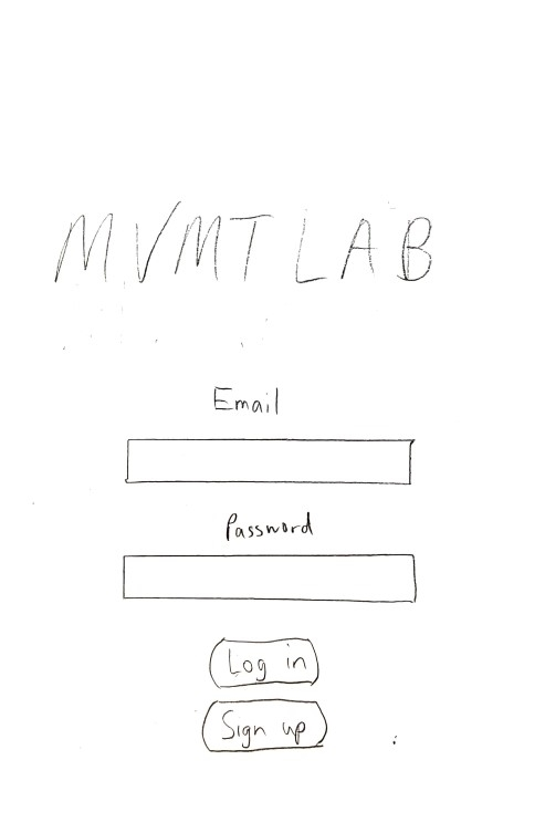
Log in/sign up when the app is first opened
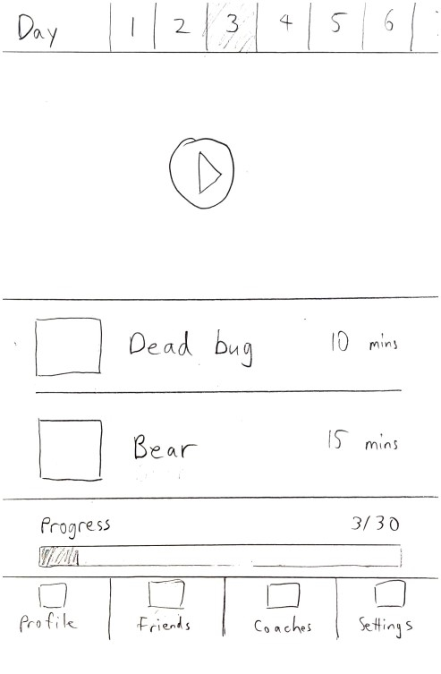
Ground Control screen
And here is the final paper prototype, which incorporated elements from all the UX designers on our team:
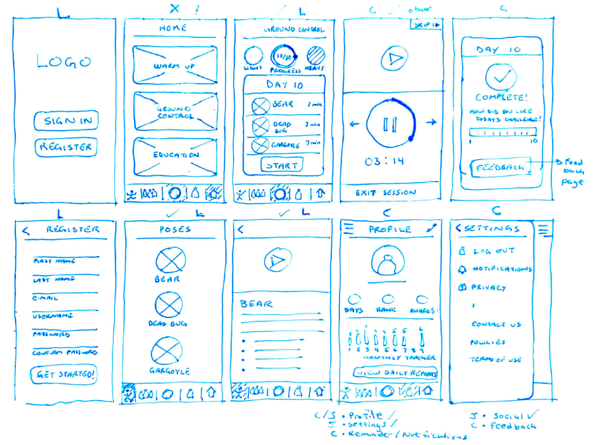
Wireframes
Mid-fi and Beyond
After the paper prototype was completed, we digitized the designs using Sketch. This was a mid-fidelity prototype intended for iPhone 8, done in grayscale. We incorporated Apple’s design guidelines so that stuff like the navigation bar would be consistent with the rest of the operating system.
The UI designers then turned the mid-fidelity prototype into a high-fidelity prototype with more suitable aesthetics.
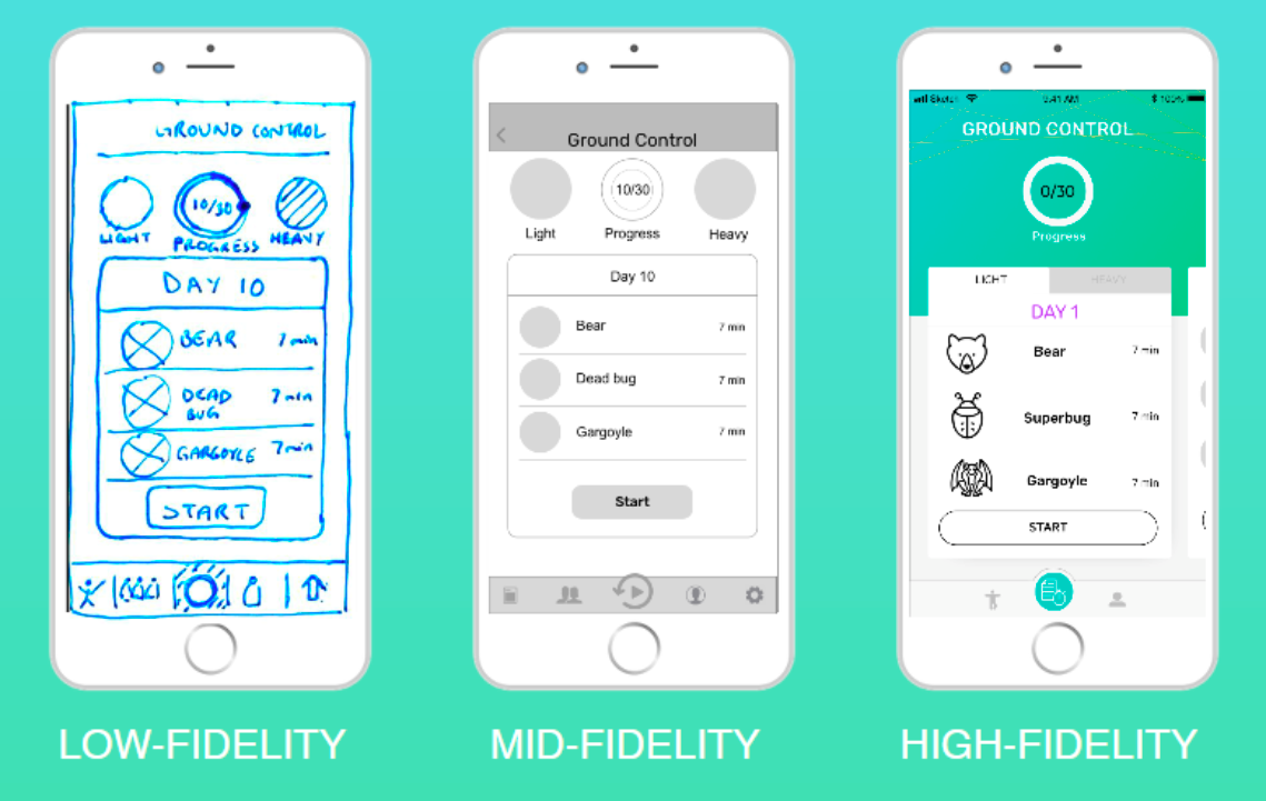
From low-fidelity paper prototypes to high-fidelity prototypes
Testing
Testing
Throughout the design process, we tested the prototypes with users. We incorporated feedback with each iteration. Though testing validated some early assumptions, the feedback led us to change the position of various buttons (e.g. the settings button on the navigation bar, which was originally accessible via the hamburger icon in the top right corner, and which was eventually moved to the user’s profile page).
Throughout the design process, we tested the prototypes with users. We incorporated feedback with each iteration. This led us to change the position of various buttons (e.g. the settings button on the navigation bar, which was originally accessible via the hamburger icon in the top right corner, and which was eventually moved to the user’s profile page).
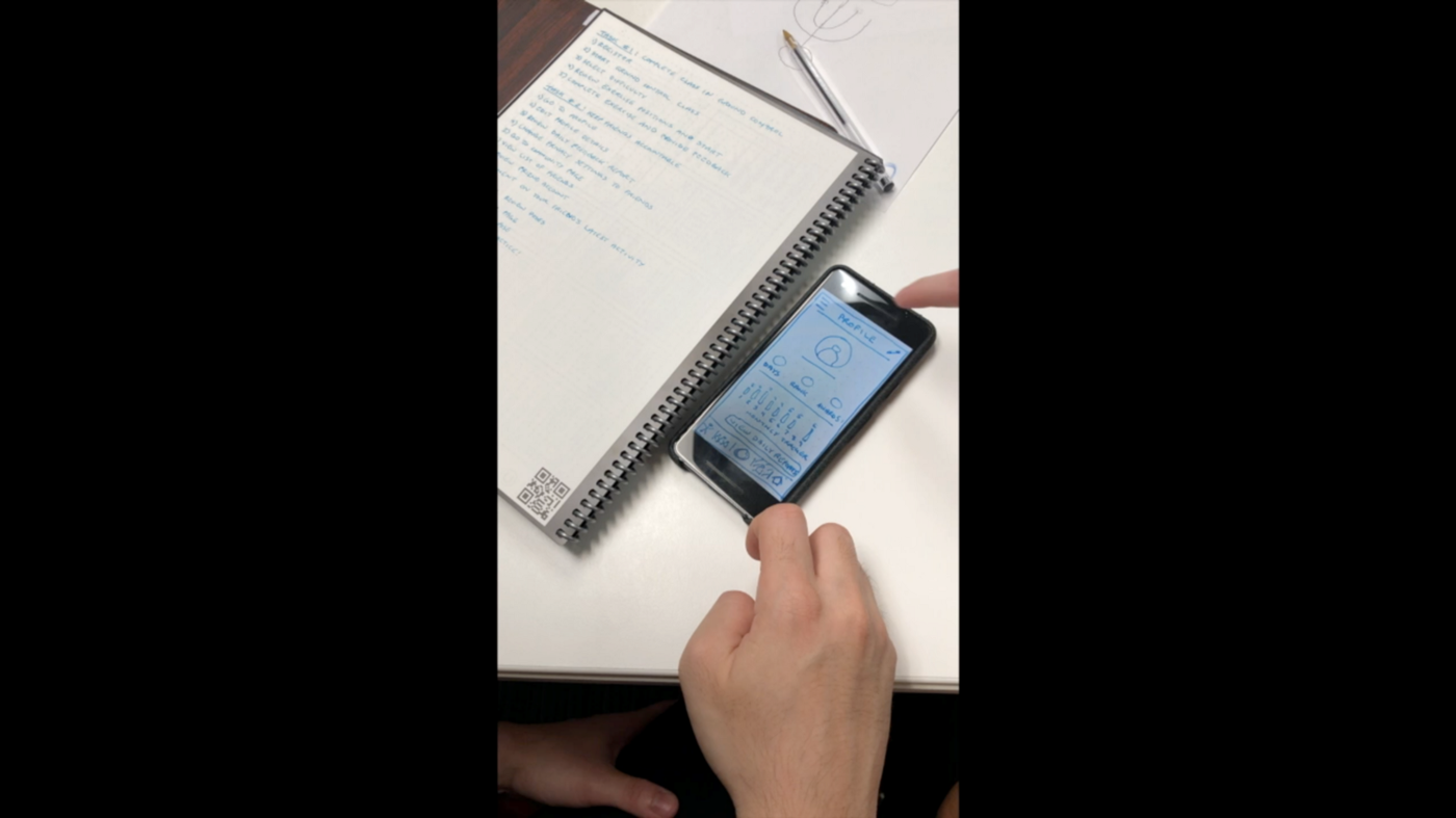
We tested prototypes throughout the design process, starting from low-fidelity.
Summary
Summary
Goals
In summary, we believe that we were able to design an app that solves the problem and meet MVMTLAB’s goals, since with the ability to rate each daily session, coaches are able to track their clients’ activity and progress through the coach access feature. Clients can now have access to the Ground Control routines and listen to Adrian’s calm and charming voice guiding them to a meditative state of nirvana. The main feature of the app provides your clients to follow a 30-day program and have the ability review their progress along the way. Finally, we believe that this app solves the problem by creating an experience that replicates all the best things that clients love about Ground Control and putting it in the palm of their hand — always accessible regardless of commuting or time constraints.
In summary, we understood that the goals for this project were to:
- Create an app that tracks clients’ activity and recovery (Business)
- Provide clients access to Ground Control outside of the clinic (App)
- Challenge clients to complete a 30-day program and experience great results from it (User)
We also heard that one of the biggest problems that clients had was the lack of access to consistently come to clinic classes due to commuting and time constraints.
Design
Following RED Academy’s design process, we believe that we were able to design an app that solves the problem and meet MVMTLAB’s goals.
- With the ability to rate each daily session, coaches are able to track their clients’ activity and progress through the coach access feature.
- Clients can now have access to the Ground Control routines and listen to Adrian’s calm and charming voice guiding them to a meditative state of nirvana.
- The main feature of the app provides your clients to follow a 30-day program and have the ability review their progress along the way.
Finally, we believe that this app solves the problem by creating an experience that replicates all the best things that clients love about Ground Control and putting it in the palm of their hand — always accessible regardless of commuting or time constraints.
Future Considerations
Future Considerations
We designed a few other screens for the functions that did not make it into the prototype, though they do represent useful functions and will probably be added at a later date.
Community Feature
Community Feature
This builds a community around the app and can be used to keep users accountable:
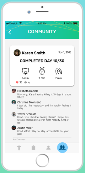
- New icon on the bottom navigation bar
- Feed to view your friends’ activities
- Comment
- Friends list
- View Karen’s profile to help keep her accountable
Privacy Setting
Privacy Setting
This goes hand-in-hand with the community function:
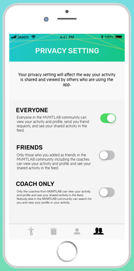
- Changes how your activity and stats are shared with others
30-Day Reward
30-Day Reward
After the 30-day program, the user may gain a reward:
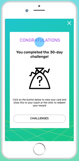
- Happens when the user is just about to complete the 30 day program
- Popup: Congrats! Come to clinic to redeem reward/swag
So with these future features, we believe that there will be improvements in the following areas:
- Accountability
- User engagement
Further Info
Further Info
Other Works

Super Smash Bros. UltimateGame UX Design
Halo: The Master Chief CollectionGame UX/UI Design
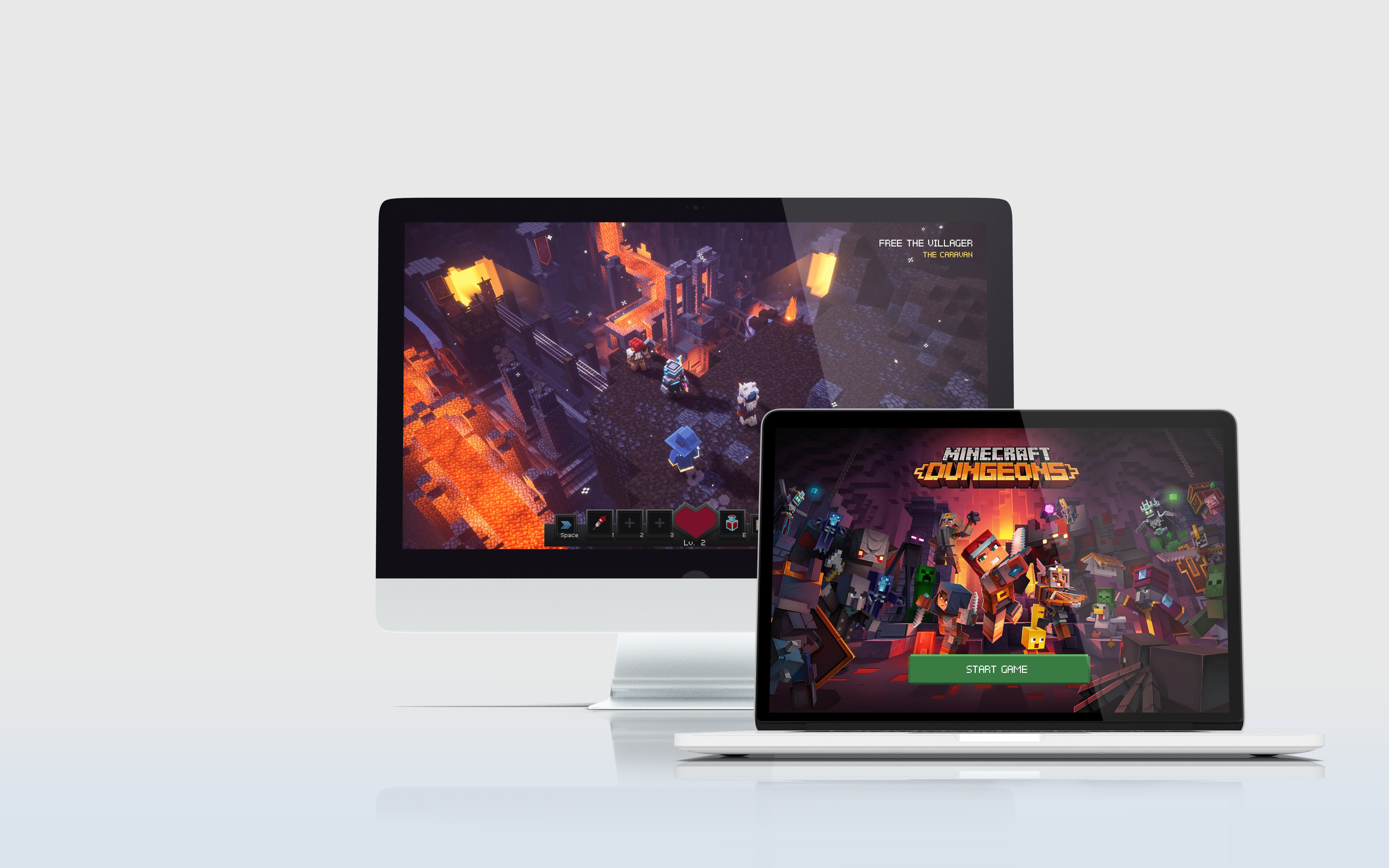
Minecraft DungeonsGame UX/UI Design
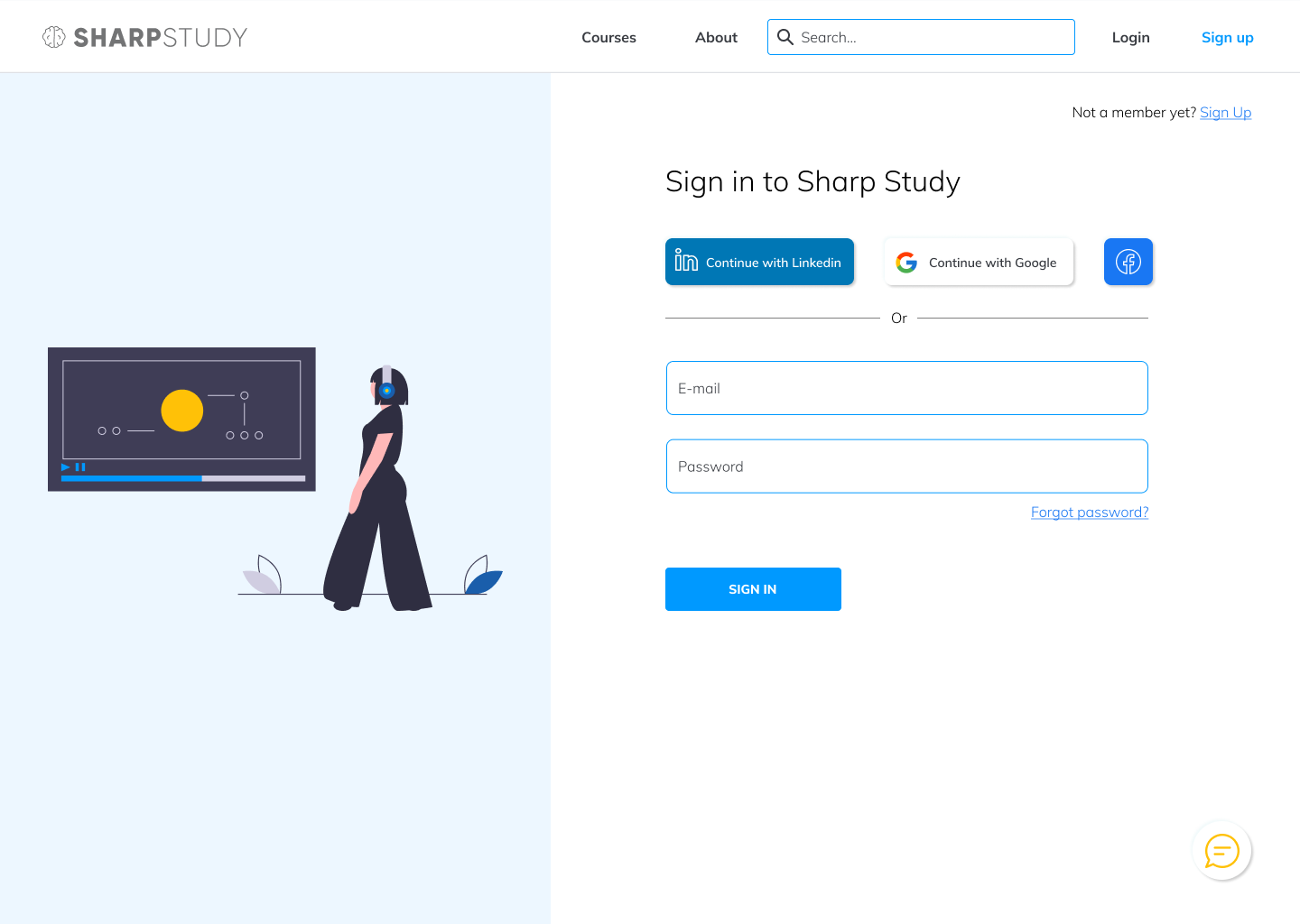
Sharp StudyUX/UI design

Tudor ConsultingBrand Guide

Evolve XUX/UI design
Collingwood Neighbourhood HouseResponsive website, UX design
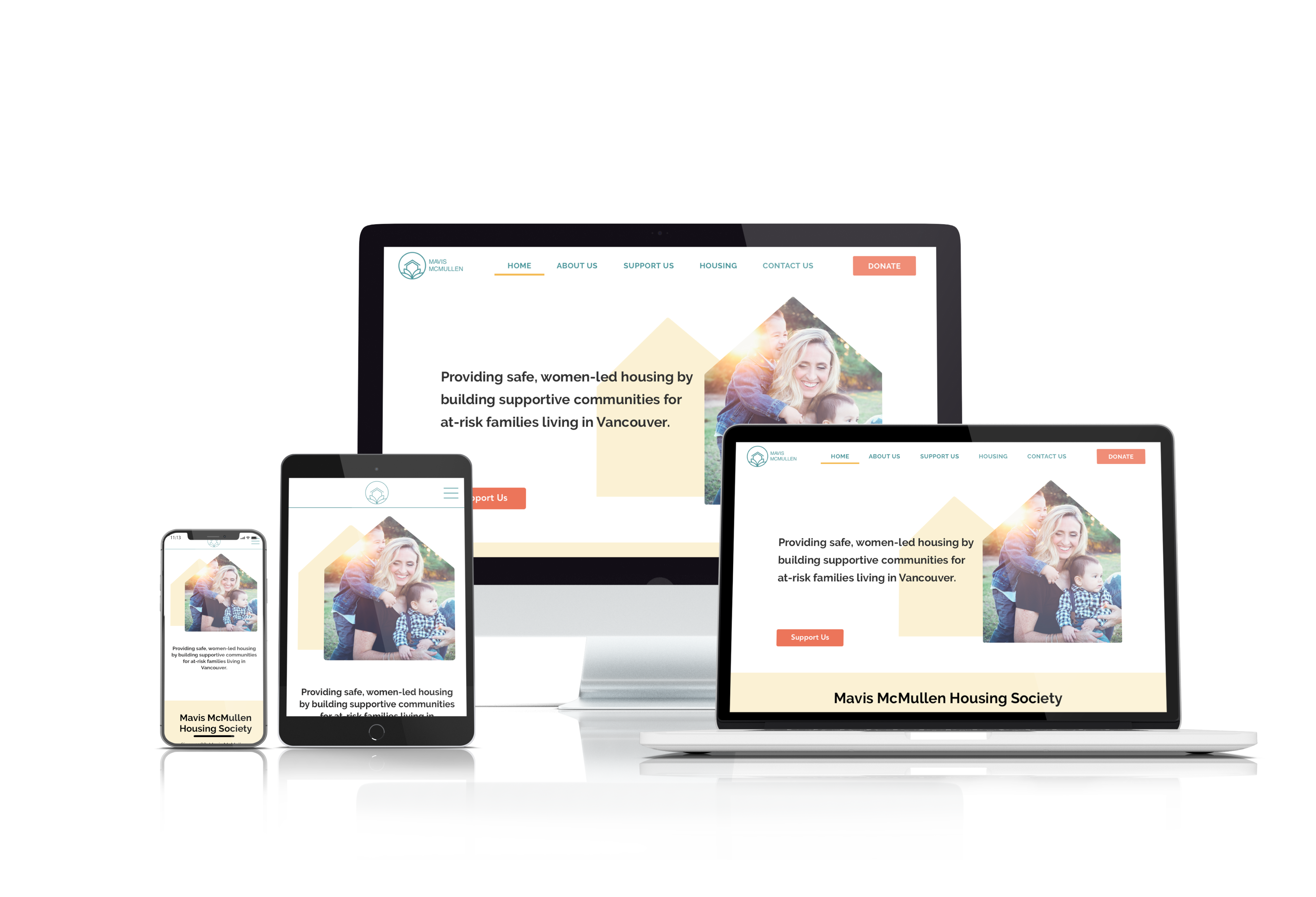
Mavis McMullen Housing SocietyResponsive website, UX design

Cool It!Mobile app, UI design
Unseen AthleteResponsive website, UI design
Boss LevelResponsive website, UI design
Copyright 2021 Luke Yin. All rights reserved.

