Overview
Overview
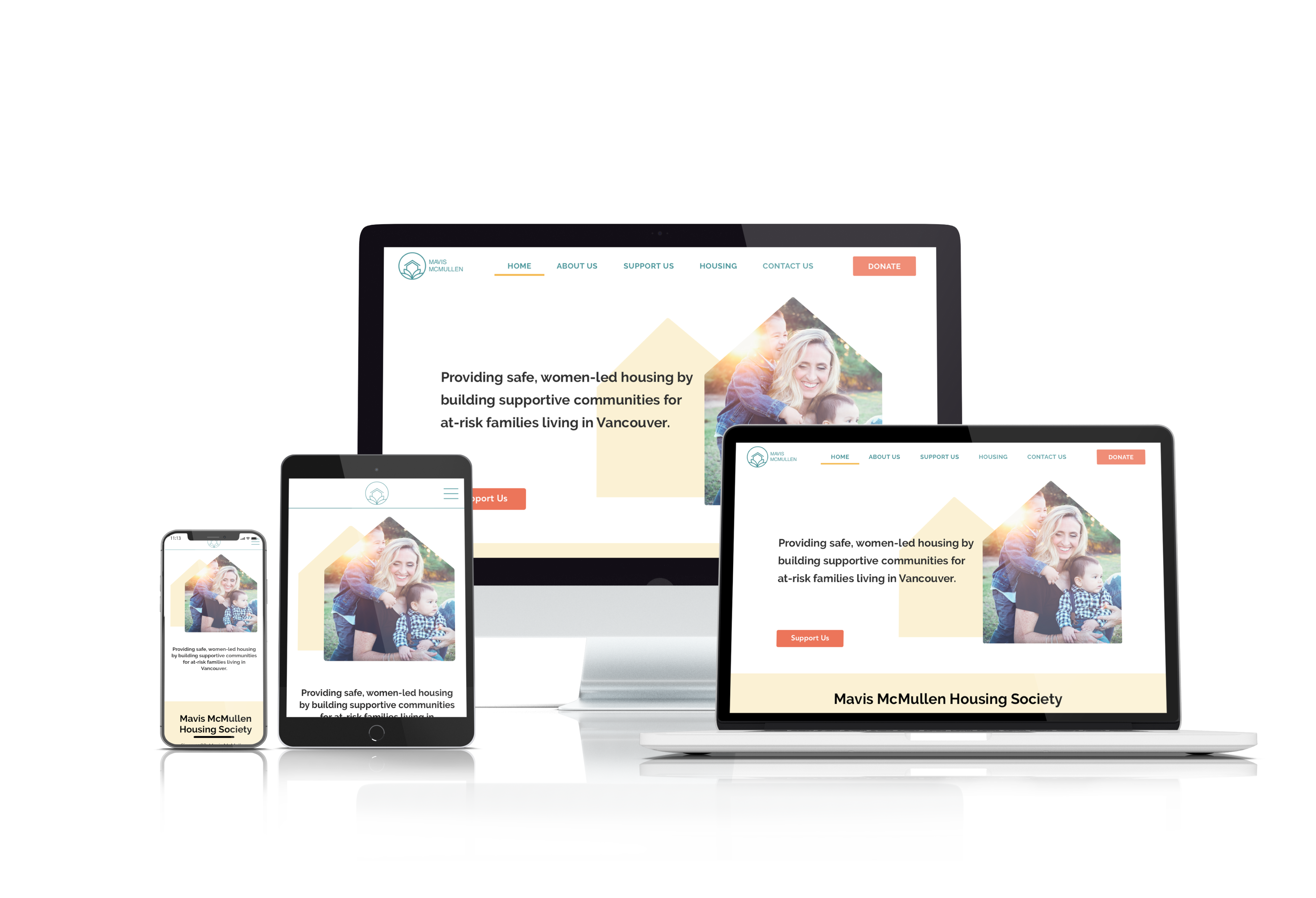
Mavis McMullen Housing Society provides women-led housing for low-income, at-risk women and their families. The primary tenant is always a woman, so it greatly reduces the need for a woman to stay in an abusive relationship just to avoid homelessness. Our UX team worked with Mavis McMullen Housing Society to deliver their project goal: a modernized website that presents information clearly and attracts donors.
Mavis McMullen Housing Society provides women-led housing for low-income, at-risk women and their families. The primary tenant is always a woman, so it greatly reduces the need for a woman to stay in an abusive relationship just to avoid homelessness. Our UX team worked with Mavis McMullen Housing Society to deliver their project goal: a modernized website that presents information clearly and attracts donors.
As a UX designer, my role was to conduct research, put together a user persona, design some user flows, wireframes, etc. and eventually create mid-fi prototypes for both desktop and mobile formats. After testing, they were improved with UI elements to create hi-fi prototypes.
While the project focused primarily on UX, we all helped with UI as well. Winnie was more experienced than the rest of us in UI, so she took the lead in the UI portion of the project. Since good UI was one of the things that the original website lacked, we felt that it was necessary for us to create better UI for Mavis McMullen Housing Society. This included a logo redesign.
As a UX designer, my role was to conduct research, put together a user persona, design some user flows, wireframes, etc. and eventually create mid-fi prototypes for both desktop and mobile formats. After testing, they were improved with UI elements to create hi-fi prototypes.
Design Process
Design Process
The project was split into 4 segments:
- Research (weeks 1–2)
- Planning (week 2)
- Design (weeks 2–3)
- Testing (weeks 2–3)
Research
Research
Research Goals
Research Goals
After the kick-off meeting with our client, we found that the most basic goal of the project was to modernize and revamp the website, which was designed in 2012. As a non-profit organization seeking donations, they would like to increase user friendliness primarily so that donors can be enticed to donate to them.
Research Methods
Research Methods
We used the following research methods for this project:
- Domain research
- Survey
- Interviews
- Gut test (UI)
These methods helped us gather data for the planning stage.
Domain Research
Domain Research
For domain research, we looked at the websites of various non-profit organizations and charities. Since Mavis McMullen Housing Society is a non-profit organization and therefore has no direct competitors, we focused on the general layout and features of similar websites.
For domain research, we looked at the websites of various non-profit organizations and charities. Since Mavis McMullen Housing Society is a non-profit organization and therefore has no direct competitors, we focused on the general layout and features of similar websites.
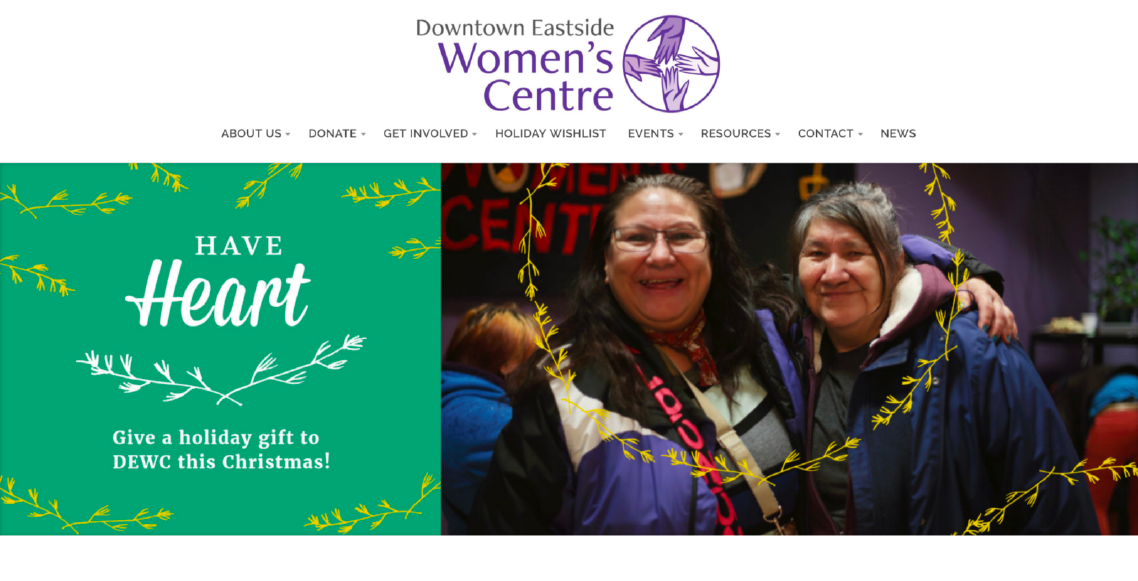
DTES Women’s Centre: a source of inspiration for the features that our website needed.
DTES Women’s Centre: a source of inspiration for the features that our website needed.
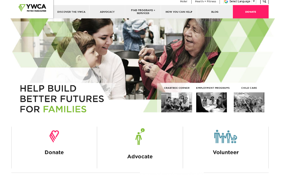
YWCA: a major source of inspiration for our website’s basic layout.
YWCA: a major source of inspiration for our website’s basic layout.
We also looked at other websites such as the ISSofBC, The Bloom Group, UNICEF, and Aunt Leah’s. Ultimately, a significant amount of our inspiration came from the YWCA, since their website is quite well-designed. Our donation page was ultimately inspired by UNICEF’s, after we realized that embedded forms from CanadaHelps were customizable in appearance, not just in content.
Survey
Survey
We surveyed 60 people about neighbourhood houses, why they would want to visit the website, etc. A key finding from the survey was broken down as follows:
We surveyed 60 people about neighbourhood houses, why they would want to visit the website, etc. A key finding from the survey was broken down as follows:
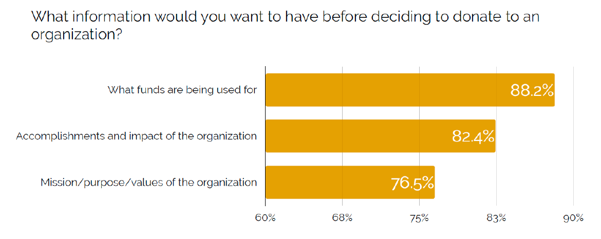
As seen above, the most important factor is transparency. Donors wanted to know how their funds would be used. Aside from that, they wanted to know what the organization has accomplished as well as their mission and values. This meant that our new website must clearly explain how funds will be used, which is information that’s not found on the old website.
As seen above, the most important factor is transparency. Donors wanted to know how their funds would be used. Aside from that, they wanted to know what the organization has accomplished as well as their mission and values. This meant that our new website must clearly explain how funds will be used, which is information that’s not found on the old website.
Interviews
Interviews
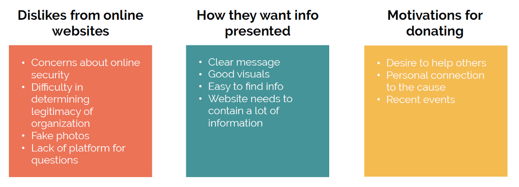
We conducted 8 interviews with various people who donate to charities, in order to find out about the kinds of charities they donate to, their motivations for donating, what information they want to see, etc.
Below are our findings:
Affinity Diagram
Affinity Diagram
Using our research findings, we created an affinity diagram, which enables us to take the qualitative answers from surveys and interviews and use them to draw insights.
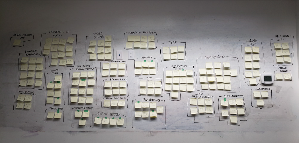
We then highlighted certain categories to help us decide what to do with our design:
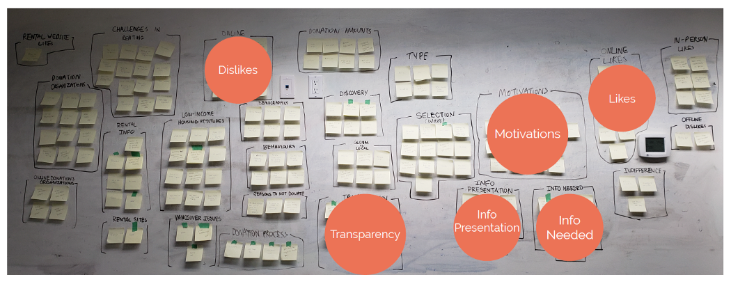
Not every category was highlighted. This is because some of the questions we asked were more broad and led to answers that weren’t particularly relevant to our design. For example, some people liked to donate to big, well-known charities with global reach, and Mavis McMullen Housing Society is very much a local charity that serves one particular area.
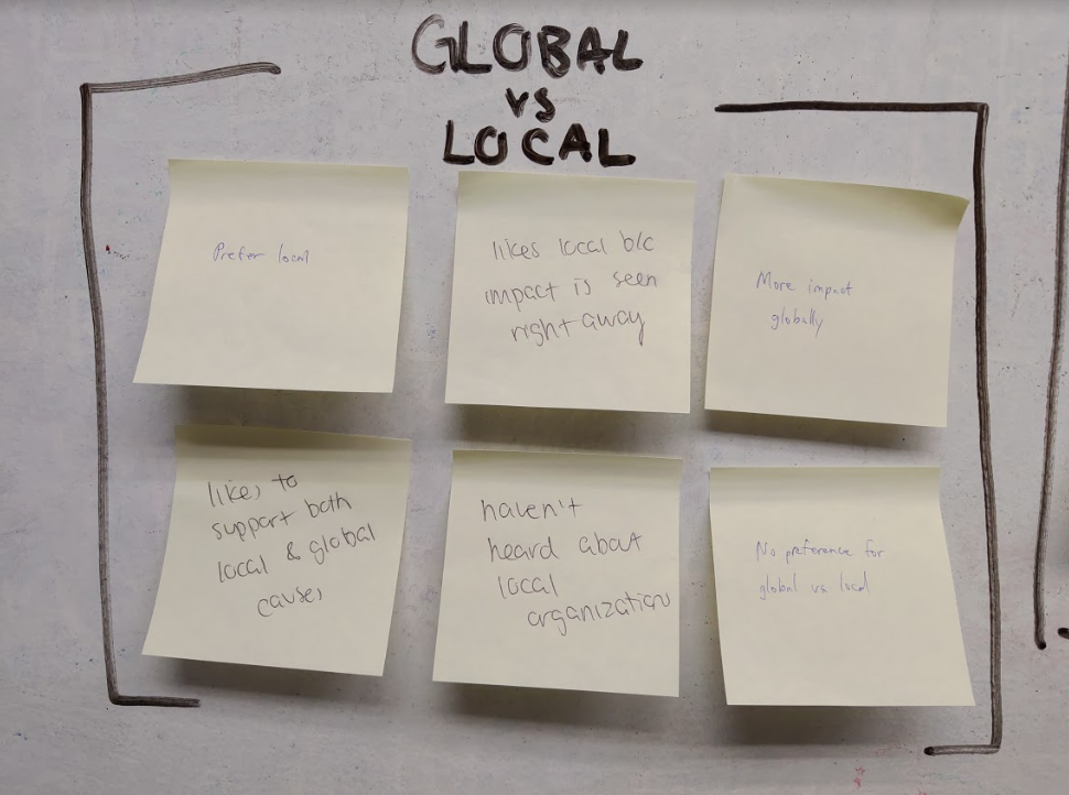
This category came up, but it wasn’t particularly relevant to our design.
Even so, those who donated to global charities often provided other insights. For example, transparency was still a key issue, so that’s one of the things we decided to focus on.
Planning
Planning
Using the data we gathered, we put together the following:
- User persona
- Storyboard
- Site map
- User flow
User Persona
User Persona
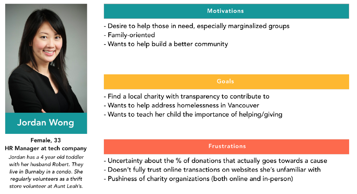
Since the website is meant primarily for donors, our user persona needed to feature an individual who’s willing and able to donate money, and also well aware of the issues that Mavis McMullen Housing Society is trying to address:
Since the website is meant primarily for donors, our user persona needed to feature an individual who’s willing and able to donate money, and also well aware of the issues that Mavis McMullen Housing Society is trying to address:
Storyboard
Storyboard
Using the user persona, we created a storyboard to see how Jordan Wong got to the Mavis McMullen Housing Society’s website (and in a position where she would benefit from a modernized and better designed website):
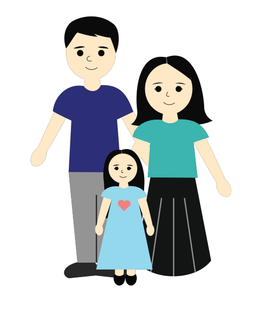
Jordan Wong has a 4 year old daughter with her husband Robert.
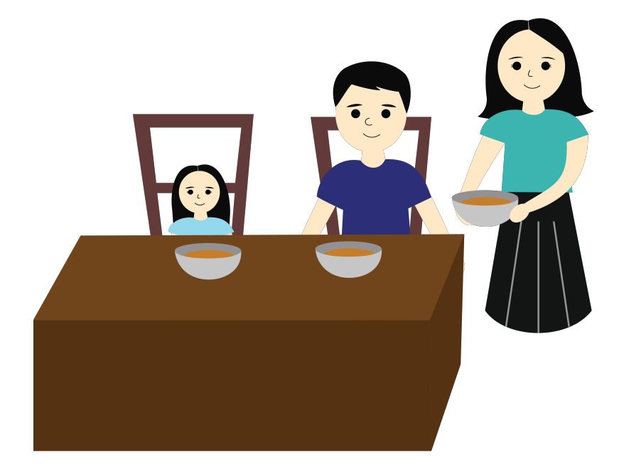
She cooks food for her family.
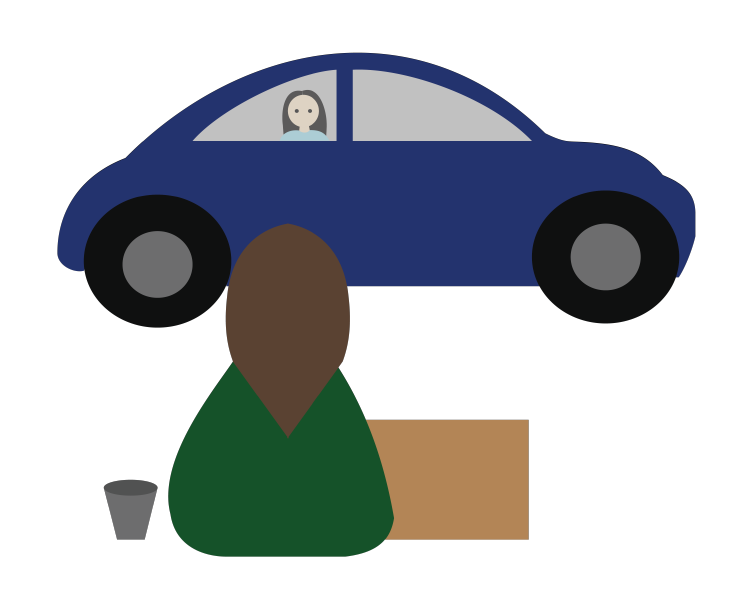
On the way to and from work every day, she passes by the Downtown Eastside, where there are lots of homeless women.
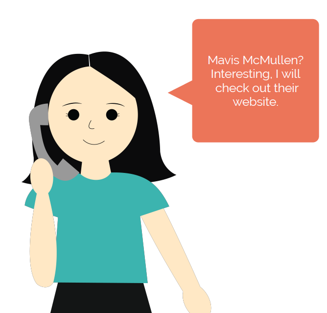
She finds out about Mavis McMullen Housing Society from a friend.
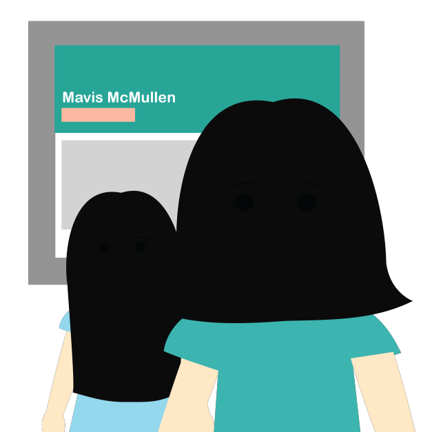
To teach her daughter about the importance of giving, she visits Mavis McMullen Housing Society’s website with her daughter.
Sitemap
Sitemap
Since the old website did not contain many pages and was reasonably well-organized, our sitemap is somewhat similar. A key difference is that there is no longer a news page, and that the donate button is now constantly visible.
Since the old website did not contain many pages and was reasonably well-organized, our sitemap is somewhat similar. A key difference is that there is no longer a news page, and that the donate button is now constantly visible.
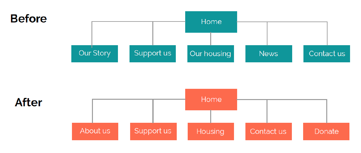
With the sitemap finished, we went on to create a user flow for donors.
User Flow
User Flow
Since the ultimate goal was to get users to donate, we combined the various different ways a user could reach the donation form. They might choose to find out about the organization first, they might (then) look for ways to provide support, but ultimately, the donate button is always visible and can be reached from any page.
Since the ultimate goal was to get users to donate, we combined the various different ways a user could reach the donation form. They might choose to find out about the organization first, they might (then) look for ways to provide support, but ultimately, the donate button is always visible and can be reached from any page.

After the user flow diagram, we did a design studio session that gave us an idea as to how some of the pages would look.
Design
Design
Design Studio
Design Studio
For the design studio session, we sketched out some ideas for the home page and the Support Us page. It wasn’t long before we made a decision on the home page:
For the design studio session, we sketched out some ideas for the home page and the Support Us page. It wasn’t long before we made a decision on the home page. Ideas for the Support Us page varied more, though it wasn’t long before we all agreed that there needed to be a progress bar for donations:
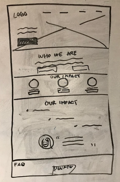
Our earliest design for the home page
Ideas for the Support Us page varied more, though it wasn’t long before we all agreed that there needed to be a progress bar for donations:
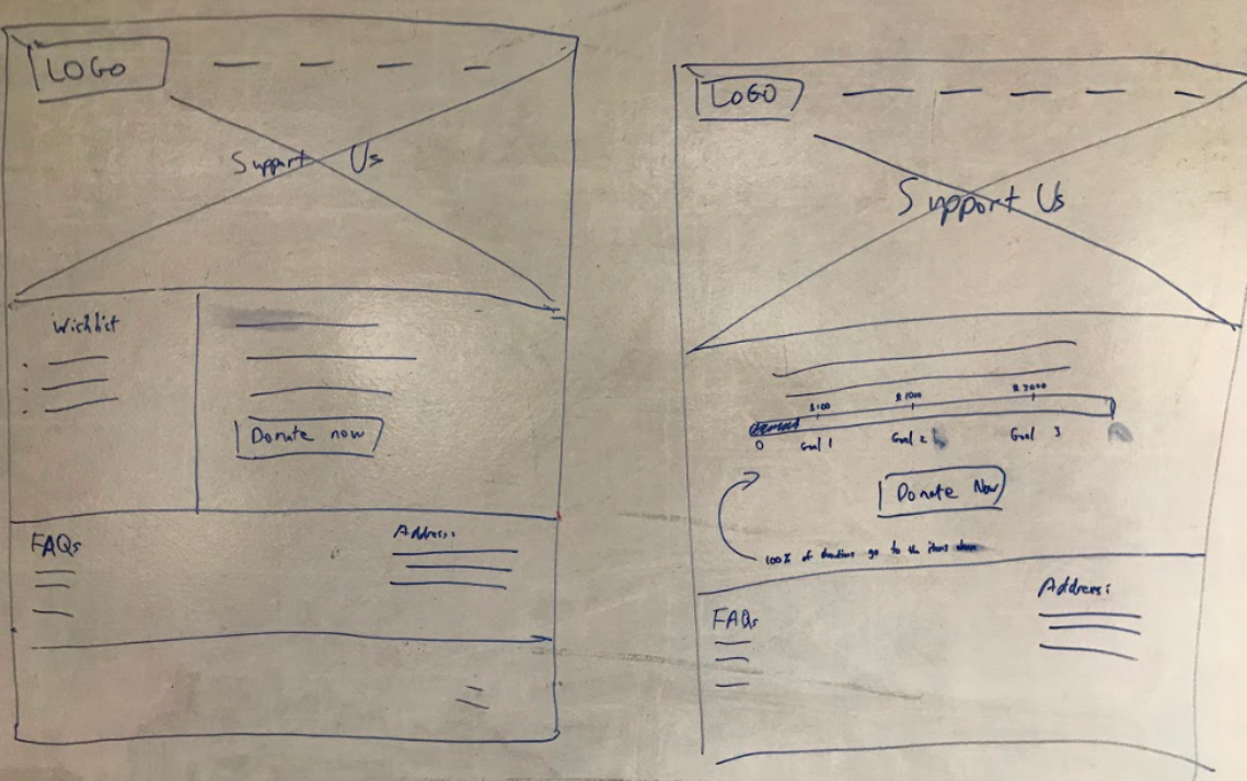
My initial designs for the Support Us page
With a basic idea of what we needed for some of the more important pages, we moved on to paper prototypes.
Paper Prototypes (Desktop)
From Paper to Hi-Fi
We started off by drawing some paper prototypes of how we thought the website should look. Here is the home page:
We started off by drawing some paper prototypes of how we thought the website should look. From there, creating the mid-fi prototypes was fairly straightforward, since we had paper prototypes drawn out already and we were able to divide up the labor. Further testing led us to change a few things. For example, some sections of the home page weren’t impactful enough, so we added more text and changed some of the headings:
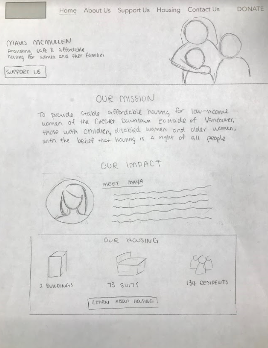
Testing showed that the home page was easy enough to navigate. We did end up changing some of the headings to really grab users’ attention though.
Mid-Fi and Hi-Fi Prototypes (Desktop)
Mid-Fi and Hi-Fi Prototypes (Desktop)
Creating the mid-fi prototypes was fairly straightforward, since we had paper prototypes drawn out already and we were able to divide up the labor. Further testing led us to change a few things, such as some headings on the home page.
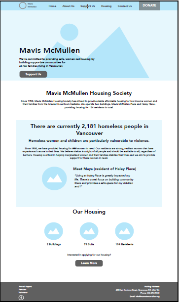
The desktop home page in mid-fi
Since some sections of the home page weren’t impactful enough, we added more text and changed some of the headings:
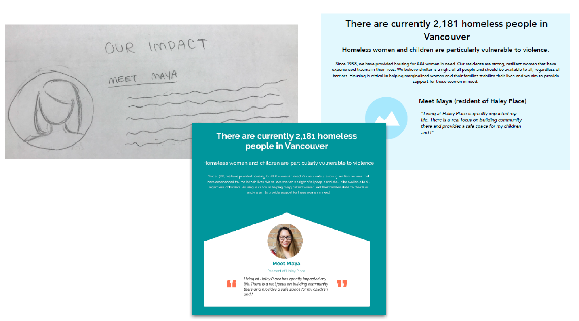
From paper to hi-fi
In addition, the progress bar for the fundraising goal has also gone through some changes. The biggest changes were that we added an explanation for the progress bar itself, as well as a call to action:
In addition, the progress bar for the fundraising goal has also gone through some changes. The biggest changes were that we added an explanation for the progress bar itself, as well as a call to action:
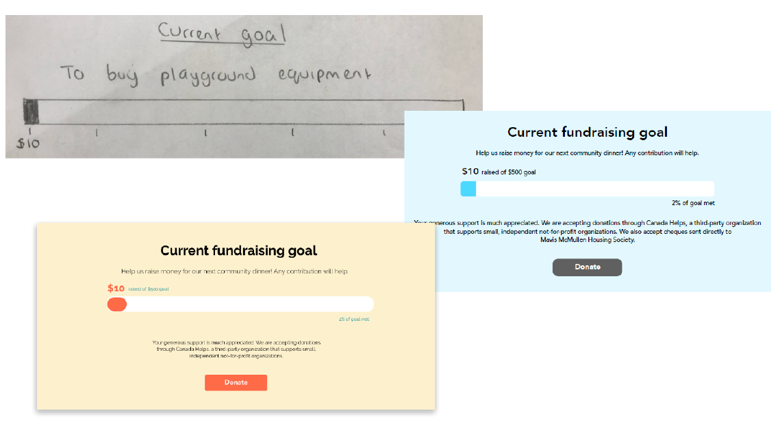
Evolution of the progress bar
We also decided to keep the wishlist separate, both to give the organization a little more leeway and to enable users to see more than just the current, most pressing item on the list.
After finalizing our desktop prototypes, we created screens on Sketch for every screen that we had on desktop. We decided to put the top nav bar in the hamburger menu, though notably, we decided to have the donate button hover at the bottom of the screen so that it’s visible at all times without cluttering the top nav bar.
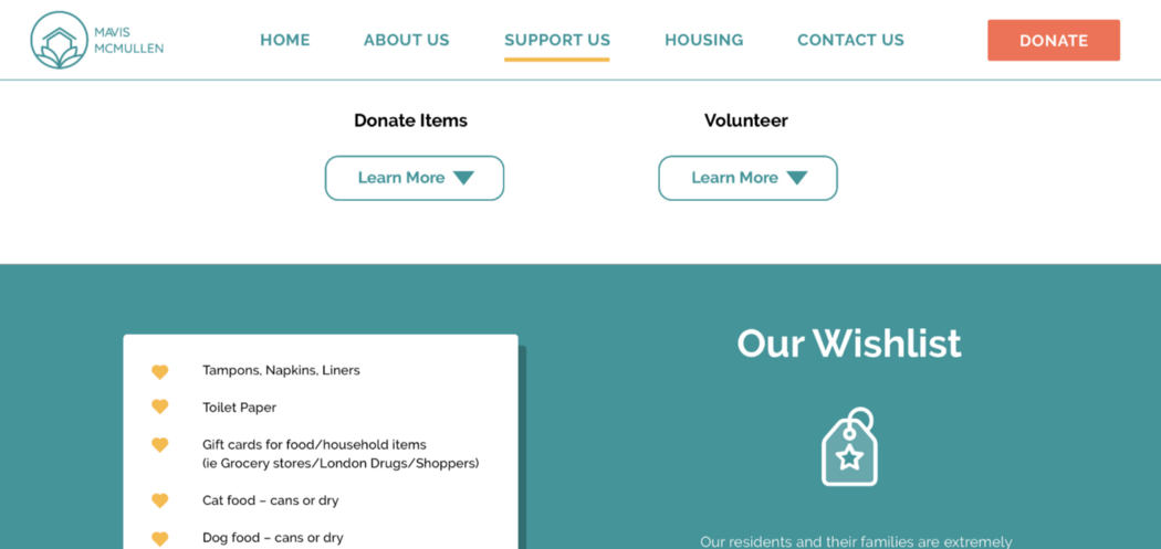
We decided that a fixed header was necessary to ensure that the donate button is visible at all times. Having the entire top nav bar visible also meant that the user could navigate more easily.
Hi-Fi Prototypes (Mobile)
Hi-Fi Prototypes (Mobile)
After finalizing our desktop prototypes, we created screens on Sketch for every screen that we had on desktop. We decided to put the top nav bar in the hamburger menu, though notably, we decided to have the donate button hover at the bottom of the screen so that it’s visible at all times without cluttering the top nav bar.
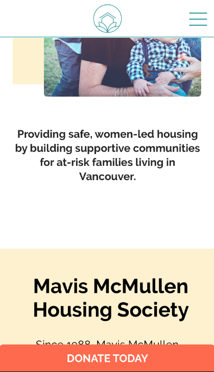
The home page on mobile
Testing
Testing
We tested throughout the design process, totaling up to 14 user tests, which led us to make numerous changes along the way. For each stage, we gave our testers 4 tasks:
- Find out about the impact of Mavis McMullen Housing Society
- Find out about donating physical items
- Find out about volunteering
- Find out about the housing provided by Mavis McMullen Housing Society
Here are the findings that led us to make changes to our design:
Support Us
Support Us
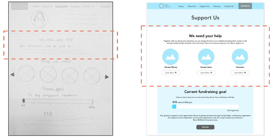
The Support Us page went through a couple of changes. During the paper prototype stage, testing showed that we should mention the different ways people can donate:
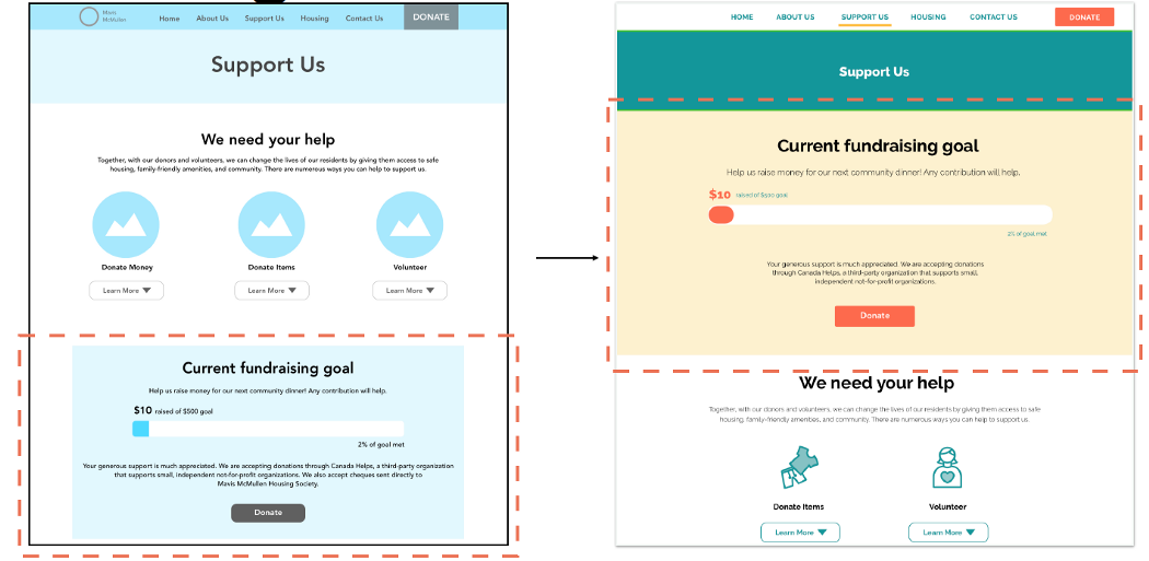
Later, when we tested the mid-fi prototype, we found that the current fundraising goal should be more prominent on the page. So we moved it to the top:
Housing
Housing
While the website itself was primarily designed for donors, it was still very clear that occasionally, a prospective tenant would find herself on the website. This meant that it had to be clear how many vacancies were available, if there were any at all.
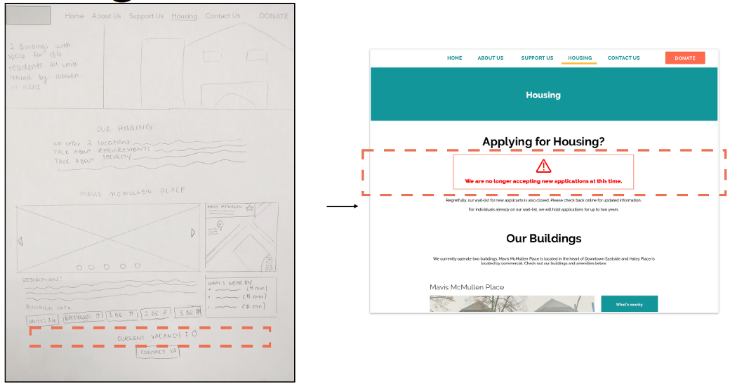
Our initial design only mentioned the number of vacancies under the description of each building. In part due to lack of contrasting UI elements, this was quite hard to find, and some users failed to find it altogether. This is why we decided to add a notice at the tope of the page to tell users that Mavis McMullen Housing Society is unable to accomodate more tenants at this time.
Donate
Donate
Our mid-fi design incorporated the most basic version of the embedded form from CanadaHelps. This form was quite long and did not fit our aesthetic, though it did still fulfill the necessary functions. Testing, however, showed that users preferred a shorter form, even if it would require multiple pages.
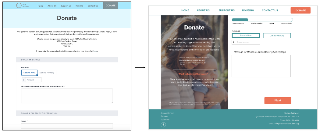
After we found that the donation form provided by CanadaHelps can be customized in quite a number of ways, we decided to split the original form into multiple pages and customize its colours.
Summary
Summary
We understood that the goal of the project was to create a modernized, donor-friendly website for Mavis McMullen Housing Society. The old website had numerous problems, including poor user-friendliness, lack of transparency, etc.
Following RED Academy’s design process, we believe that we were able to design a responsive website that solves the problem and meets Mavis McMullen Housing Society’s goals.
We understood that the goal of the project was to create a modernized, donor-friendly website for Mavis McMullen Housing Society. The old website had numerous problems, including poor user-friendliness, lack of transparency, among others.
Following RED Academy’s design process, we believe that we were able to design a responsive website that solves the problem and meets Mavis McMullen Housing Society’s goals.
Due to time constraints, we were not able to implement features such as a designated FAQ page, an online application form for housing, etc. even though there is quite a bit of demand for them. However, they do represent useful functions and will probably be added at a later date.
Future Considerations
Future Considerations
Due to user demand, we recommended that the following functions be added at a later date:
Designated FAQ Page
Designated FAQ Page
Currently, there’s no designated FAQ page. While the Support Us page does have some FAQs about donations, there could easily be more questions about other topics. A separate FAQ page would make it easier for users to find information, especially if prospective tenants were also using the website.
Online Application for Housing
Online Application for Housing
Due to lack of housing units, there is currently no online application for housing. Ideally, there would be more space in the future, which means that an online application would prove to be useful.
Address Attitudes Towards Low-Income Housing
Address Attitudes Towards Low-Income Housing
The survey and interviews showed that not everyone is aware of low-income housing, nor do they realize how much of a problem housing can be in Vancouver. Going forward, this will have to change, and Mavis McMullen Housing Society would benefit significantly if people knew about these things.
Separate Pages for “Support Us”
Separate Pages for “Support Us”
Since the Support Us page is quite long right now, it could potentially be split into 2 pages. This would reduce the need for scrolling and thereby increase readability.
With these features added, we believe that Mavis McMullen Housing Society’s website will become even more usable.
Further Info
Further Info
Case Study
Other Works


Copyright 2021 Luke Yin. All rights reserved.
