Overview
Overview
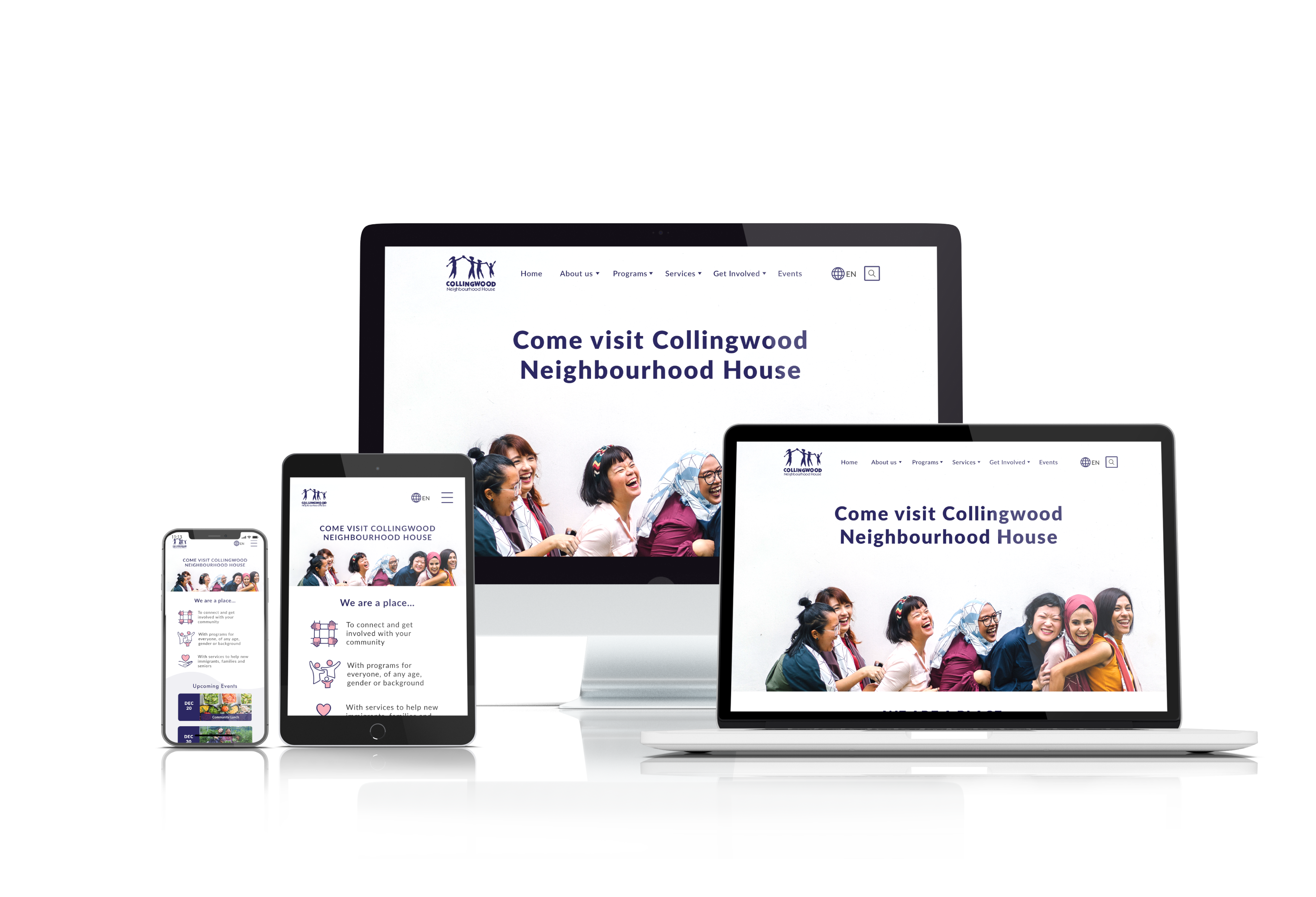
Collingwood Neighbourhood House (CNH) is a place where the community can take part in various programs, receive services, etc. It differs from a community centre in that it’s a private non-profit organization that’s geared more towards low-income individuals. Our UX and UI team worked with CNH to deliver their project goal: a modernized website that feels welcoming and enables users to easily find the information they’re looking for.
Collingwood Neighbourhood House (CNH) is a place where the community can take part in various programs, receive services, etc. It differs from a community centre in that it’s a private non-profit organization that’s geared more towards low-income individuals. Our UX and UI team worked with CNH to deliver their project goal: a modernized website that feels welcoming and enables users to easily find the information they’re looking for.
As one of the UX designers on the team, my role was to conduct research, audit content, conduct a card sort with the client, design some user flows, wireframes, etc. and eventually create mid-fi prototypes for both desktop and mobile formats. After testing with clickable prototypes, the updated mid-fi prototypes were handed over to the UI designers. Testing was conducted with hi-fi prototypes as well before handing the project off to the developers.
As one of the UX designers on the team, my role was to conduct research, audit content, conduct a card sort with the client, design some user flows, wireframes, etc. and eventually create mid-fi prototypes for both desktop and mobile formats. After testing, the clickable prototypes were handed over to the UI designers.
Design Process
Design Process
The project was split into 4 segments:
- Research (week 1)
- Planning (week 2)
- Design (weeks 2–3)
- Testing (weeks 2–3)
Research
Research
Research Goals
Research Goals
After the kick-off meeting with our client, we found that the most basic goal of the project was to modernize and revamp the website, which was designed in the early 2000s. As a non-profit organization, they would like to increase user friendliness so that visitors can find information easily.
Research Methods
Research Methods
We used the following research methods for this project:
- Domain research
- Survey
- Interviews
- Gut test (UI)
These methods helped us gather data for the planning stage.
Domain Research
Domain Research
For domain research, we looked at the following websites:
- Kitsilano Community Centre
- Mount Pleasant Community Centre
- West Point Grey Community Centre
- YMCA
- YWCA
The YMCA and YWCA were not community centres, but they also had a large number of services and programs, much like CNH. Since CNH is a non-profit organization with no direct competitors, we focused on how similar websites were organized.
For domain research, we looked at various websites for community centres as well as YMCA and YWCA, since they had a large number of services and programs. Since CNH is a non-profit organization with no direct competitors, we focused on how similar websites were organized.
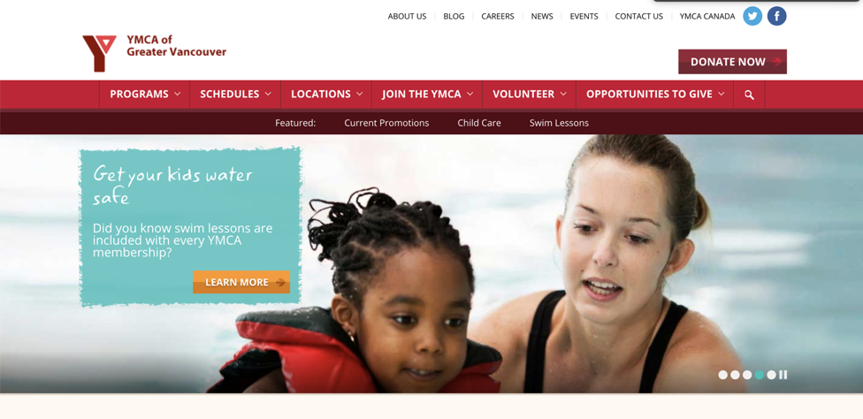
YMCA: a major source of inspiration for our website’s design.
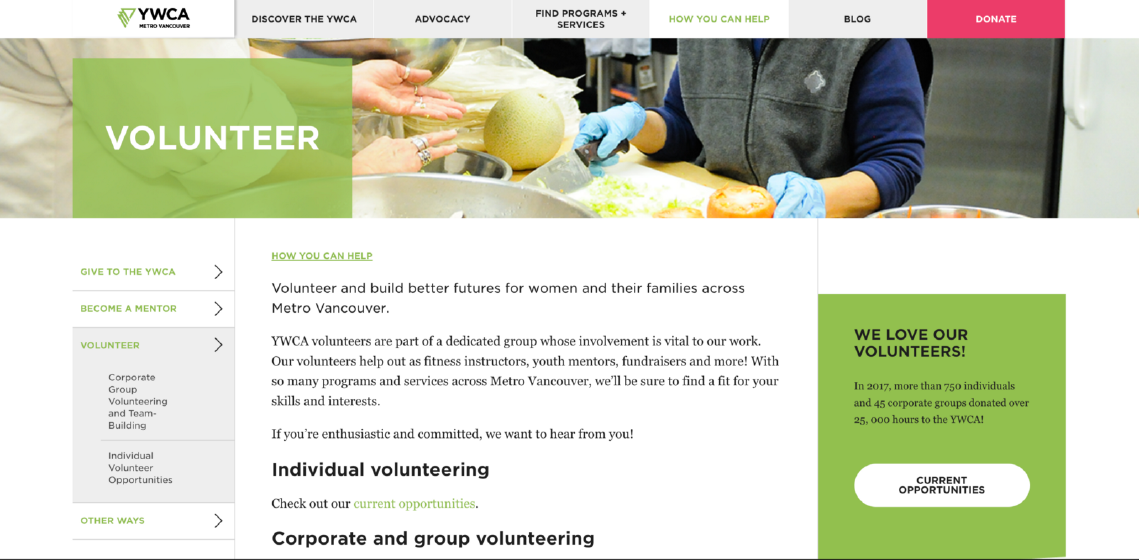
YWCA: a major source of inspiration for how the programs on our website are organized.
The rest of the websites we looked at were not particularly well designed, even though they may be responsive (i.e. layout changes with screen size). Ultimately, most of our inspiration came from YWCA and YMCA, since these were well designed yet content-heavy, which aligns with the goals for our website.
While we did also look at many other websites, ultimately, most of our inspiration came from YWCA and YMCA, since these were well designed yet content-heavy, which aligns with the goals for our website. CNH’s old website was also loaded with content, much of which cannot simply be removed.
Survey
Survey
We surveyed 60 people about neighbourhood houses, why they would want to visit the website, etc. A key finding from the survey was broken down as follows:
We surveyed 60 people about neighbourhood houses, why they would want to visit the website, etc. A key finding from the survey was broken down as follows:
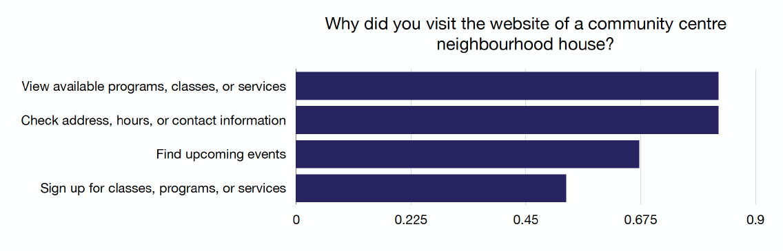
As seen above, the vast majority of users were interested in viewing available programs, classes, or services, and they also wanted to see the address, hours, or contact information. Many users were also interested in finding upcoming events. Since a significant number wanted to sign up online for classes, programs, or services, we recommended that this function should be added down the road.
As seen above, the vast majority of users were interested in viewing available programs, classes, or services, and they also wanted to see the address, hours, or contact information. Many users were also interested in finding upcoming events.
Interviews
Interviews
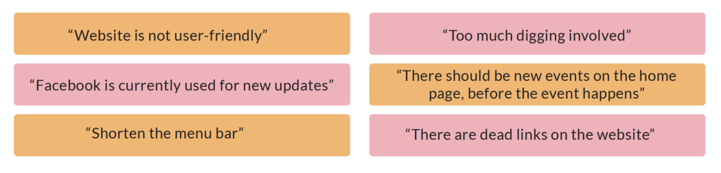
We conducted 12 interviews with people at CNH, including volunteers and staff members. Most agreed that the old website was inadequate and has various problems, such as lack of user-friendliness, dead links, and poor content organization.
Below are some quotes from the interviews:
Affinity Diagram
Affinity Diagram
Using our research findings, we created an affinity diagram, which enables us to take the qualitative answers from surveys and interviews and use them to draw insights.
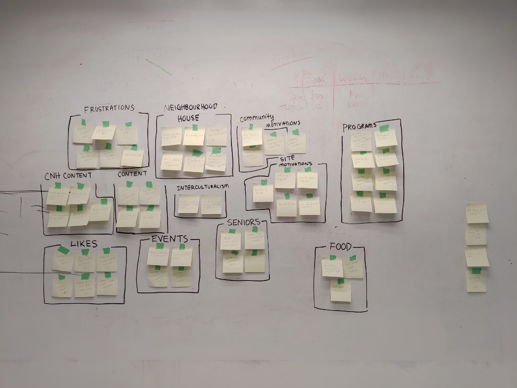
We then put more detailed labels on each category to help us decide what do do with our design:
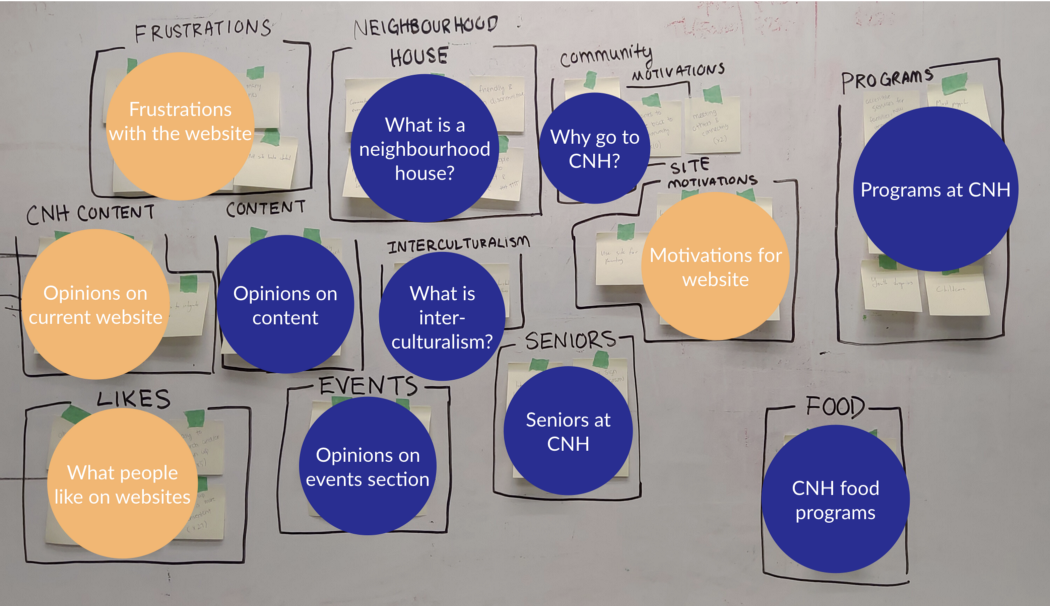
Frustrations with the CNH website mostly focused on the fact that it was hard to navigate. Many also thought that the website wasn’t updated frequently enough. Most people liked it when they could find information on a website easily, and since most people visited the CNH website to find information about programs and services, it was crucial that we focused our efforts on solving these problems. The sections of the affinity diagram that influenced our design the most have been marked in orange.
Planning
Planning
Using the data we gathered, we put together the following:
- User persona
- Storyboard
- Customer journey map
- Content audit/organization
- Card sort
- Sitemap
- User flows
User Persona
User Persona
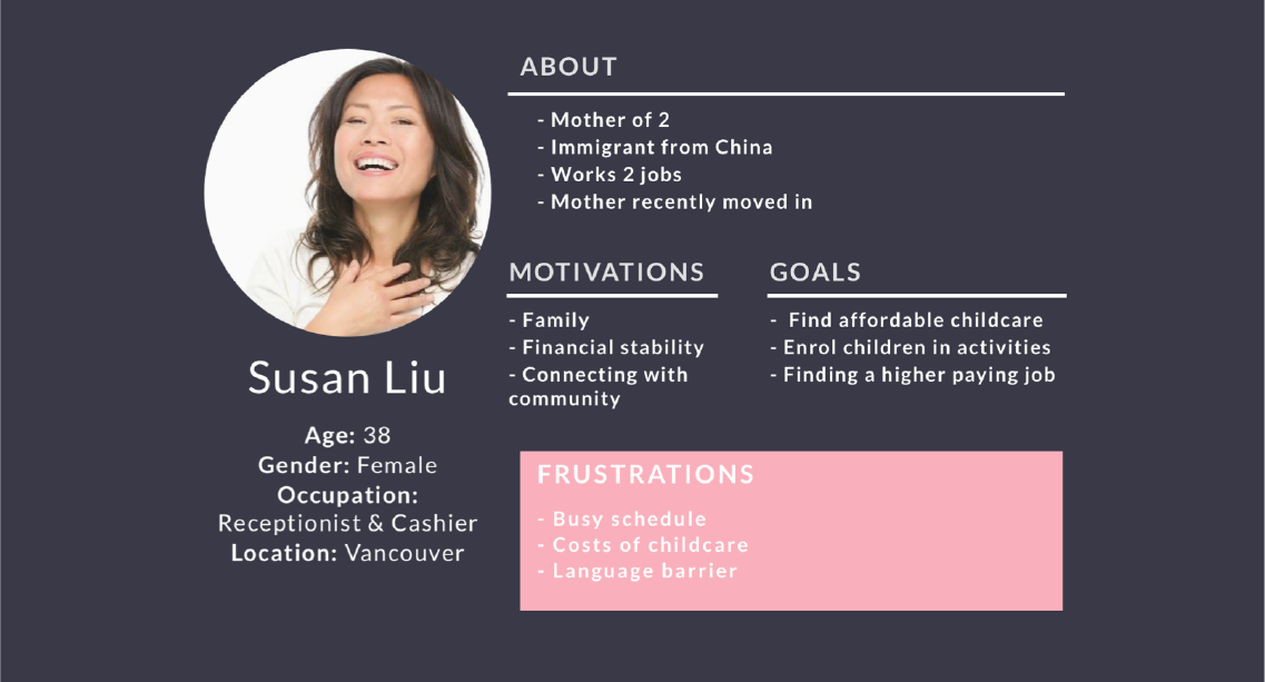
Since the website is meant for the whole community, our user persona needed to feature an individual who would use a number of different sections on the website. Since CNH has childcare services, immigrant services, and a multitude of programs for children at low prices, we put together a user persona who would be able to take advantage of all of these:
Since the website is meant for the whole community, our user persona needed to feature an individual who would use a number of different sections on the website. Since CNH has childcare services, immigrant services, and a multitude of programs for children at low prices, we put together a user persona who would be able to take advantage of all of these:
Storyboard
Storyboard
Using the user persona, we created a storyboard to show how Susan Liu got to the CNH website (and in a position where she would benefit from a modern, well-designed website).
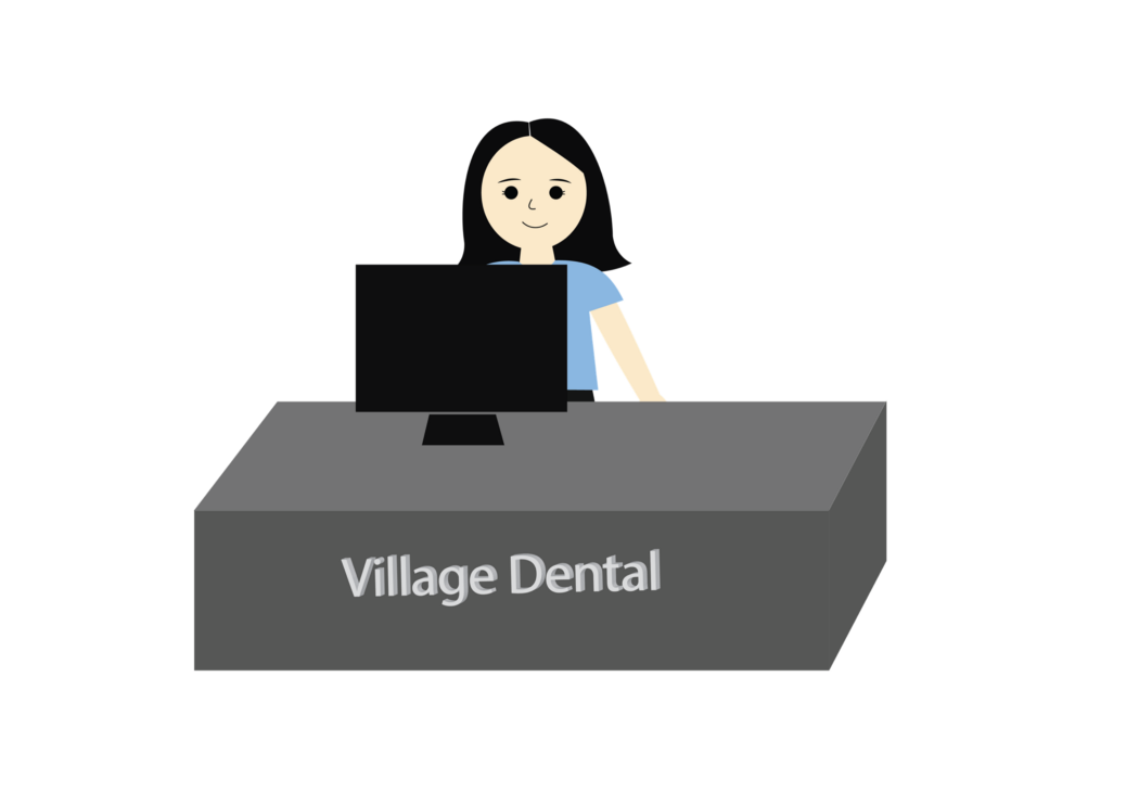
Susan works as a receptionist for a dental clinic during the day.
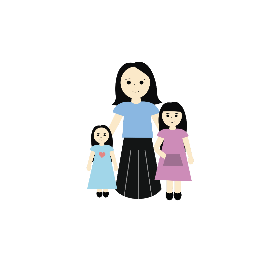
Susan has 2 children, ages 2 and 10.
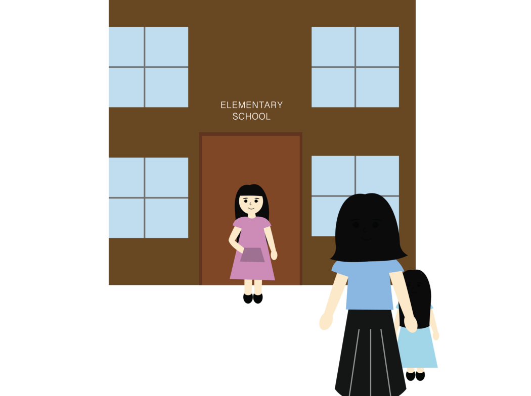
She has to pick up her daughter from school every day.
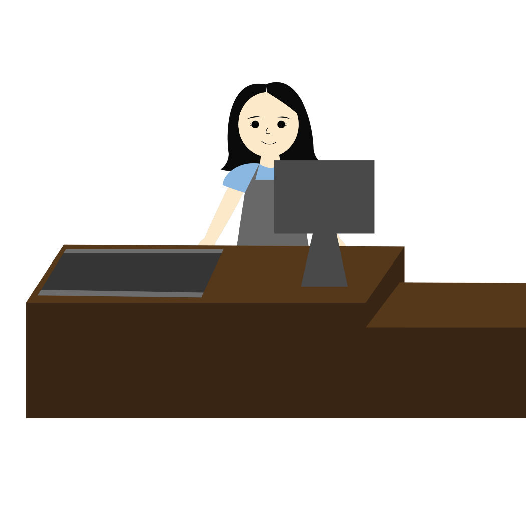
At night, she works as a cashier at the local supermarket.
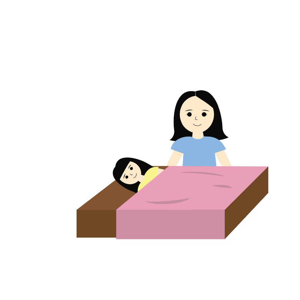
By the time she gets home, it’s time for her kids to go to bed.
After tucking her kids into bed, she is able to look for programs and services on the CNH website, which is quite frustrating to use.
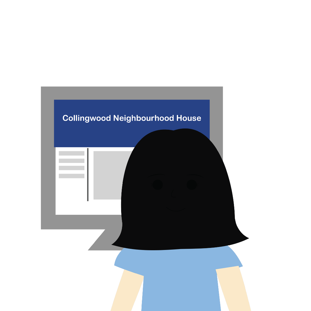
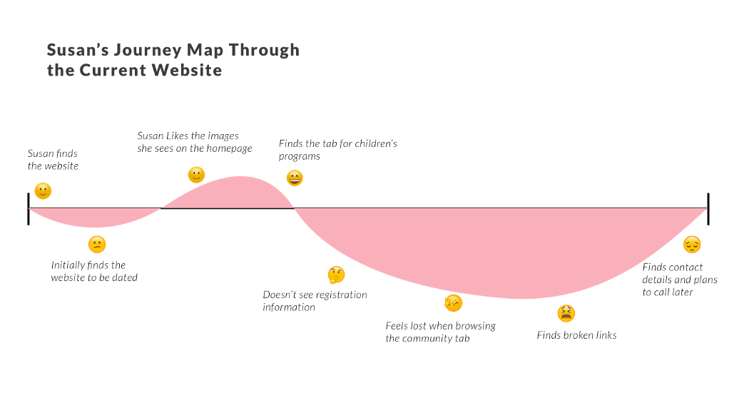
Customer Journey Map
Customer Journey Map
We created a customer journey map for Susan to further illustrate the difficulties she encountered on the Collingwood Neighbourhood House website:
Content Audit/Organization
Content Audit/Organization
Since the original website was poorly organized and had repetitive content, dead links, etc. we had to do a content audit. This helped us see how the old website was organized and where the problems were.
Since the original website was poorly organized and had repetitive content, dead links, etc. we had to do a content audit. This helped us see how the old website was organized and where the problems were.
After auditing, we attempted to reorganize the whole website. Some parts of the website were outdated, so we incorporated information from the latest version of their brochure.
A small portion of our content audit. Every page on the website was put into a spreadsheet so that we could reorganize everything and cut content where necessary.
After auditing, we attempted to reorganize the whole website. Some parts of the website were outdated, so we incorporated information from the latest version of their brochure.
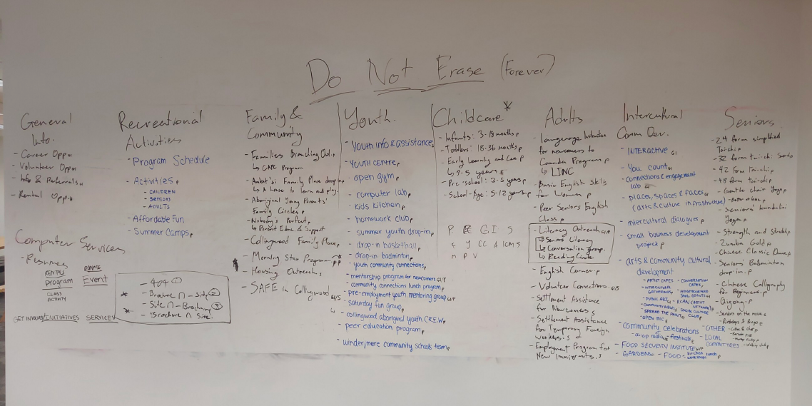
The beginning of our attempt to reorganize the website. The categories at the top were taken from the brochure.
We then attempted to sort them into broad categories, which would help us declutter the top nav bar.
We then attempted to sort them into broad categories, which would help us declutter the top nav bar.
We sorted items into categories, which formed the basis of how the new website was to be organized.
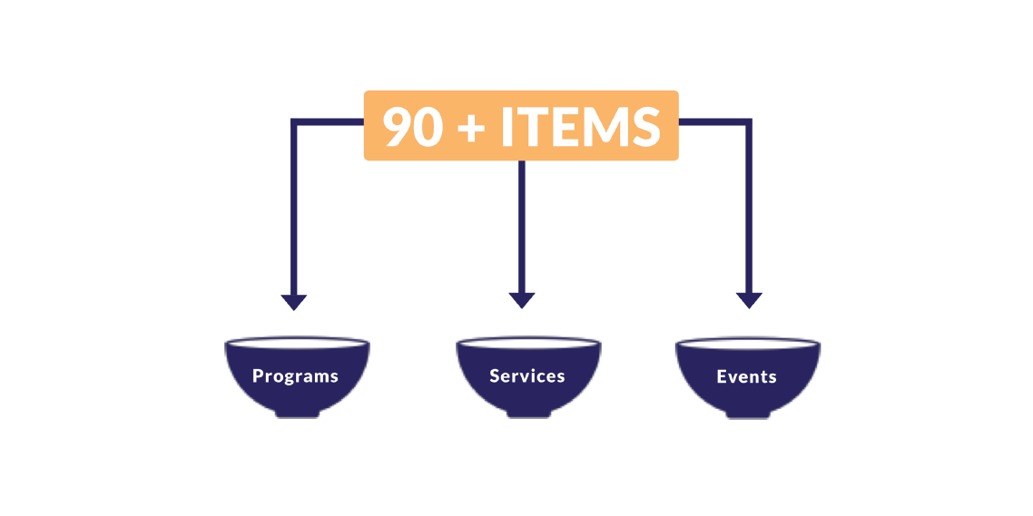
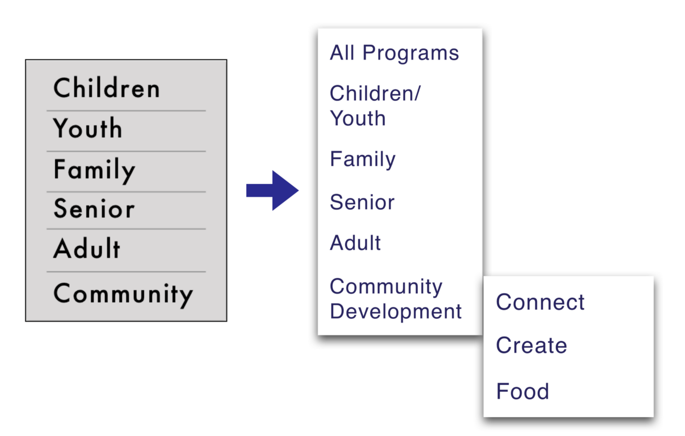
After we sorted the items into broad categories, we created sub-categories to organize things further. This was absolutely necessary because certain categories (e.g. programs) had a large number of items. It would be very tedious to sift through them without further categorization, which was also one of the problems that the original website had.
After we sorted the items into broad categories, we created sub-categories to organize things further. This was absolutely necessary because certain categories (e.g. programs) had a large number of items. It would be very tedious to sift through them without further categorization, which was also one of the problems that the original website had. Unfortunately, we had difficulty sorting some of them further into sub-categories, yet we knew we had to, because many categories still had a lot of items.
An early attempt at reorganizing the programs section.
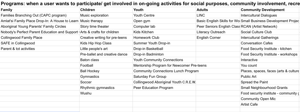
The items were sorted further into sub-categories based on the audience, type of content, etc. For example, a music class for children would fall under Programs → Children/Youth → Art, Music & Dance. At this point, however, we had difficulty sorting some of them further into sub-categories, yet we knew we had to, because many categories still had a lot of items. Community development programs, for example, were especially hard to sort. And so we conducted a card sort with the CNH staff.
Card Sort
Card Sort
We conducted a card sort with the CNH staff for items that we had trouble sorting ourselves. This helped us establish further sub-categories.
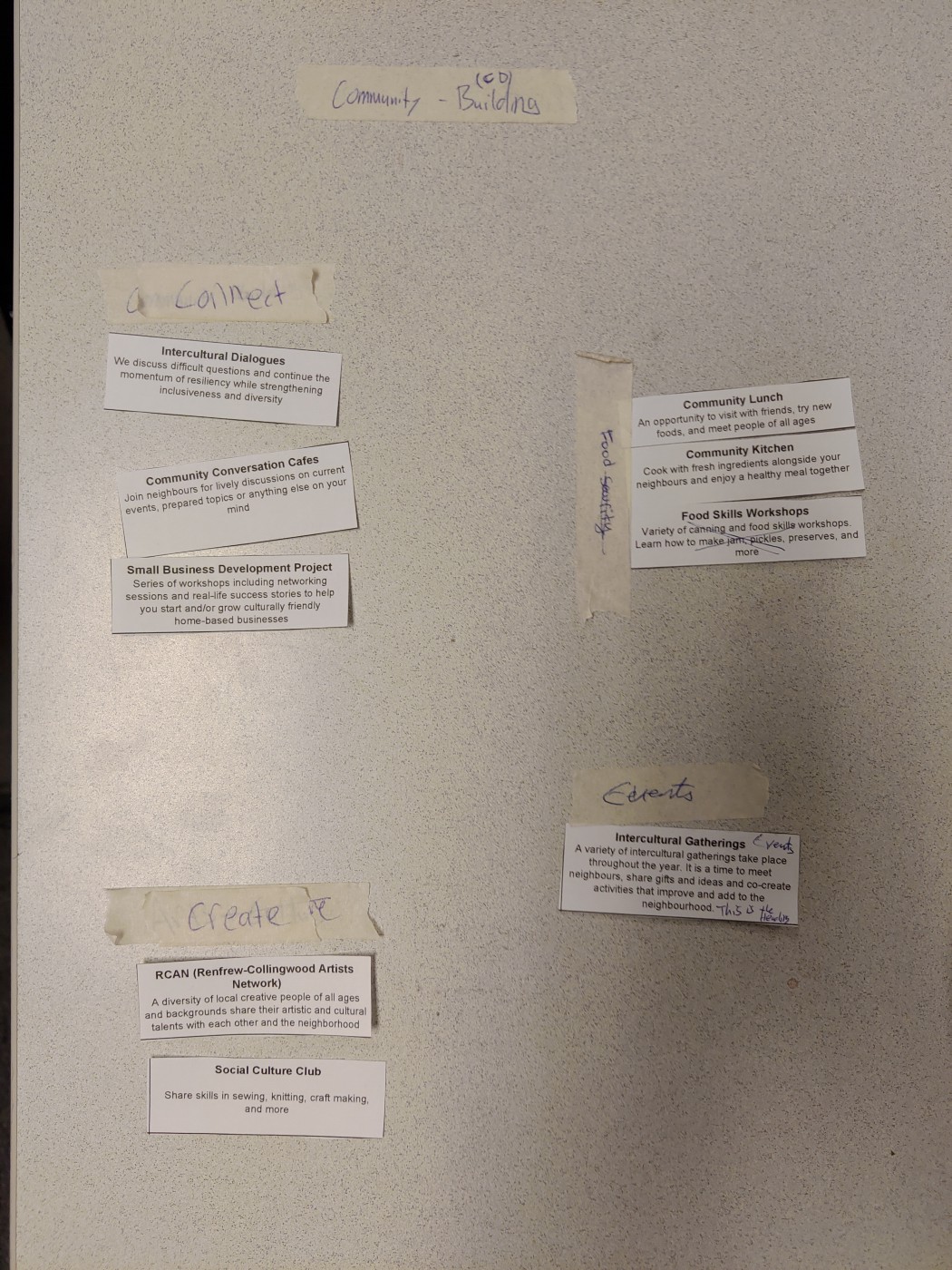
A card sort was conducted for items that were ambiguous or could plausibly fit into multiple categories. This particular one was done with the department that focused on building community.
With the sub-categories sorted out, we were able to proceed to creating the sitemap.
Sitemap
Sitemap
We created a sitemap based on the categories and sub-categories we came up with. This gave us a much clearer view of how the website will be organized.
After we conducted the card sort, we created a sitemap based on the categories and sub-categories we came up with. This gave us a much clearer view of how the website will be organized.
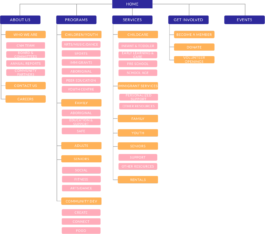
Sitemap for the whole website
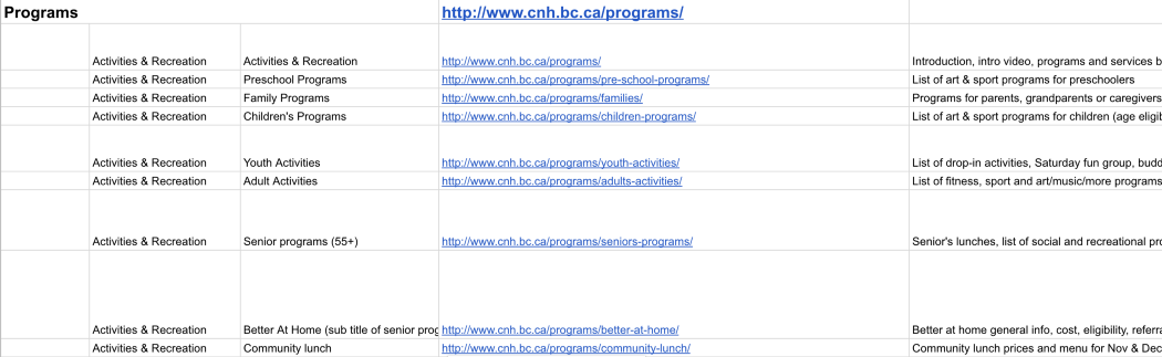
In particular, the programs section was organized in a way that differed significantly from how CNH originally organized their website:
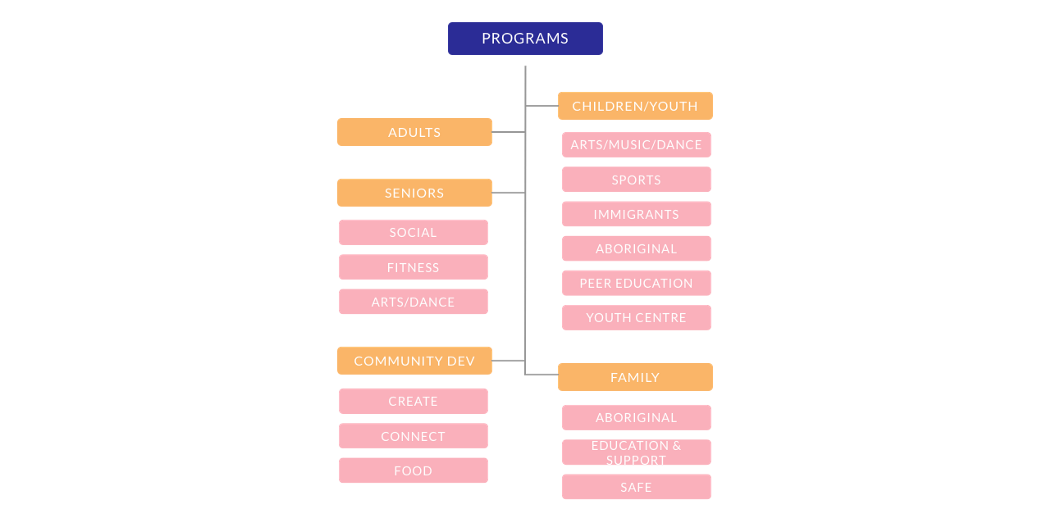
The programs section
With the sitemap finished, we went on to create some user flows.
User Flows
User Flows
Since the CNH website has lots of different sections, we created multiple user flows that correspond with different parts of the website.
Since the CNH website has lots of different sections, we created multiple user flows that correspond with different parts of the website.
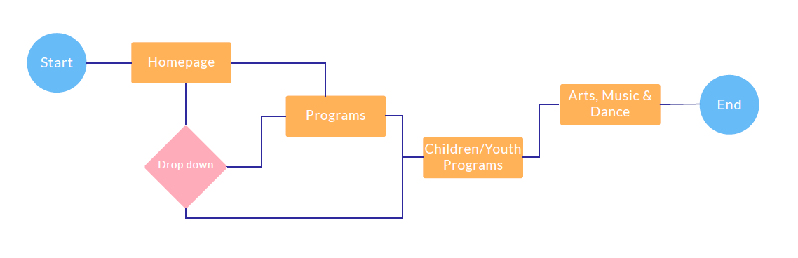
This is for a user who wants to find music lessons for their child
This is for a user who wants to find music lessons for their child
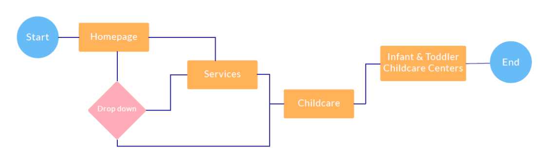
This is for a user who is looking for childcare options
This is for a user who is looking for childcare options
From the user flow diagrams, we were able to create some paper prototypes.
Design
Design
Paper Prototypes (Desktop)
From Paper to Mid-Fi
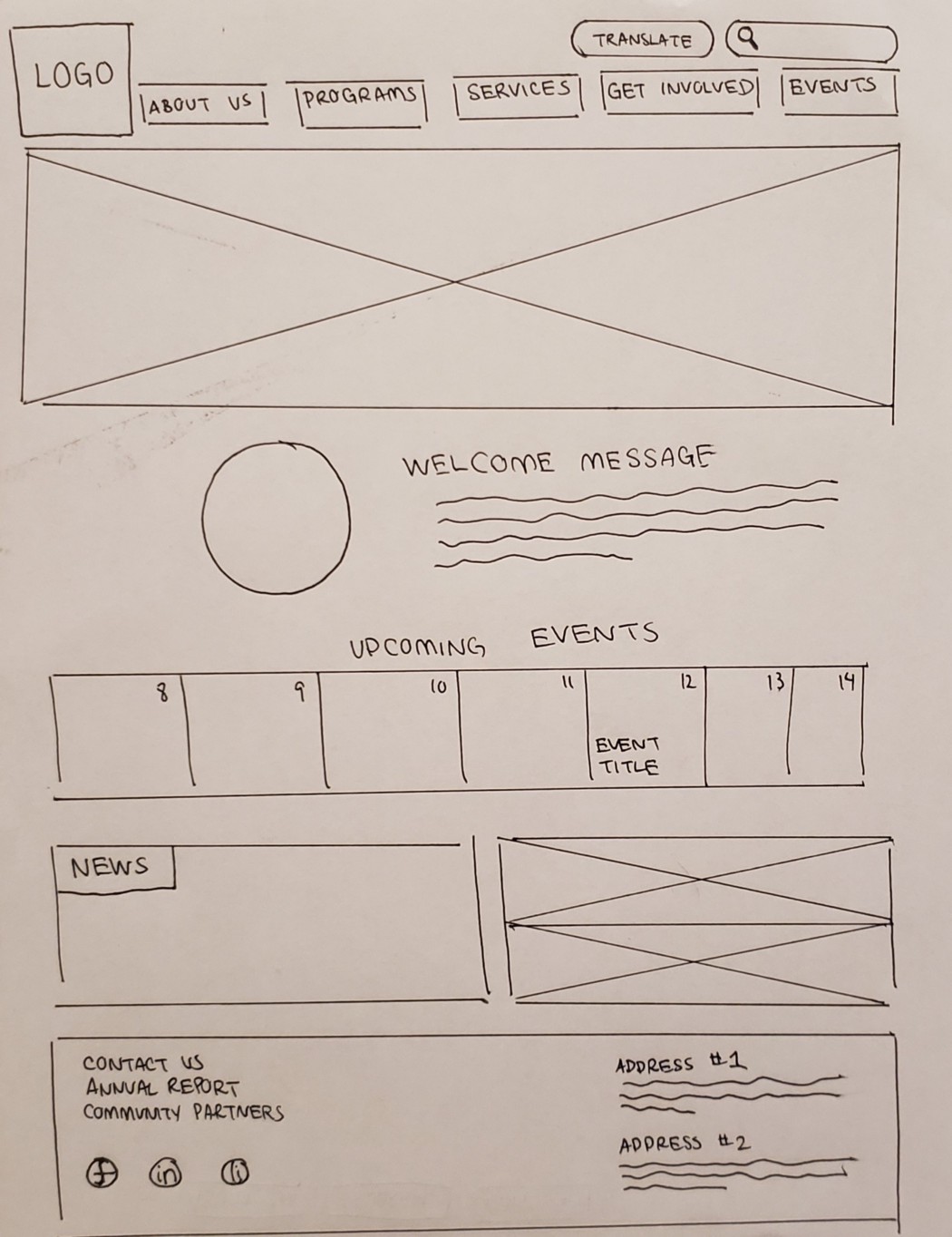
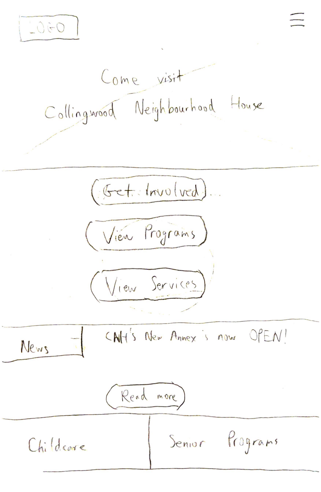
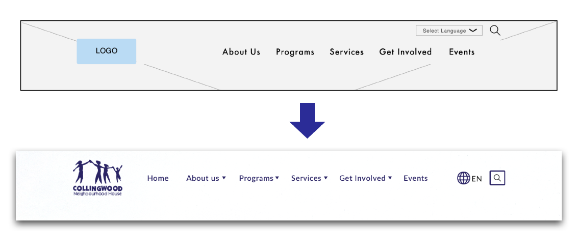
We started off by drawing some paper prototypes of how we thought the website should look. Here’s my design of the header and footer:
We started off by drawing some paper prototypes of how we thought the website should look on desktop. Eventually, after a number of design studio sessions, we finalized the paper prototypes. After extensive testing, we finished the mid-fi prototypes, sent them off to our UI designers, and started the screens to mobile.
Since responsive websites do not have separate desktop and mobile sites (the layout simply changes based on screen size), it was important that we try to keep most (if not all) of the functions found on the desktop site. Our goal for this part of the project was to design mobile pages that were just as functional as the desktop ones. However, we ran into some difficulties—the desktop version had a side nav, which had to be repositioned or removed altogether. We did a design studio session to figure out how it would work.
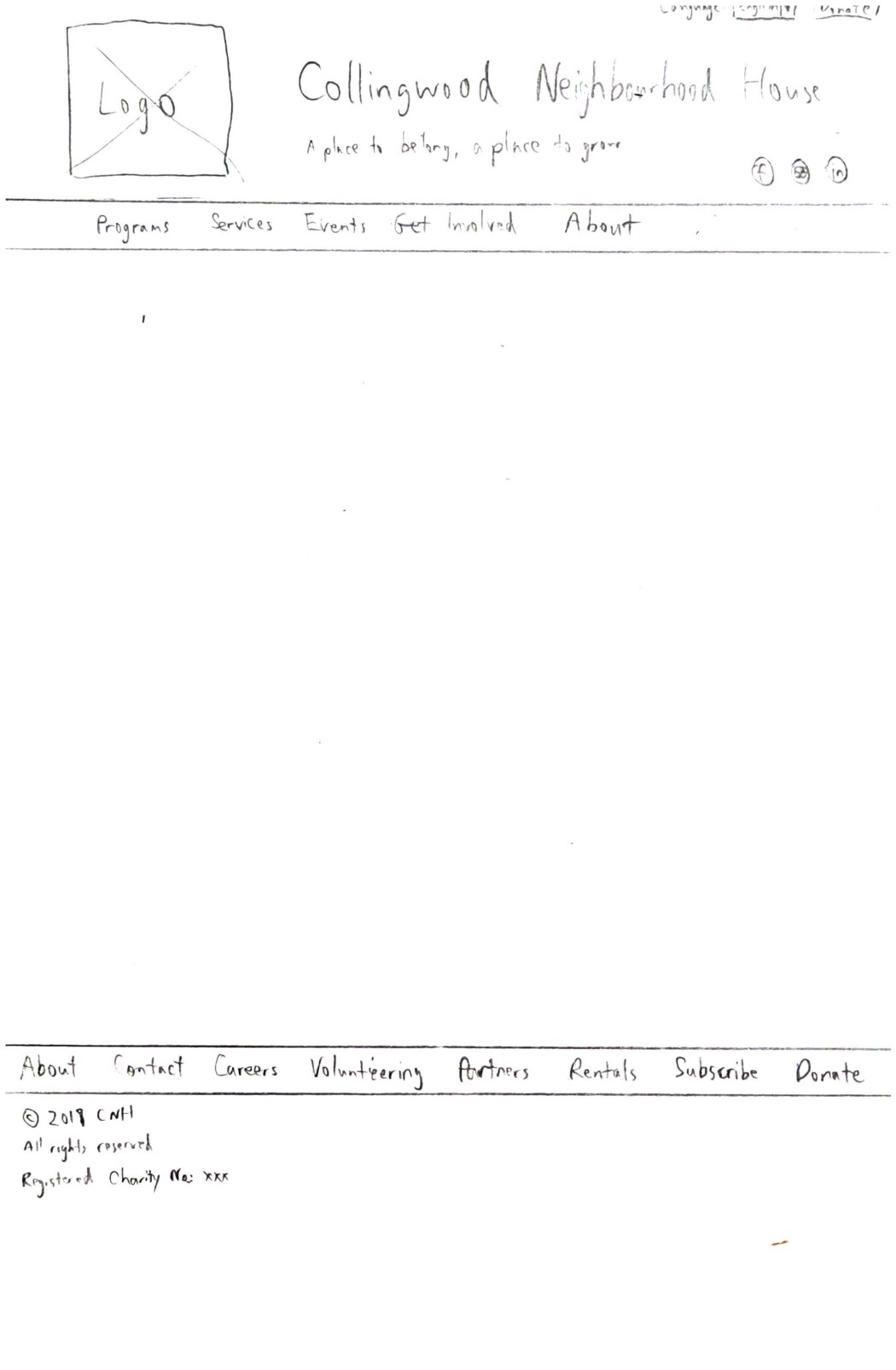
This design was eventually superseded, since the footer in this design was mostly just a cleaner version of the old design. Many of the links in the footer could be collapsed into the top nav bar instead.
This design was what we had for the home page before we moved on to mid-fi screens in Sketch. Testing yielded promising results, as people were able to navigate through this quite easily.
Mid-Fi Prototypes (Desktop)
Mid-Fi Prototypes (Desktop)
Creating the mid-fi prototypes was fairly straightforward, since we had paper prototypes drawn out already. Further testing led us to change a few things, such as how the home page looked.
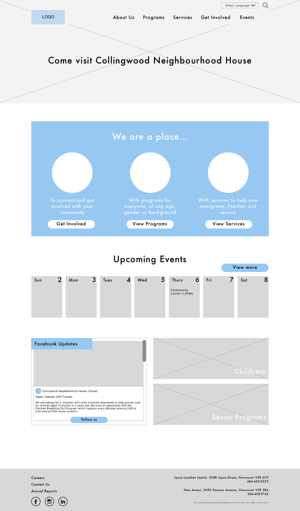
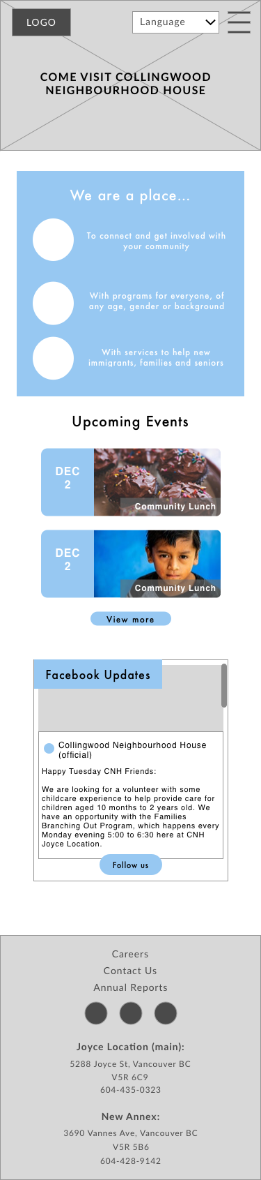
Mid-fi home page, version 1
We changed the introduction to include more pictures and to introduce various features on the website. The news section was also changed to an embedded Facebook post, since testing with the CNH staff revealed that they did not want to maintain a separate news section. They did post updates on Facebook fairly regularly, so we decided to take advantage of that in our design.
We also made a variety of pages that showcased the new design. Of special note is the events calendar, which CNH did not previously have.
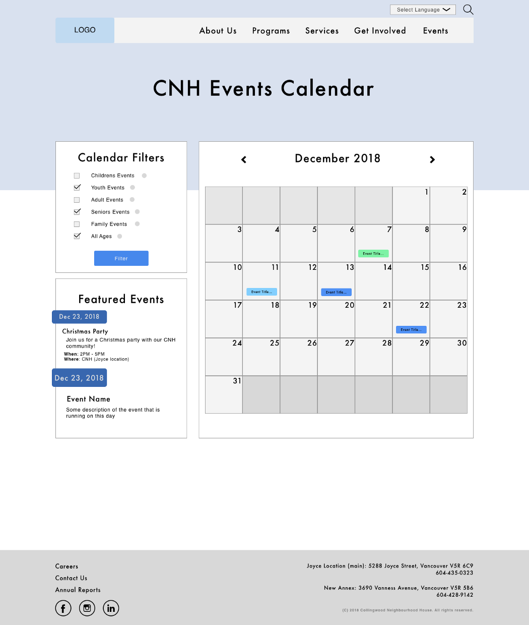
Events calendar
Due to the number of menu levels, it was necessary to have a side navigation bar to ensure that the user knows where they are at all times. Digging through the top nav every time was not an option.
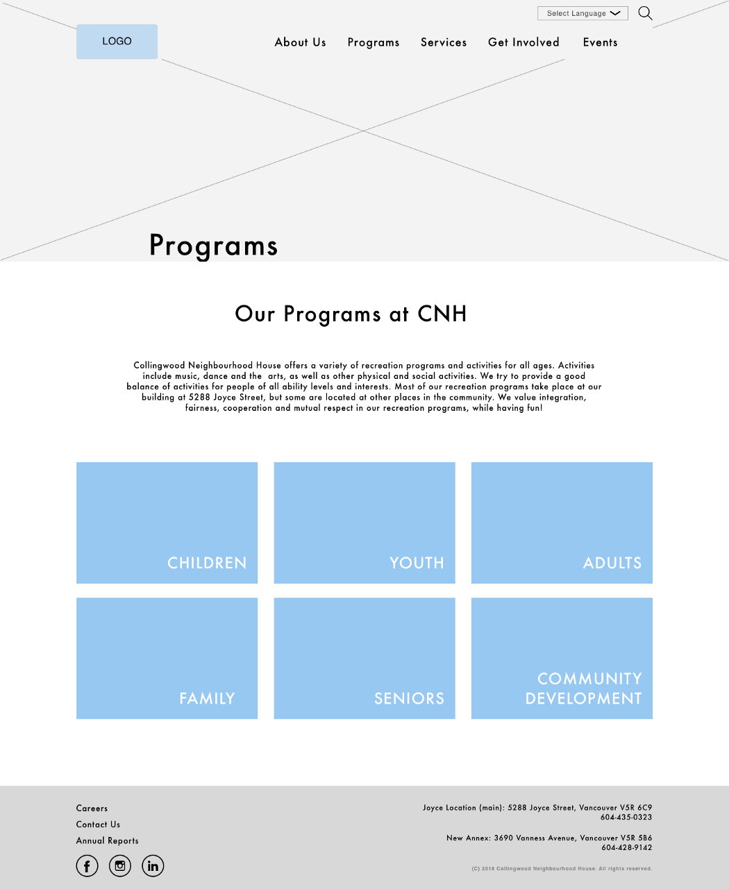
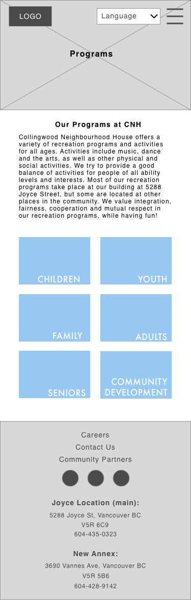
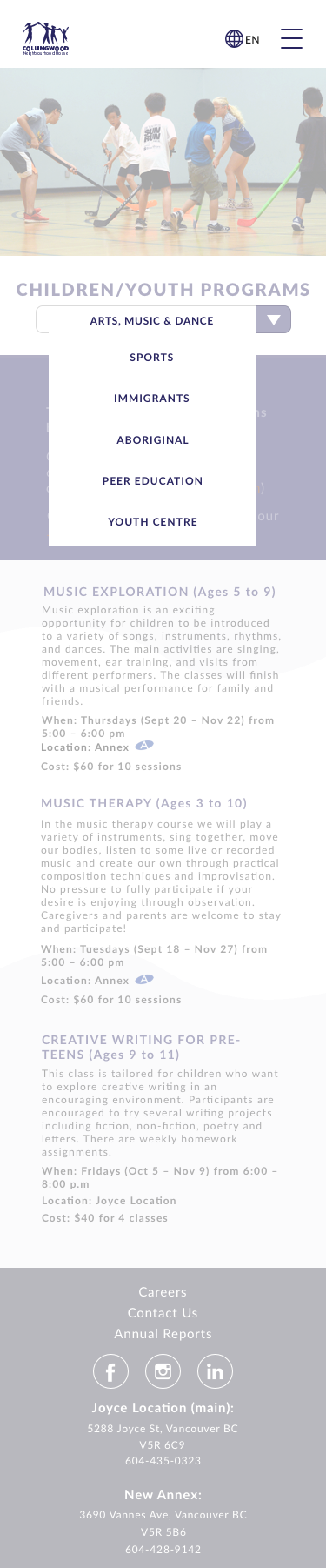
Programs at CNH
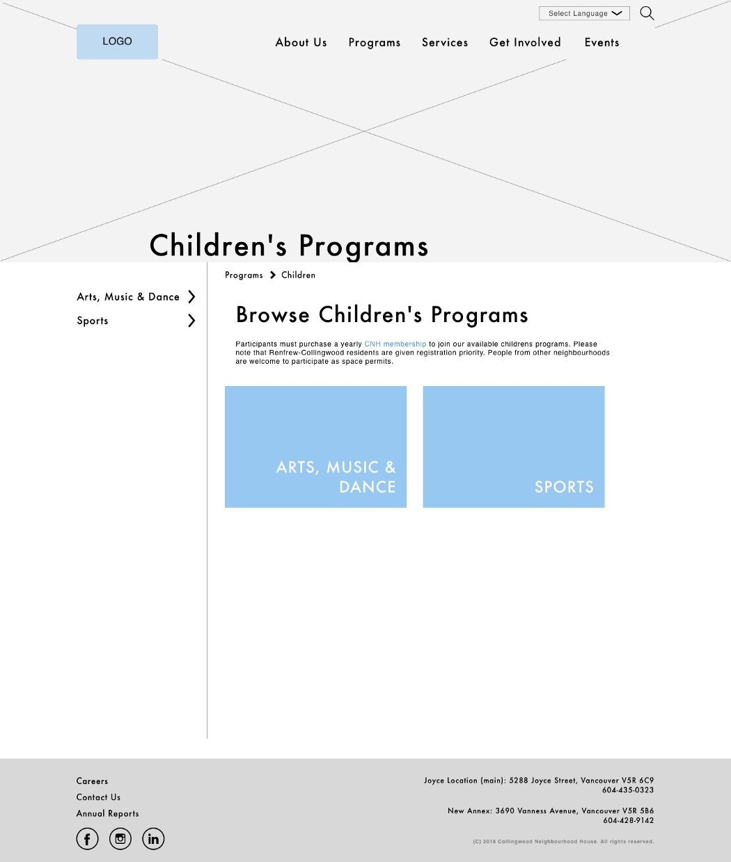
Programs → Children
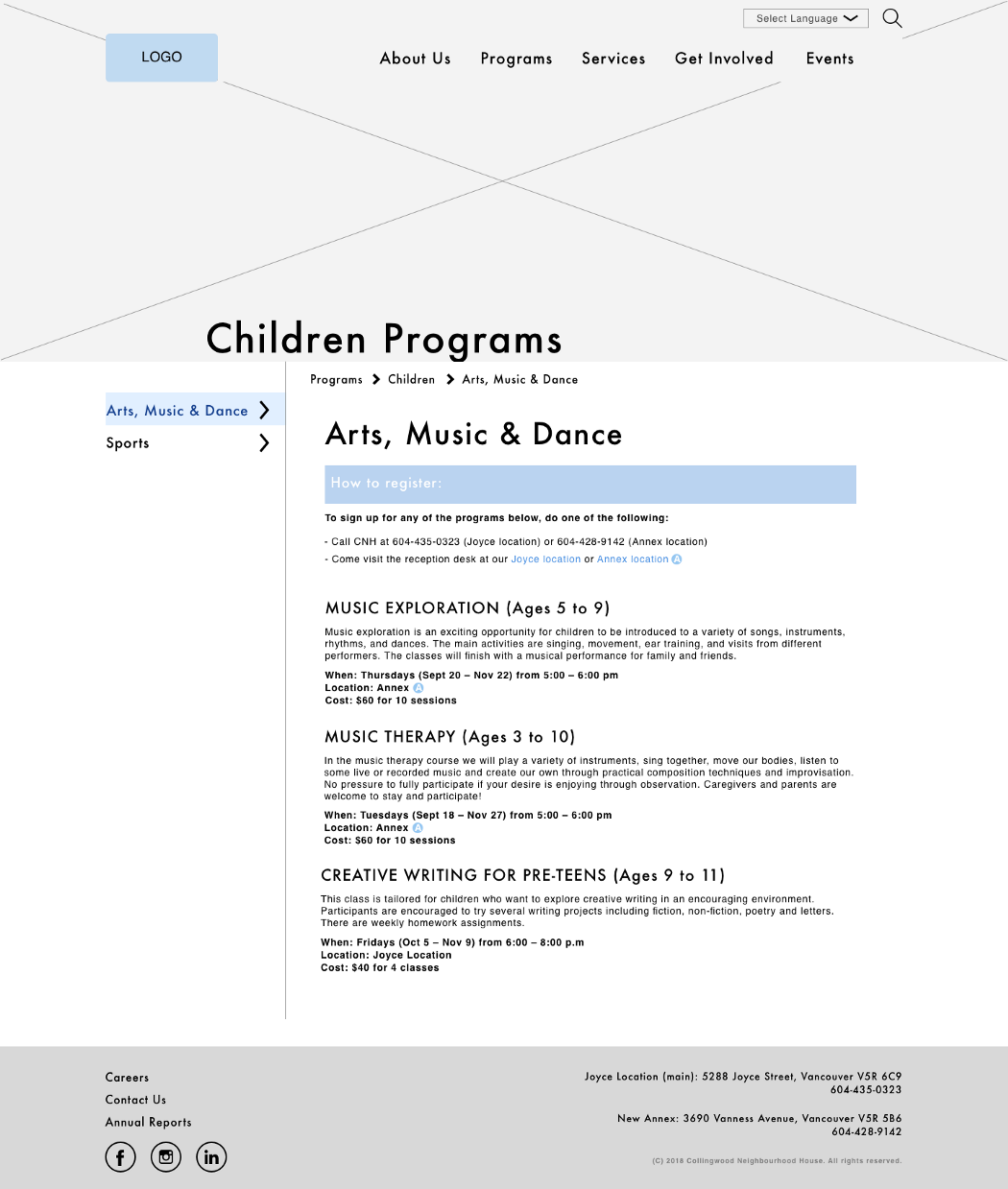
Programs → Children → Arts, Music & Dance
We incorporated dropdown menus into our top nav bar to assist with navigation. In the final product, the dropdown menu would pop up when the mouse hovers over it.
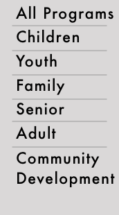
Dropdown menu for programs
Dropdown menu for programs
Testing also showed that there was little point in having a week’s worth of events on the home page, since there could potentially be weeks where all the boxes would be empty. Some event titles might also be hard to read. As such, we decided to remove the events bar and replace it with a preview of upcoming events, whenever they may be. This ensures that the events preview section on the home page would always be populated, as there will always be another event coming up eventually.
Hover over the event image for a quick preview.
At this point, we handed the designs in Sketch to the UI members of the team.
Paper Prototypes (Mobile)
Paper Prototypes (Mobile)
Since responsive websites do not have separate desktop and mobile sites (the layout simply changes based on screen size), it was important that we try to keep most (if not all) of the functions found on the desktop site. Our goal for this part of the project was to design mobile pages that were just as functional as the desktop ones.
An early version of the mobile home page. Note the hamburger menu icon in the top right corner.
The menu that pops up after you click the hamburger icon. This replaces the top nav bar in the desktop version.
Since there was a side nav bar in the desktop version, I thought we needed to include that functionality in the mobile version as well. However, we had a bit of trouble deciding where to put it.
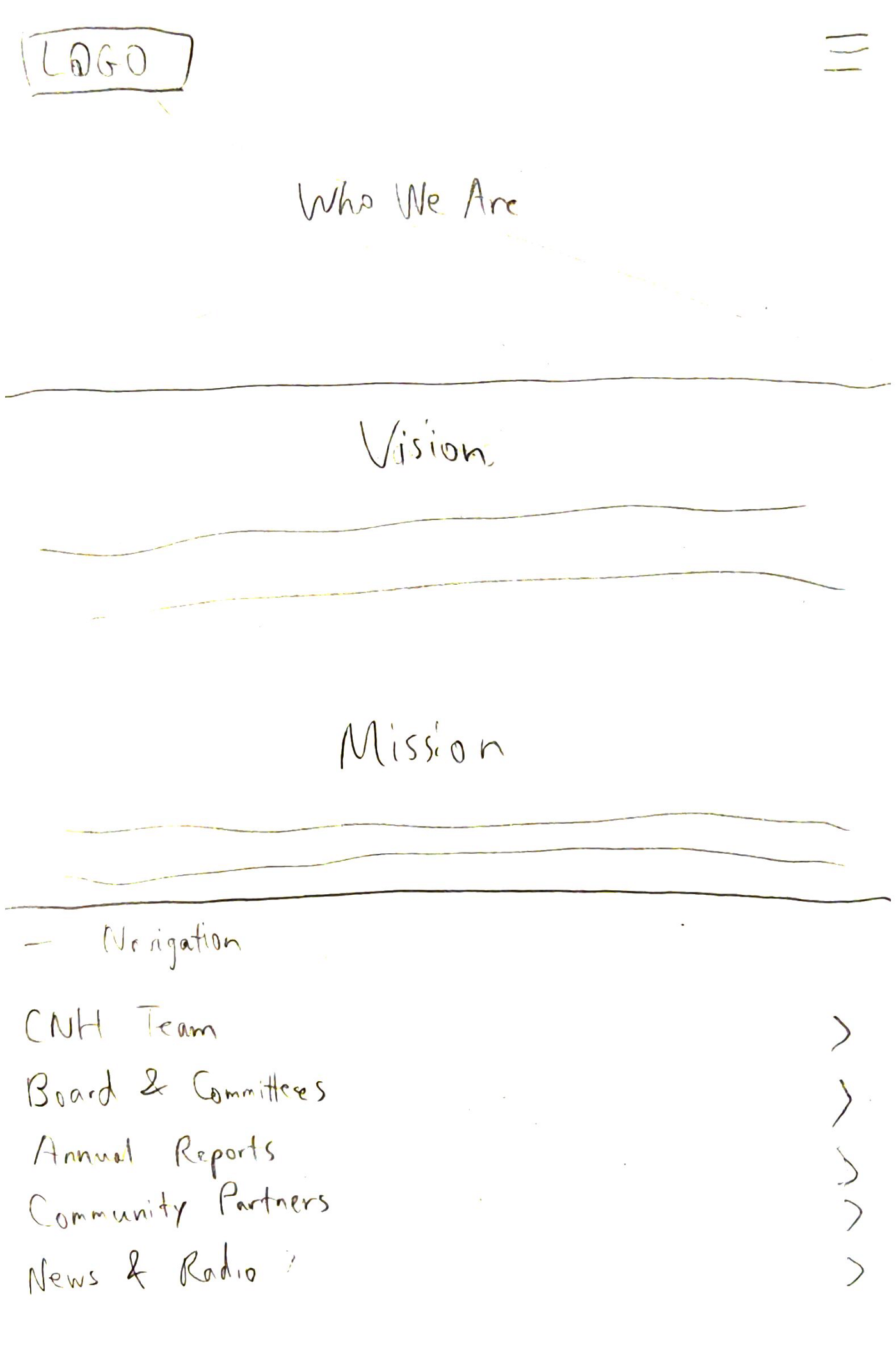
A version with the side nav bar floating on the bottom of the page. It’s meant to be both collapsible and always visible in the same place no matter how far you scroll.
Testing showed that few people used the collapsible nav bar at the bottom to navigate to other parts of the website. Most people looked for something at the top of the page, and upon finding nothing, they simply went through the hamburger menu instead.
Design Studio
Design Studio
Since we had trouble deciding which design to use for the mobile equivalent of the side nav, we did a design studio session. This was a quick 90-second session in which we all came up with ideas on how it should look.
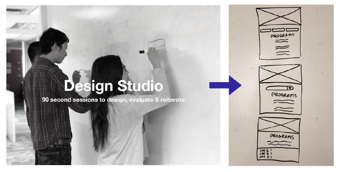
We settled on the design in the middle, since it was both easy to find and practical. The top one featured a row of buttons, which would be problematic given the fact that some of the labels in the side nav can be quite long. This problem would be compounded in cases where the side nav also had a lot of items.
Mid-Fi Prototypes (Mobile)
Mid-Fi Prototypes (Mobile)
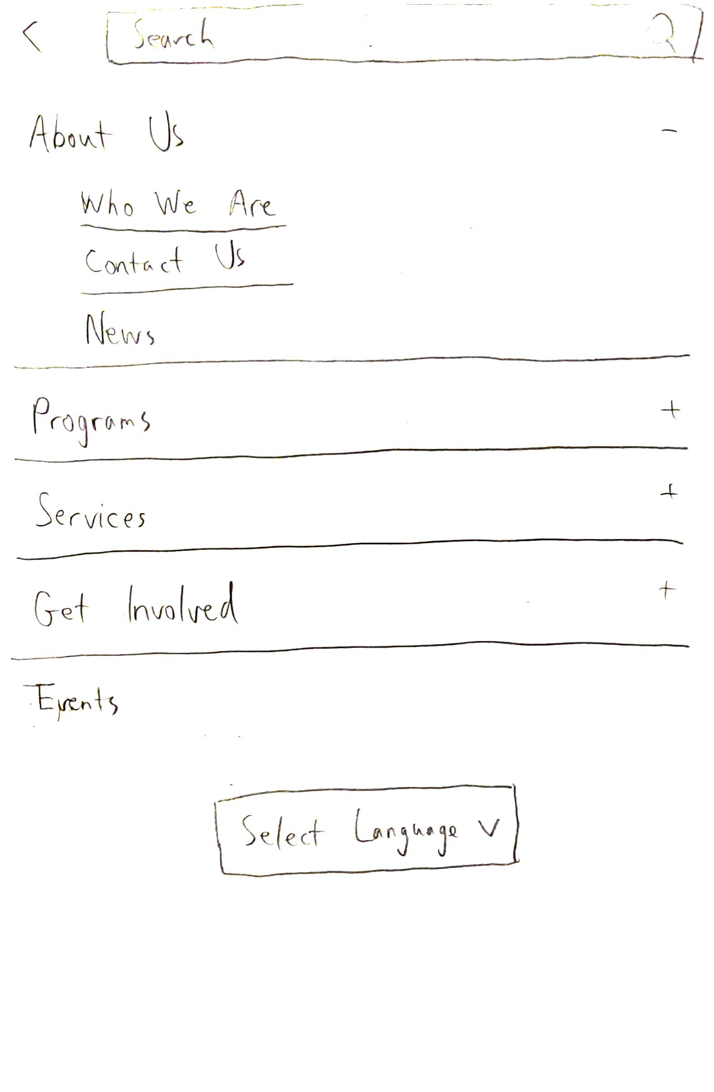
After finalizing our mobile paper prototypes, we created screens on Sketch for every screen that we had in the mid-fi desktop prototypes. The process was very similar to the one we used for desktop. Through testing, we found that users did not want to dig through the hamburger menu to find the language selection box.
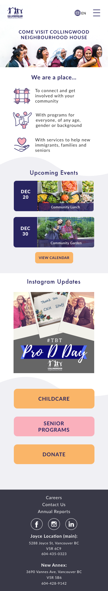
Mobile home page
An early design for the programs page on mobile devices
Testing showed that simply rearranging the same tiles did not make things particularly convenient for mobile users. As such, we decided to change the tiles into horizontal buttons:
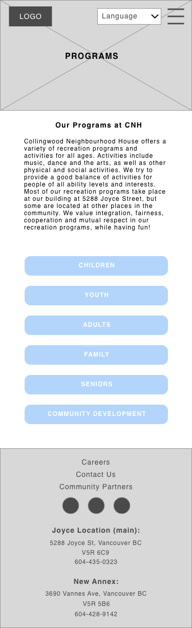
Our final mid-fi design for the programs page
At this point, we sent the prototypes to our UI team members.
Hi-Fi Prototypes (Desktop)
Hi-Fi Prototypes (Desktop)
Here are some screens from the final prototype for the desktop version of the site. Note that our UI designers made a few changes after further testing and checking with the developers.
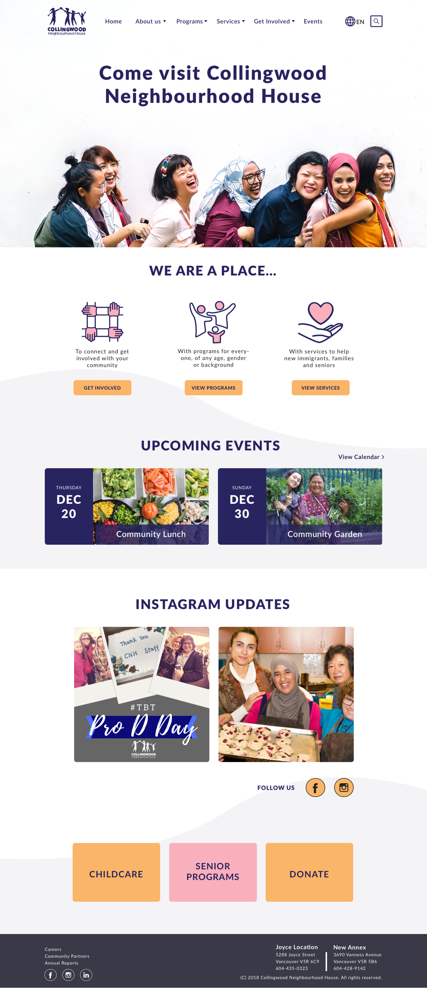
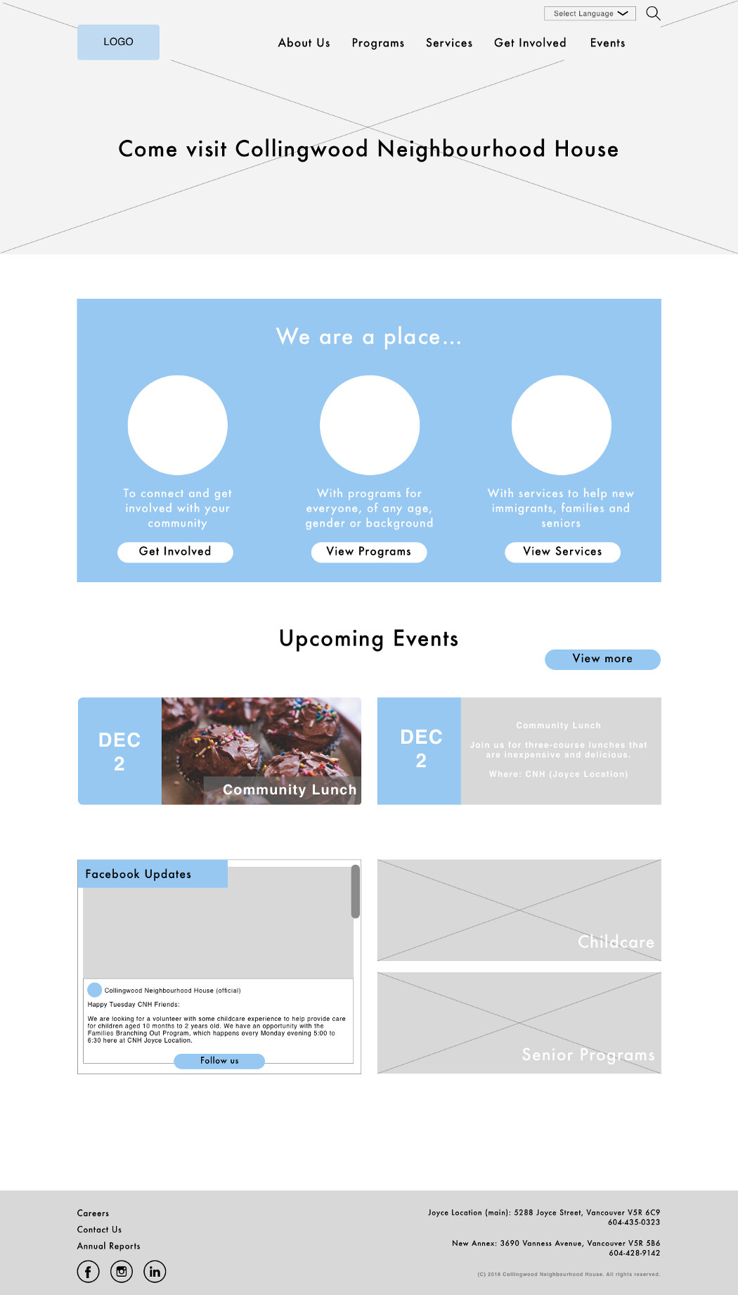
Final home page for desktop
Certain dropdown menus were found to be insufficient through testing, so we added another layer:
Through testing, we also found that the language selection needed to reflect the language that is currently being displayed on the page:
After the screens were converted to hi-fi, and after further testing, some screens had to be changed. For example, the top nav should show the language that’s currently being displayed:
Hi-Fi Prototypes (Mobile)
Hi-Fi Prototypes (Mobile)
As with the desktop version, our UI designers made a few changes after further testing and checking with the developers.
Finalized home page for mobile
Final side nav menu for mobile
Testing
Testing
We tested throughout the design process, and this led us to make numerous changes along the way. Here are the findings that led us to make changes to our design:
Paper Prototypes (Desktop)
Paper Prototypes (Desktop)
- The footer should differ significantly from how the old CNH website is set up, since it was quite cluttered and much of the information in there could be found elsewhere.
Mid-Fi Prototypes (Desktop)
Mid-Fi Prototypes (Desktop)
- We did not need a preview of the week’s events on the home page. Instead, it was better for us to have a preview of the next 2 events, whenever they may be.
- We needed to showcase services and programs on the home page. It was not as useful to simply introduce CNH in words.
Paper Prototypes (Mobile)
Paper Prototypes (Mobile)
- The side nav from the desktop site should not be turned into a collapsible fixed footer at the bottom of the screen.
Mid-Fi Prototypes (Mobile)
Mid-Fi Prototypes (Mobile)
- For pages that required a side nav in the desktop version, users were receptive to having the side nav menu near the top of the screen.
- The language selection box should be immediately visible and not stuck inside the hamburger menu.
- Instead of rearranging tiles to fit the screen, it was better to have the different selections as horizontal buttons instead.
Hi-Fi Prototypes (Desktop)
Hi-Fi Prototypes (Desktop)
- Children and youth should be combined, since it was hard to draw the line between them. Many programs could plausibly be sorted into either category.
- For the top nav bar, an extra layer of dropdown menus had to be added.
- The current language should be visible.
- The rentals page was too cluttered.
Summary
Summary
We understood that the goal of the project was to create a modernized, welcoming, and user-friendly website for Collingwood Neighbourhood House. The old website had numerous problems, including poor organization, dead links, etc.
Following RED Academy’s design process, we believe that we were able to design a responsive website that solves the problem and meets CNH’s goals.
We understood that the goal of the project was to create a modernized, welcoming, and user-friendly website for Collingwood Neighbourhood House. The old website had numerous problems, including poor organization, dead links, etc. which we resolved through designing a responsive website.
Due to time constraints, we were not able to implement features such as online registration, waitlist status information, etc. even though testing with users revealed quite a bit of demand for them. However, they do represent useful functions and will probably be added at a later date.
Future Considerations
Future Considerations
Since testing with users revealed quite a bit of demand for the following features, we recommended that they be added at a later date.
Online registration for programs and membership
Online registration for programs and membership
Currently, there is no online registration function. If a user wants to register for programs or membership, they would need to call CNH and possibly go there in person. An online registration system would make this significantly more convenient.
Better integration for other committee websites
Better integration for other committee websites
There are currently certain committees (e.g. the Food Security Institute) with websites that are hosted externally. If possible, integrating them into the CNH website would make things easier for users.
Waitlist status information for childcare
Waitlist status information for childcare
If a user wants to use CNH’s childcare services, they would be put on a waitlist. It would be useful for them to be able to check how many people are ahead of them in order to help them gauge the amount of time they have to wait.
Engage user legibility by adding more icons
Engage user legibility by adding more icons
More icons are always nice, and would improve the website’s overall legibility. Simply removing text is not an option since most of the information is actually useful.
With these features added, we believe that the CNH website will become even more usable and welcoming.
Further Info
Further Info
Case Study
Final Website
Other Works

Super Smash Bros. UltimateGame UX Design
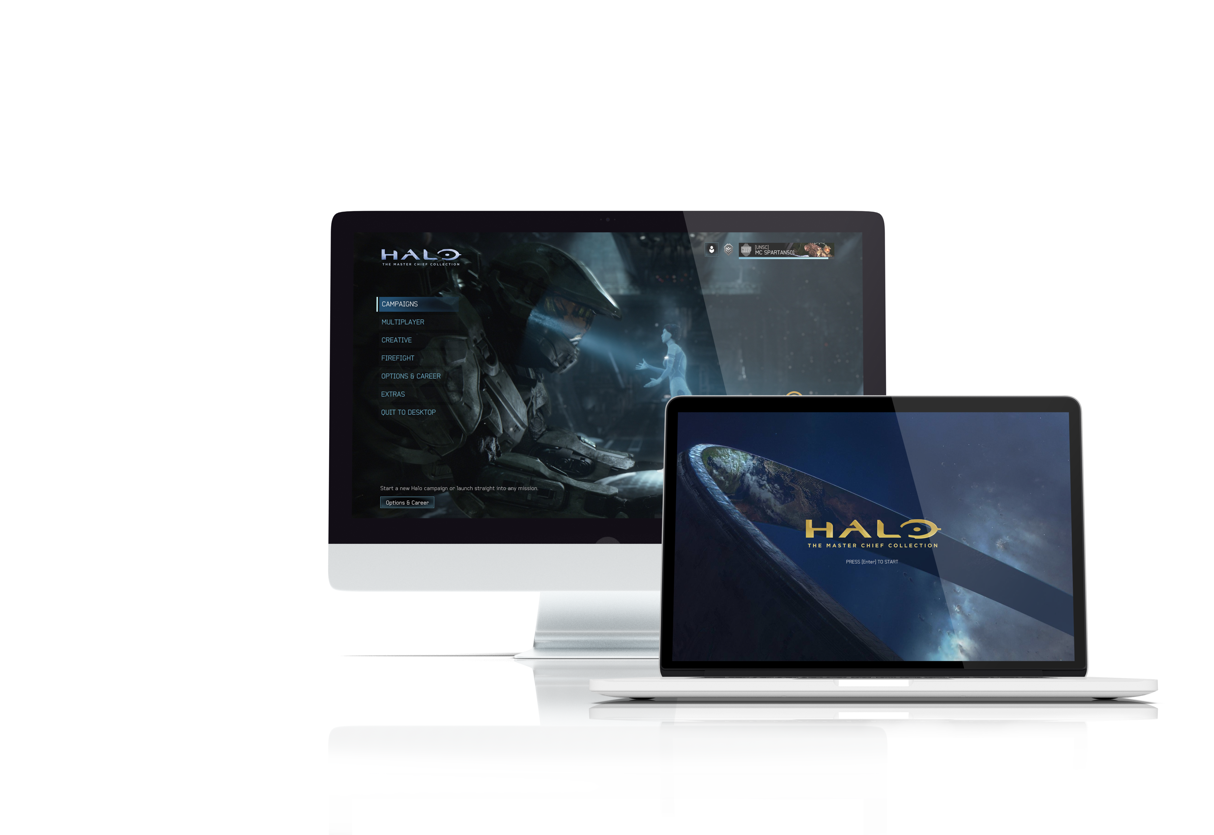
Halo: The Master Chief CollectionGame UX/UI Design
Minecraft DungeonsGame UX/UI Design
Sharp StudyUX/UI design

Tudor ConsultingBrand Guide
Evolve XUX/UI design

Ground ControlMobile app, UX design
Mavis McMullen Housing SocietyResponsive website, UX design

Cool It!Mobile app, UI design
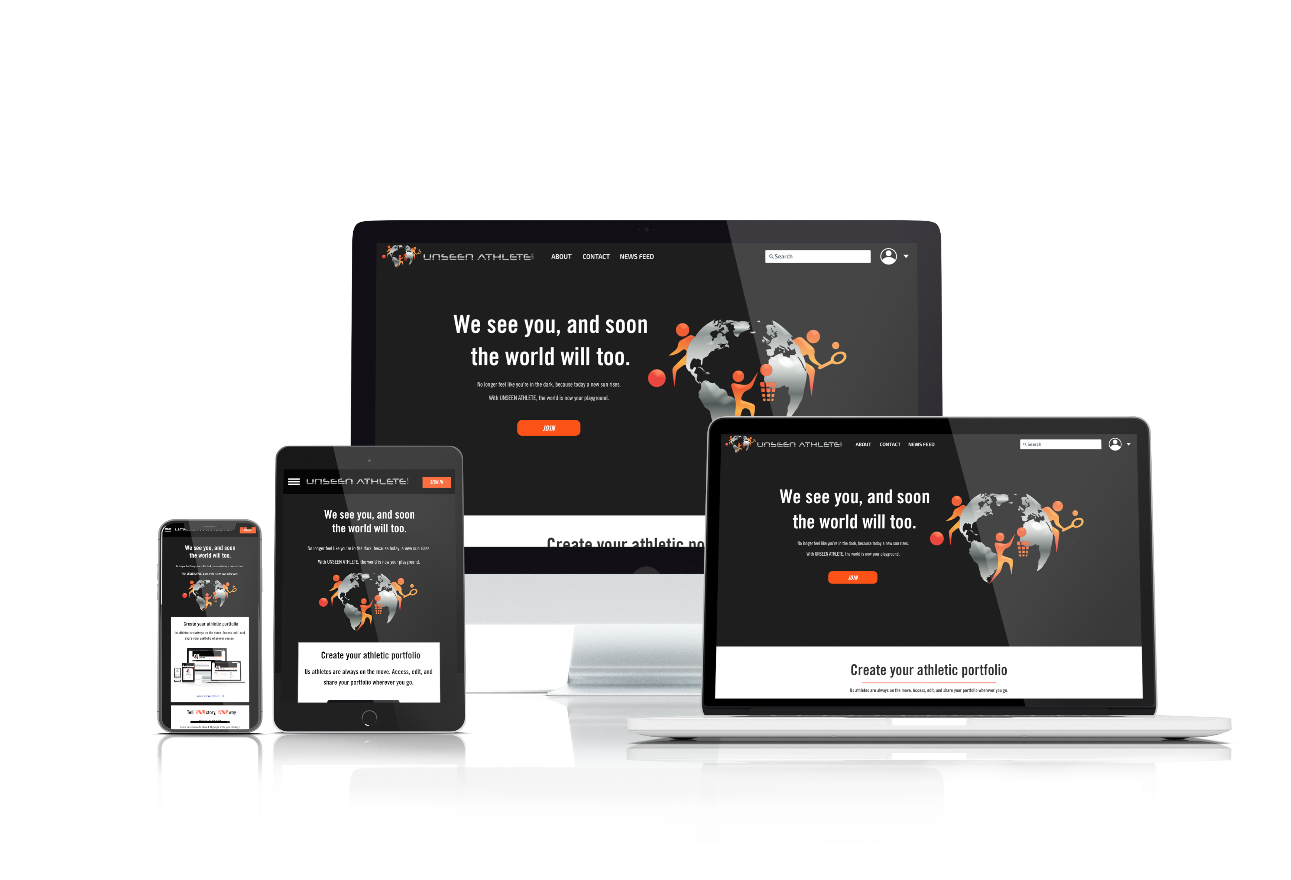
Unseen AthleteResponsive website, UI design
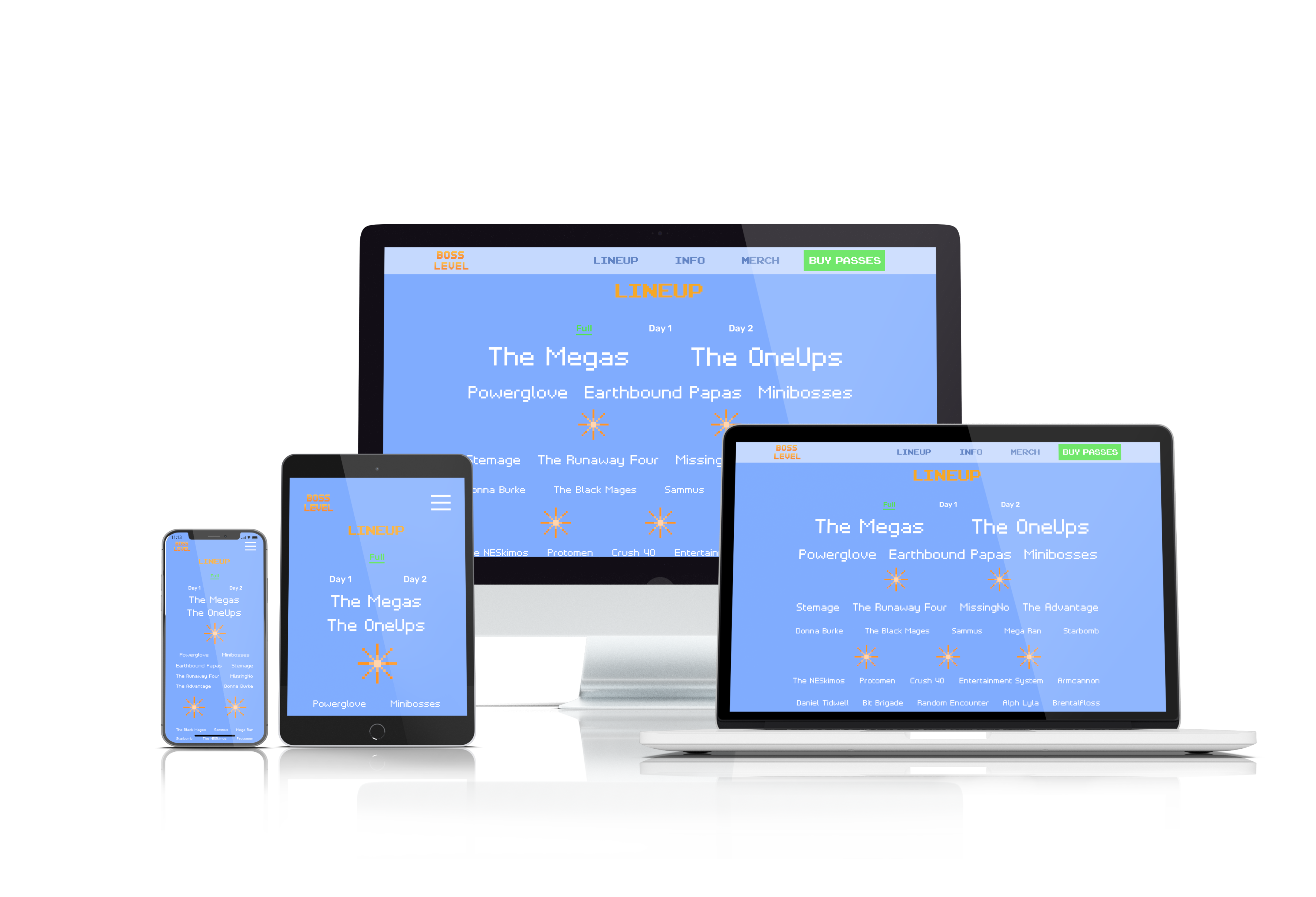
Boss LevelResponsive website, UI design

Copyright 2021 Luke Yin. All rights reserved.