Overview
Overview
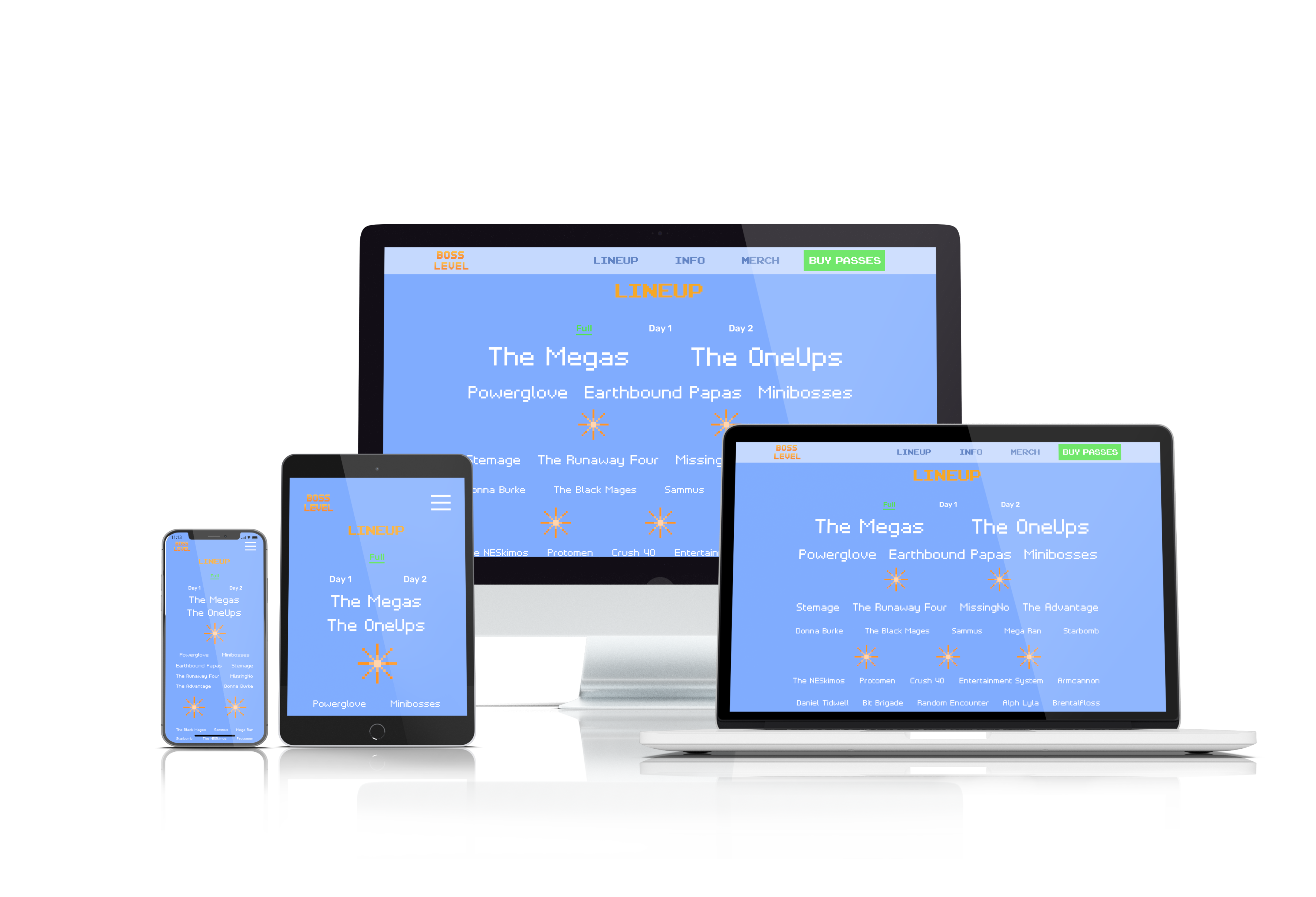
This is a concept for a music festival that revolves around video games. The purpose of this project is to show how the website for such a festival might look if it were to exist in real life.
This is a concept for a music festival that revolves around video games. The purpose of this project is to show how the website for such a festival might look if it were to exist in real life.
Research
Research
Domain Research
Domain Research
I looked at other music festivals, especially those that feature video game music. In particular, I focused on the layout and aesthetics of each website.
I looked at other music festivals, especially those that feature video game music. In particular, I focused on the layout and aesthetics of each website.
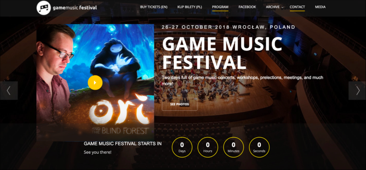
Game Music Festival features video game music performed by an orchestra.
Game Music Festival features video game music performed by an orchestra.
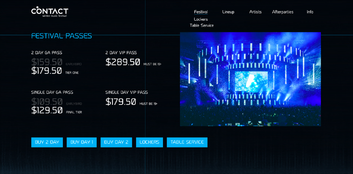
Contact has a reasonably detailed website and an intuitive layout, though it’s hindered greatly by its buggy info page that doesn’t scroll to the bottom.
Contact has a reasonably detailed website and an intuitive layout, though it’s hindered greatly by its buggy info page that doesn’t scroll to the bottom.
In addition to the above, I also looked at festivals and concerts such as Video Games Live, Coachella, FVDED In The Park, and PLAY. Insomniac’s PLAY Festival is the only direct competitor, though its website has very little content at the time of writing, due to the fact that 2019 is its inaugural year and no details have been announced.
In addition to the above, I also looked at festivals and concerts such as Video Games Live, Coachella, FVDED In The Park, and PLAY. Insomniac’s PLAY Festival is the only direct competitor, though its website has very little content at the time of writing, due to the fact that 2019 is its inaugural year and no details have been announced.
User Persona
User Persona
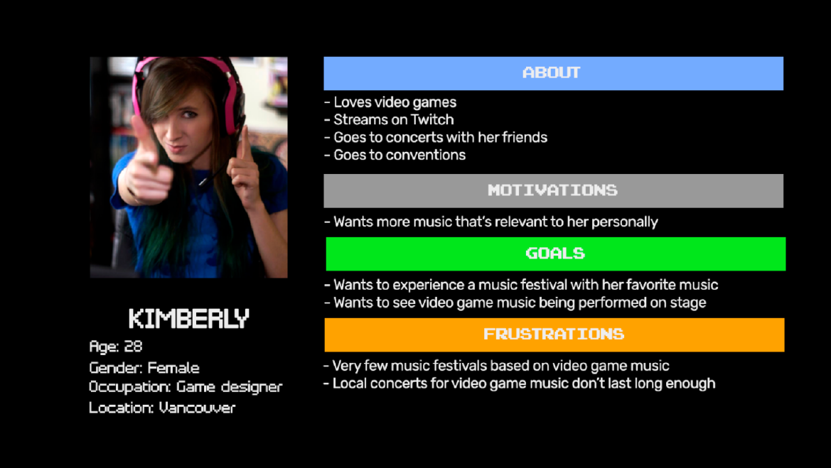
I created a user persona based on the domain research above. The user needs to be interested in both video games and music in order to enjoy a festival about video game music, and the music must also be performed by a live cover band or a DJ rather than an orchestra.
I created a user persona based on the domain research above. The user needs to be interested in both video games and music in order to enjoy a festival about video game music, and the music must also be performed by a live cover band or a DJ rather than an orchestra.
The Design Process
The Design Process
The Why—Design Inception
The Why—Design Inception
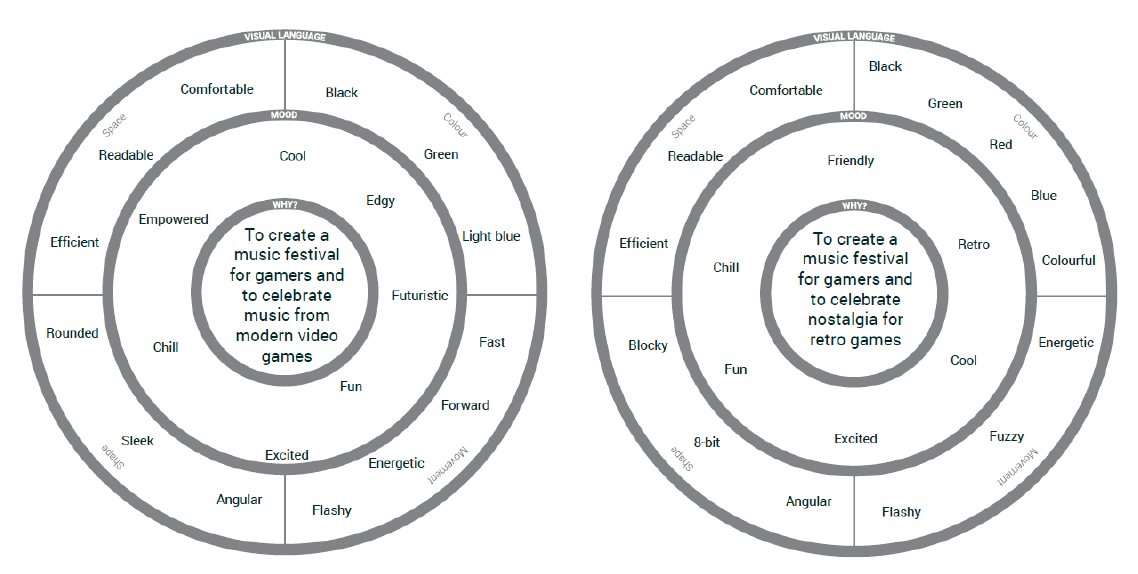
The Why was already quite clear: it was to create a music festival for gamers. This split into 2 different directions, which led to 2 slightly different Whys:
Modern: To create a music festival for gamers and to celebrate music from modern video games
Retro: To create a music festival for gamers and to celebrate nostalgia for retro games
Mood and the 4 Elements of the Visual Language
Mood and the 4 Elements of the Visual Language
The different Whys led to differences in both mood and visual language. Although there are still similarities, a festival about music from modern games should look sleek, while a festival about music from retro games should look retro.
The different Whys led to differences in both mood and visual language. Although there are still similarities, a festival about music from modern games should look sleek, while a festival about music from retro games should look retro.
Mood Boards
Mood Boards
The design inceptions led to 2 different mood boards:
The design inceptions led to two different mood boards:
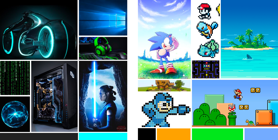
I decided to go with the Retro mood board because it appears to be something that really hasn’t been done before. The PLAY Festival mentioned earlier appears to have a more modern feel to it. Besides, the Retro mood board seems more welcoming and friendly, which our user, Kimberly, would appreciate.
I decided to go with the Retro mood board because it appears to be something that really hasn’t been done before. The PLAY Festival mentioned earlier appears to have a more modern feel to it. Besides, the Retro mood board seems more welcoming and friendly, which our user, Kimberly, would appreciate.
Logo Design
Logo Design
From fairly early on, I decided to use a typography-based logo for the festival. This keeps it in line with most other music festivals and ensures that the name of the festival is immediately obvious to anyone who sees the logo.
From fairly early on, I decided to use a typography-based logo for the festival. This keeps it in line with most other music festivals and ensures that the name of the festival is immediately obvious.
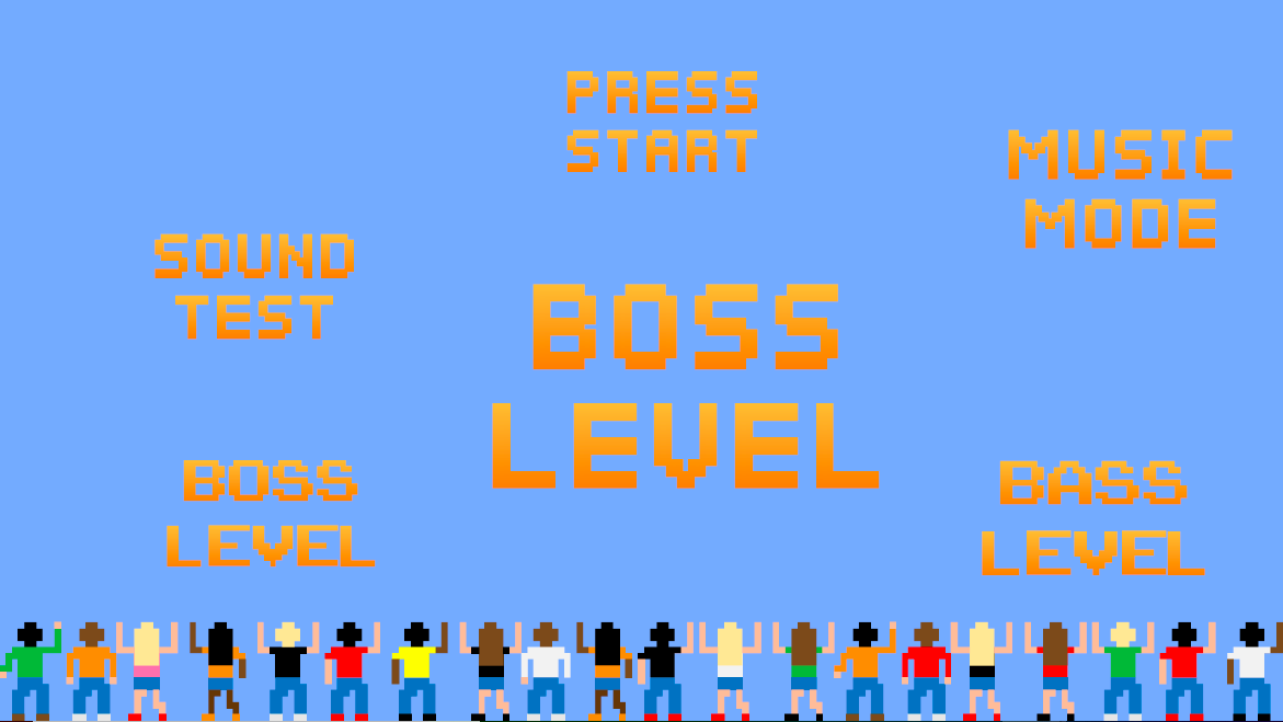
I looked at various different options for the logo. I knew that I wanted a pixelated typeface, but did I want ArcadeClassic or Pixelar? Did I want to call it Music Mode or Press Start? Or perhaps Sound Test, as a reference to Sonic the Hedgehog? Perhaps Bass Level, since it’s a music festival?
In the end I decided on Boss Level. The festival doesn’t revolve around bass players, and calling it Boss Level ensures that people would immediately associate it with video games.
Style Tile
Style Tile
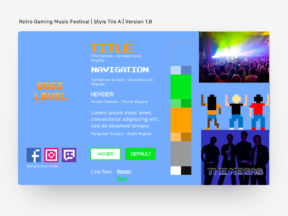
I decided to use ArcadeClassic for page titles and nav bars, since it’s a bold arcade-style typeface that’s easy enough to read for shorter pieces of text. For text that’s potentially longer or smaller, I chose Pixelar. For the longest pieces of text, I chose Rubik, since it’s often associated with video games.
For iconography, I decided to make 8-bit renditions of social media icons. This helps them fit in with the theme while still allowing them to be easily identifiable via shape and colour scheme.
I also drew the concert-goers by hand in Illustrator. These figures would help the website look less bland. To achieve the 8-bit style, I turned gridlines on and had everything snap to grid. Rectangles are what give the figures the 8-bit look and feel.
Merchandise
Merchandise
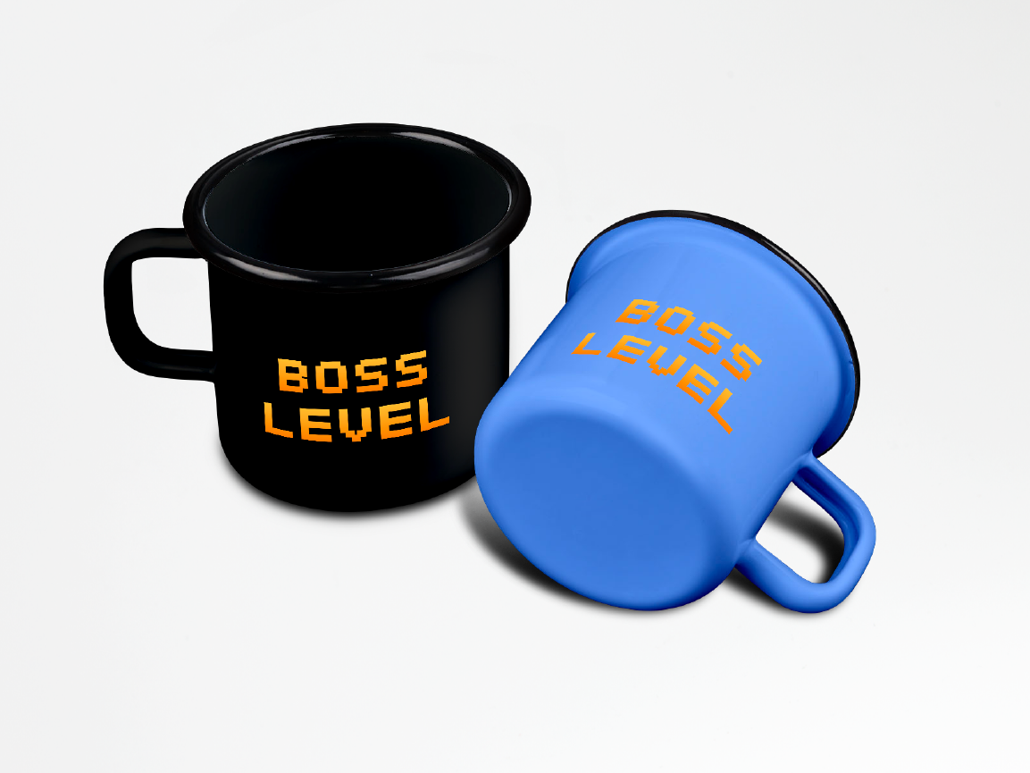
Like many other festivals, Boss Level needs to have merchandise available. I decided on items like t-shirts, mugs, etc. with the logo on a background of a colour found in the colour scheme above.
Like many other festivals, Boss Level needs to have merchandise available. I decided on items like t-shirts, mugs, etc. with the logo on a background of a colour found in the colour scheme above.
Campaign
Campaign
These days, no music festival is complete without an ad campaign, so I made ads of varying (but standard) sizes for use on websites, social media, etc. Each ad has a black variant and a blue variant, which are meant to showcase the look and feel of the website.
These days, no music festival is complete without an ad campaign, so I made ads of varying (but standard) sizes for use on websites, social media, etc. Each ad has a black variant and a blue variant, which are meant to showcase the look and feel of the website.

Wireframes
Wireframes
In order to figure out the website’s layout, I drew up some wireframes on paper:
In order to figure out the website’s layout, I drew up some wireframes on paper:
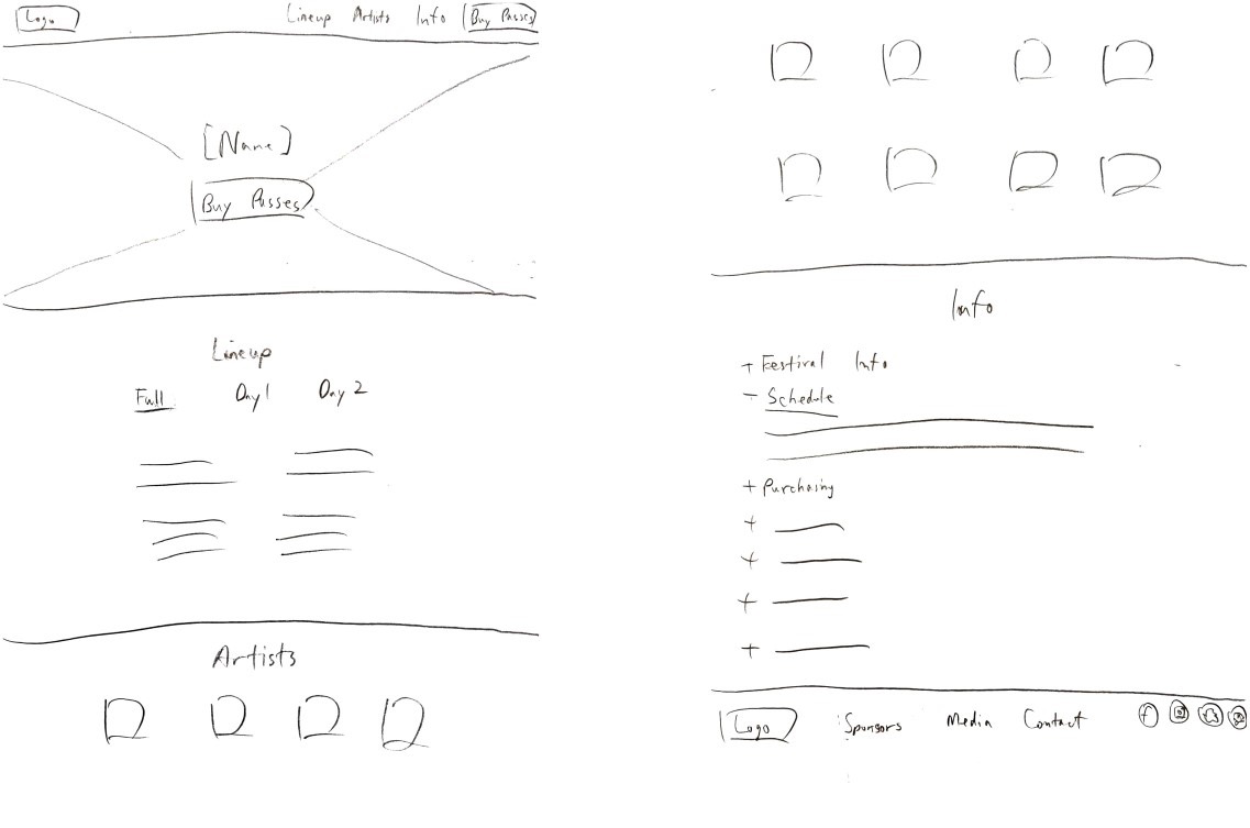
My initial design had a single-page layout, much like the one that Contact Festival uses. However, it soon became apparent that having separate pages would be much simpler, since there’s just so much information.
My initial design had a single-page layout, much like the one that Contact Festival uses. However, it soon became apparent that having separate pages would be much simpler, since there’s just so much info.
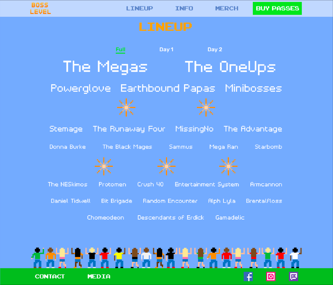
It also became apparent that there was no need to separate the Lineup from the Artists page, since the same artists would be displayed on both pages anyway.
It also became apparent that there was no need to separate the Lineup from the Artists page, since the same artists would be displayed on both pages anyway.
Conclusion
Conclusion
Through this project, I learned to design a responsive website from beginning to end all by myself. I also honed my skills with Illustrator, since I created the dancing figures by hand.
The next step of the project, were it to continue, would be to flesh out every page on the website. For example, the info page could have all its segments fleshed out so that visitors can find out all the details about the website. There could also be more things to do at the festival — some arcade machines or a gaming tournament could make things even more interesting, as well as attract a bigger audience. Finally, it would be great if this became a festival in real life…
Further Info
Further Info
Other Works

Super Smash Bros. UltimateGame UX Design
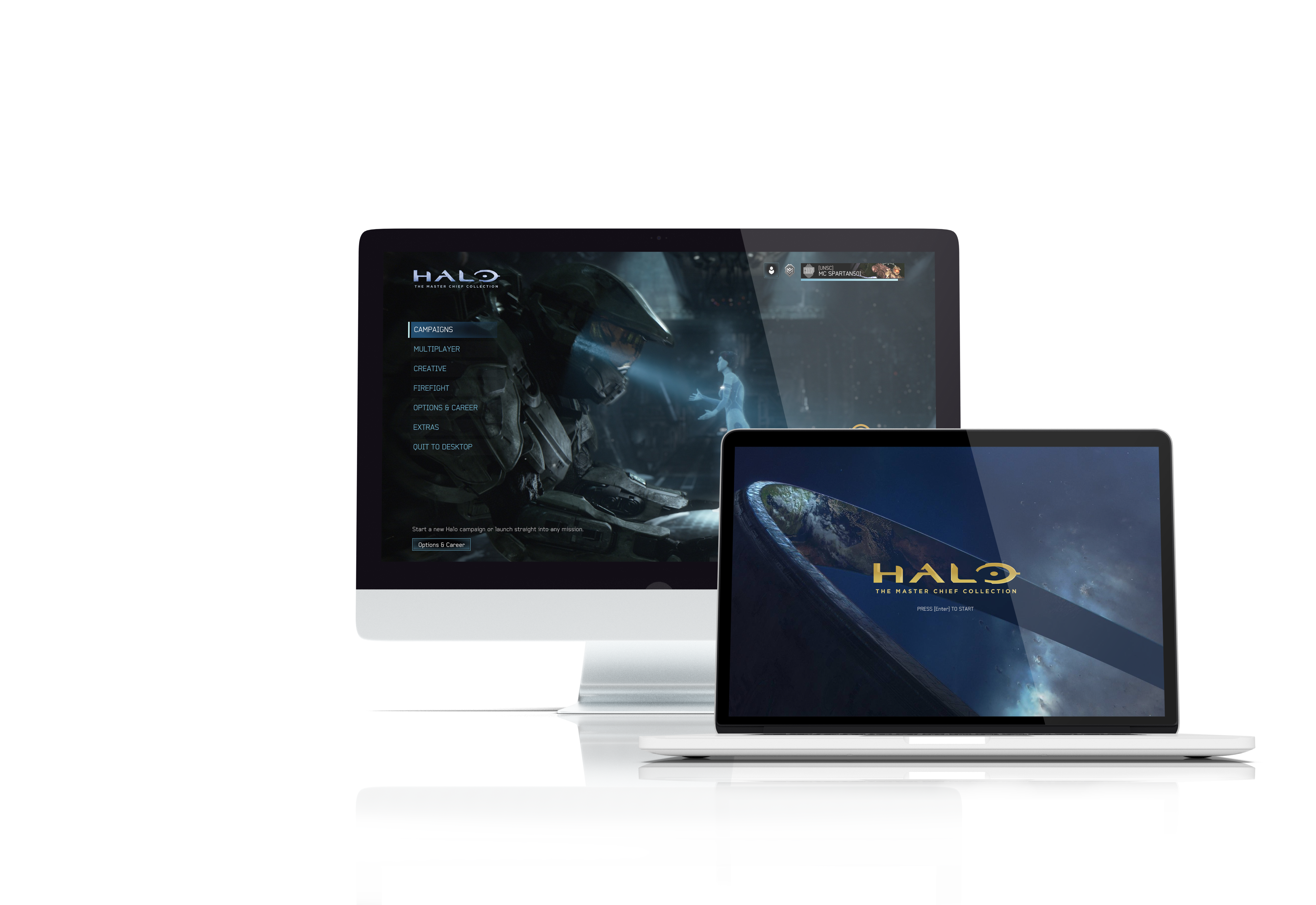
Halo: The Master Chief CollectionGame UX/UI Design
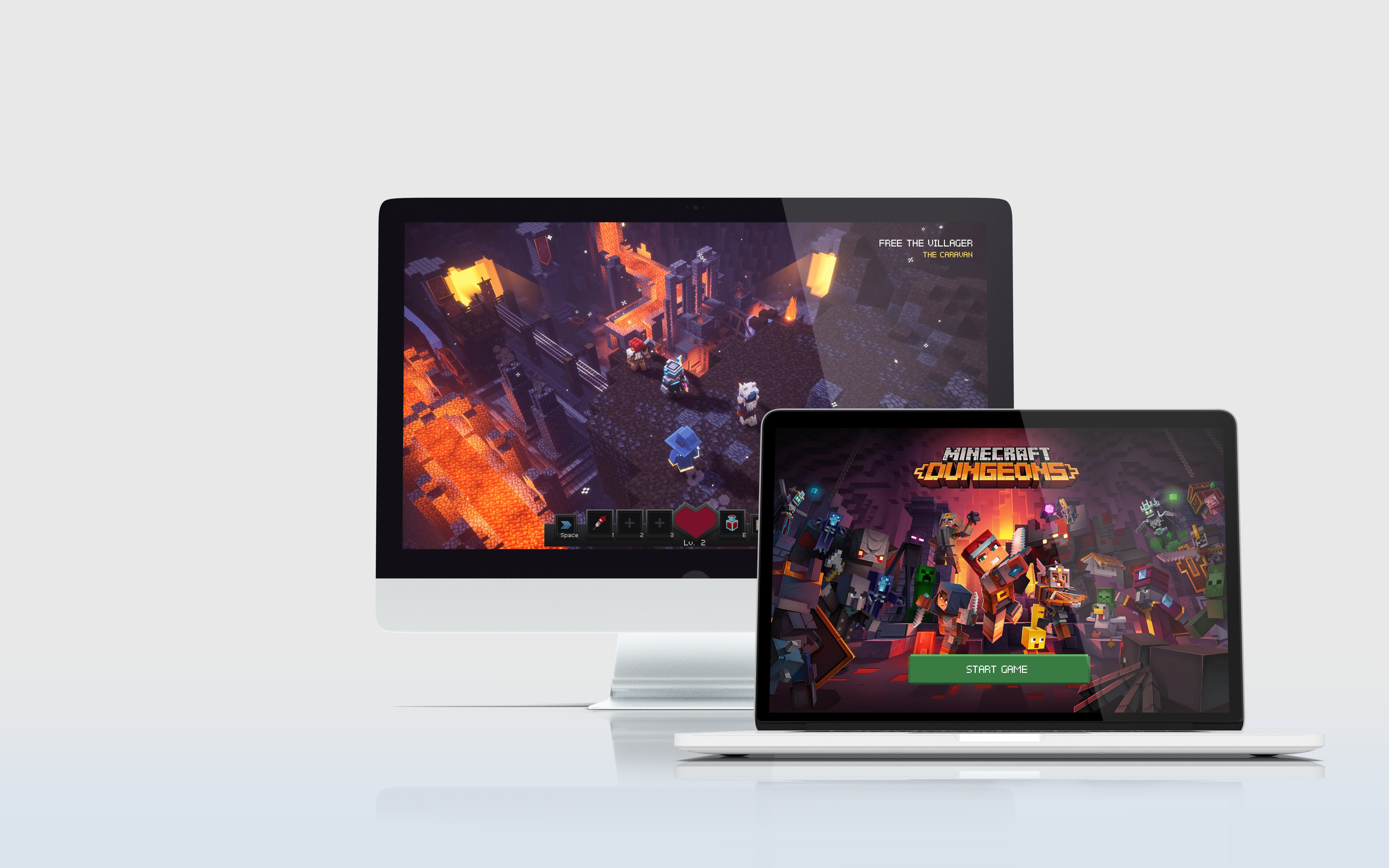
Minecraft DungeonsGame UX/UI Design
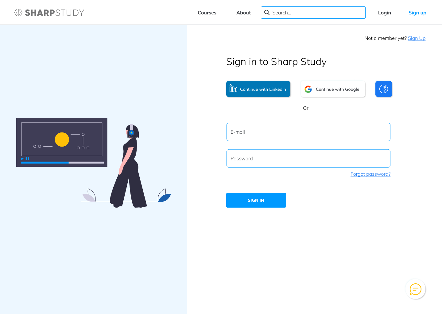
Sharp StudyUX/UI design

Tudor ConsultingBrand Guide
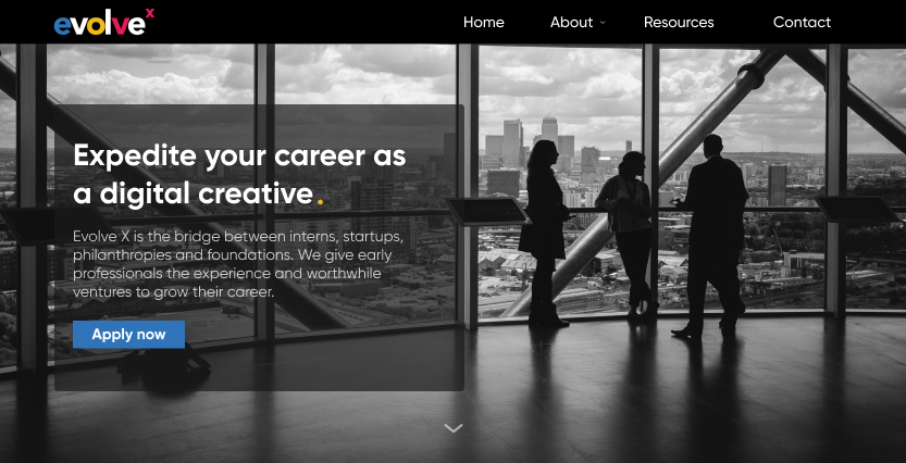
Evolve XUX/UI design
Collingwood Neighbourhood HouseResponsive website, UX design

Ground ControlMobile app, UX design
Mavis McMullen Housing SocietyResponsive website, UX design

Cool It!Mobile app, UI design
Unseen AthleteResponsive website, UI design
Copyright 2021 Luke Yin. All rights reserved.

