
Introduction
Overview
The BC Sustainable Energy Association (BC SEA) runs a program called Cool It! for students in high school and below, in an effort to get students to track how much greenhouse gases (GHGs) they’re emitting and to help them decrease it.
As one of the UI designers on the team, my job was to create a style for the brand and to ensure that the app not only looks good, but fulfills the client's goals. While they did have some previous assets, they were quite outdated and we designed many new assets from scratch, including the logo.
The BC Sustainable Energy Association (BC SEA) runs a program called Cool It! for students in high school and below, in an effort to get students to track how much greenhouse gases (GHGs) they’re emitting and to help them decrease it.
Research
Research
We started by looking for websites that focus on sustainability. These included Planet Ark, Elements Society, etc.
We started by looking for websites that focus on sustainability. These included Planet Ark, Elements Society, etc.
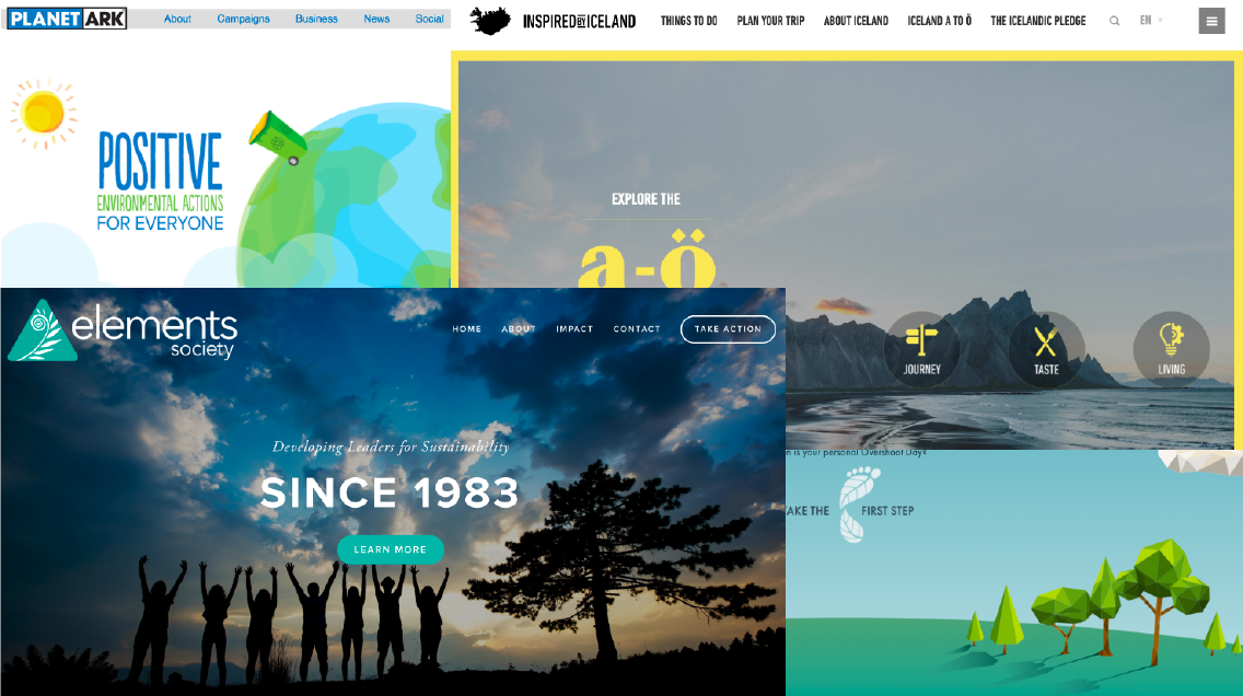
Some of these sites were clearly geared towards an older audience, while others looked very much kid-friendly. Since we are designing for high school students, however, we didn't need anything that was particularly cartoony.
Some of these sites were clearly geared towards an older audience, while others looked very much kid-friendly. Since we are designing for high school students, however, we didn't need anything that was particularly cartoony.
Gut Test
Gut Test
We conducted a gut test with our client to find out what they like and dislike in apps. We had approximately 20 different designs in total, and the client had up to 20 seconds to decide whether she liked each one.
We conducted a gut test with our client to find out what they like and dislike in apps. We had approximately 20 different designs in total, and the client had up to 20 seconds to decide whether she liked each one.
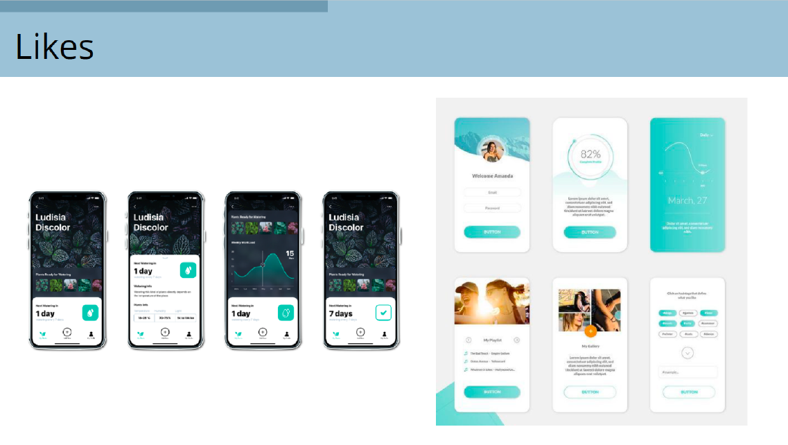
Our client liked these two designs the best. Both were examples of flat design and they both had some graphics. Both looked pretty clean, especially the one on the right.
Our client liked these two designs the best. Both were examples of flat design and they both had some graphics. Both looked pretty clean, especially the one on the right.
The Design Process
The Design Process
The Why—Design Inception
The Why—Design Inception
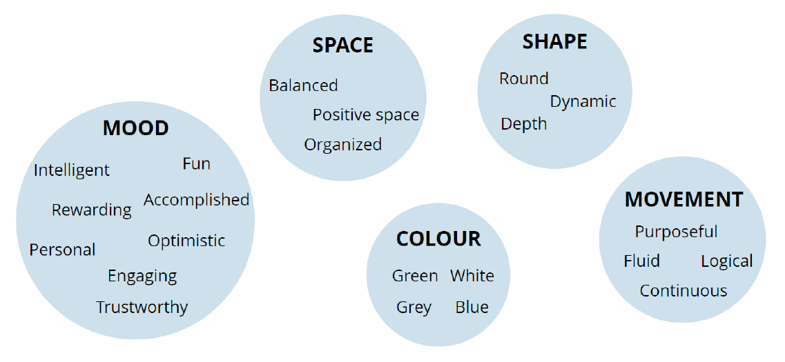
We settled on a central reason for the project, i.e. the Why. It was to encourage British Columbians to become environmental leaders and reduce their carbon footprint by tracking each user’s contribution to greenhouse gas savings.
With the Why figured out, we were able to move on to the mood, space, colour, shape, and movement.
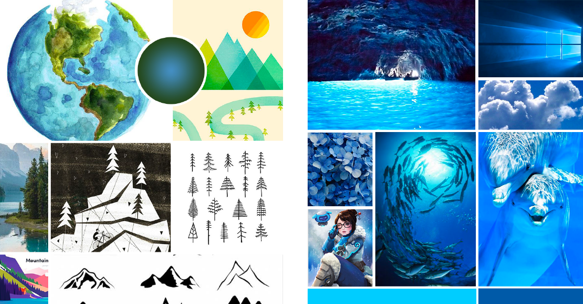
We split off into two different directions so that the client can be given a choice. One had more vector images with greens, yellows, and blues, while the other had mostly blue photos.
We split off into two different directions so that the client can be given a choice. One had more vector images with greens, yellows, and blues, while the other had mostly blue photos.
This led to two different style tiles:
This led to two different style tiles:
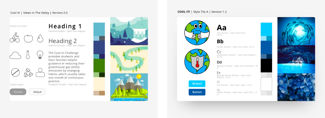
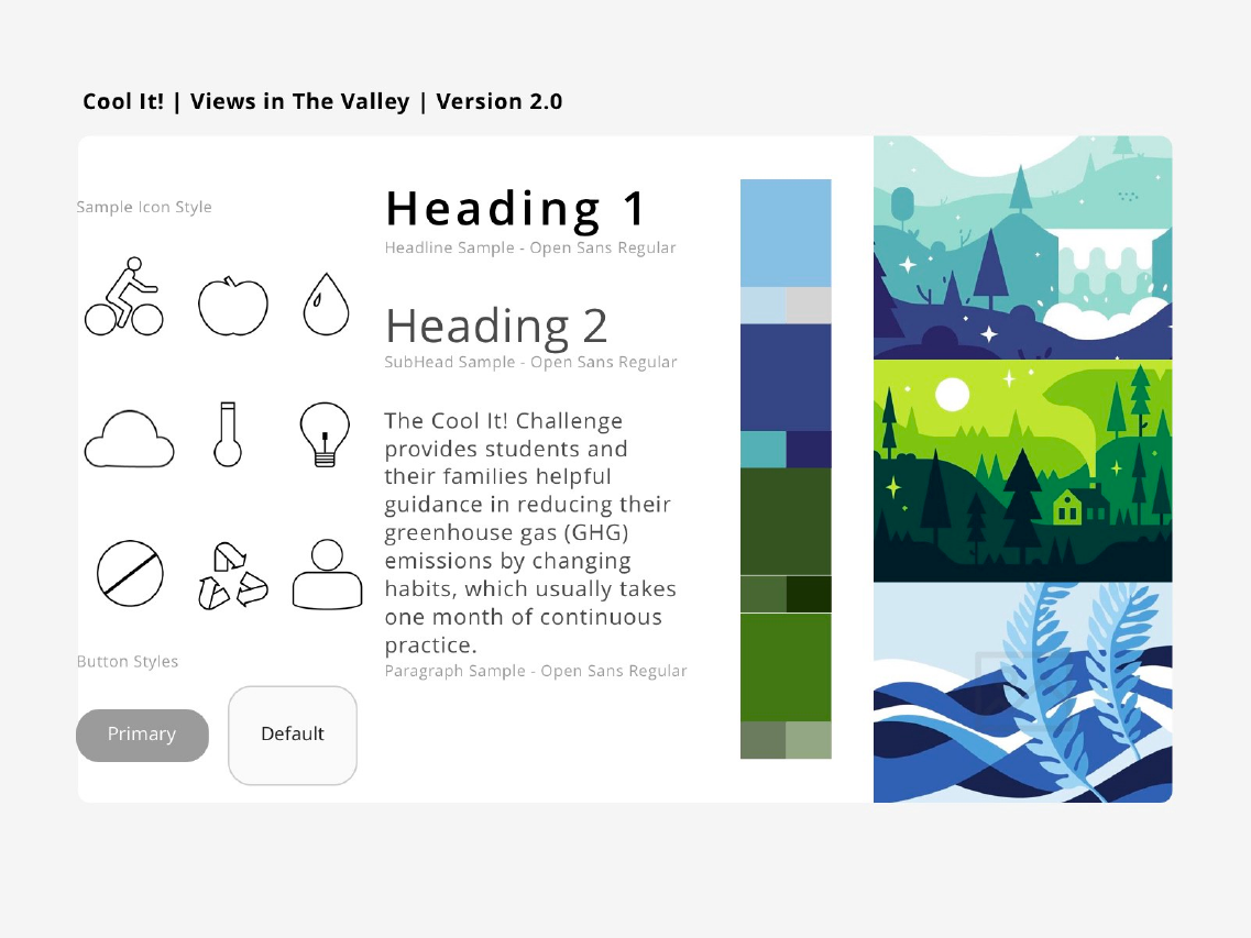
In the end, the client preferred the first one (Views in the Valley), though we did make a few further changes:
In the end, the client preferred the first one (Views in the Valley), though we did make a few further changes:
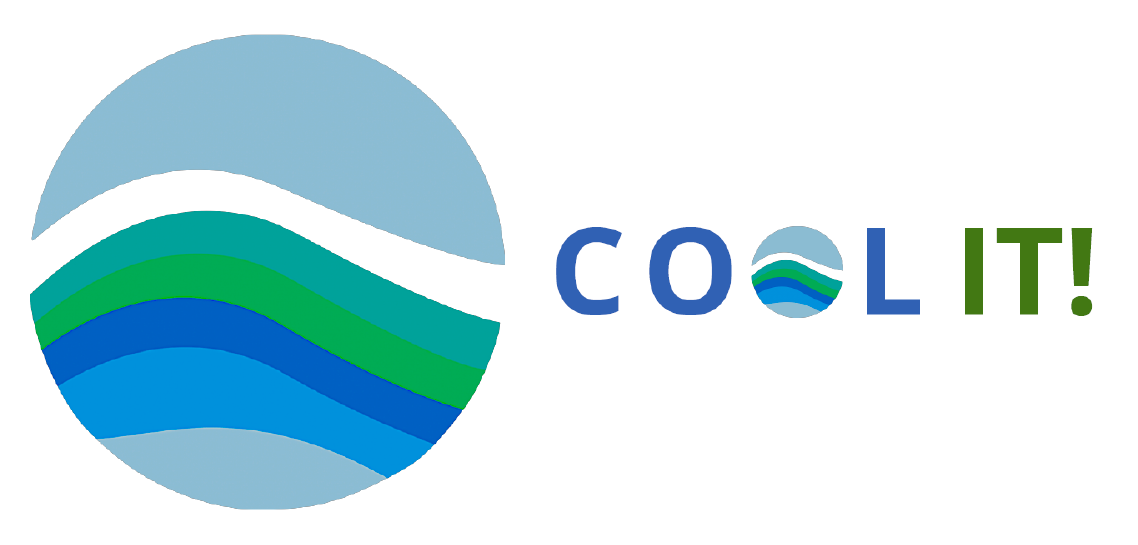
We also changed the logo to something that not only looks better, but reflects the fact that the Cool It! is a program under the BC SEA:
We also changed the logo to something that not only looks better, but reflects the fact that the Cool It! is a program under the BC SEA:
We added colours and graphics to the mid-fi prototypes provided by our UX designers to create hi-fi prototypes. We did run into a few hurdles along the way—it took a while for us to decide how the background should look, which screens should have a background, etc.
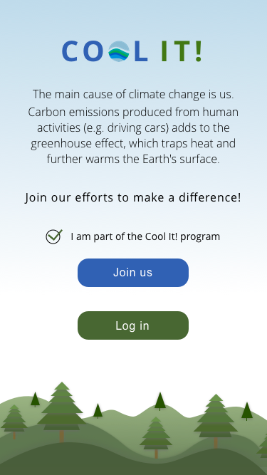
It also took a while to decide on a layout for certain screens. For example, the layout for the login/registration page changed a number of times before we finally settled on this:
We added colours and graphics to the mid-fi prototypes provided by our UX designers to create hi-fi prototypes. We did run into a few hurdles along the way—it took a while for us to decide how the background should look, which screens should have a background, etc.
It also took a while to decide on a layout for certain screens. For example, the layout for the login/registration page changed a number of times before we finally settled on this:
Usability Testing
Usability Testing
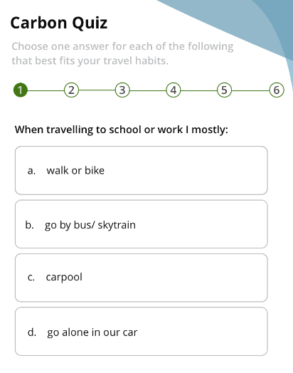
Testing revealed that the quiz involved too much scrolling, so we had to split it into 5 sections — which meant 5 separate screens. This also meant that we needed a way to navigate between the screens, since users might want to go back and forth to check their answers before submitting them:
Testing revealed that the quiz involved too much scrolling, so we had to split it into 5 sections — which meant 5 separate screens. This also meant that we needed a way to navigate between the screens, since users might want to go back and forth to check their answers before submitting them:
Conclusion
Conclusion
The goal of the project was to create a companion app for BC SEA’s Cool It! program in order to teach high school students how to help save the environment. To this end, we delivered a gamified mobile app that solves this problem. The highlight of the project for me was sorting out the typography in Sketch (and defining the header, body, etc. in the style guide). The app was well-received by the client, so with any luck, it will translate into satisfied users who actually use it to help them cut down on GHG emissions and save the environment.
The goal of the project was to create a companion app for BC SEA’s Cool It! program in order to teach high school students how to help save the environment. To this end, we delivered a gamified mobile app that solves this problem. The highlight of the project for me was sorting out the typography in Sketch (and defining the header, body, etc. in the style guide). The app was well-received by the client, so with any luck, it will translate into satisfied users who actually use it to help them cut down on GHG emissions and save the environment.
Further Info
Further Info
Case Study
Other Works

Super Smash Bros. UltimateGame UX Design
Halo: The Master Chief CollectionGame UX/UI Design
Minecraft DungeonsGame UX/UI Design
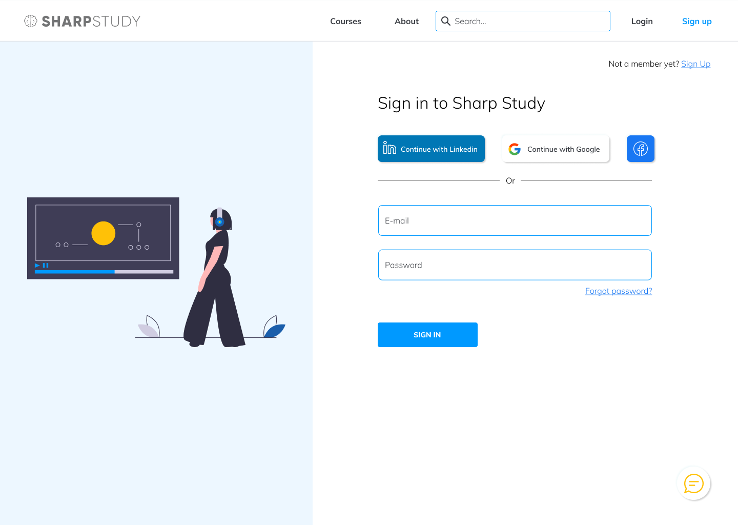
Sharp StudyUX/UI design

Tudor ConsultingBrand Guide
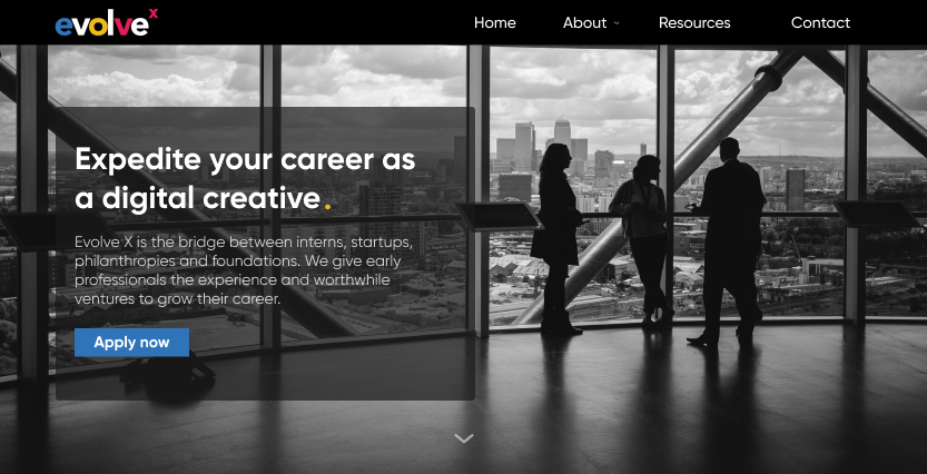
Evolve XUX/UI design
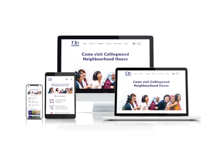
Collingwood Neighbourhood HouseResponsive website, UX design

Ground ControlMobile app, UX design
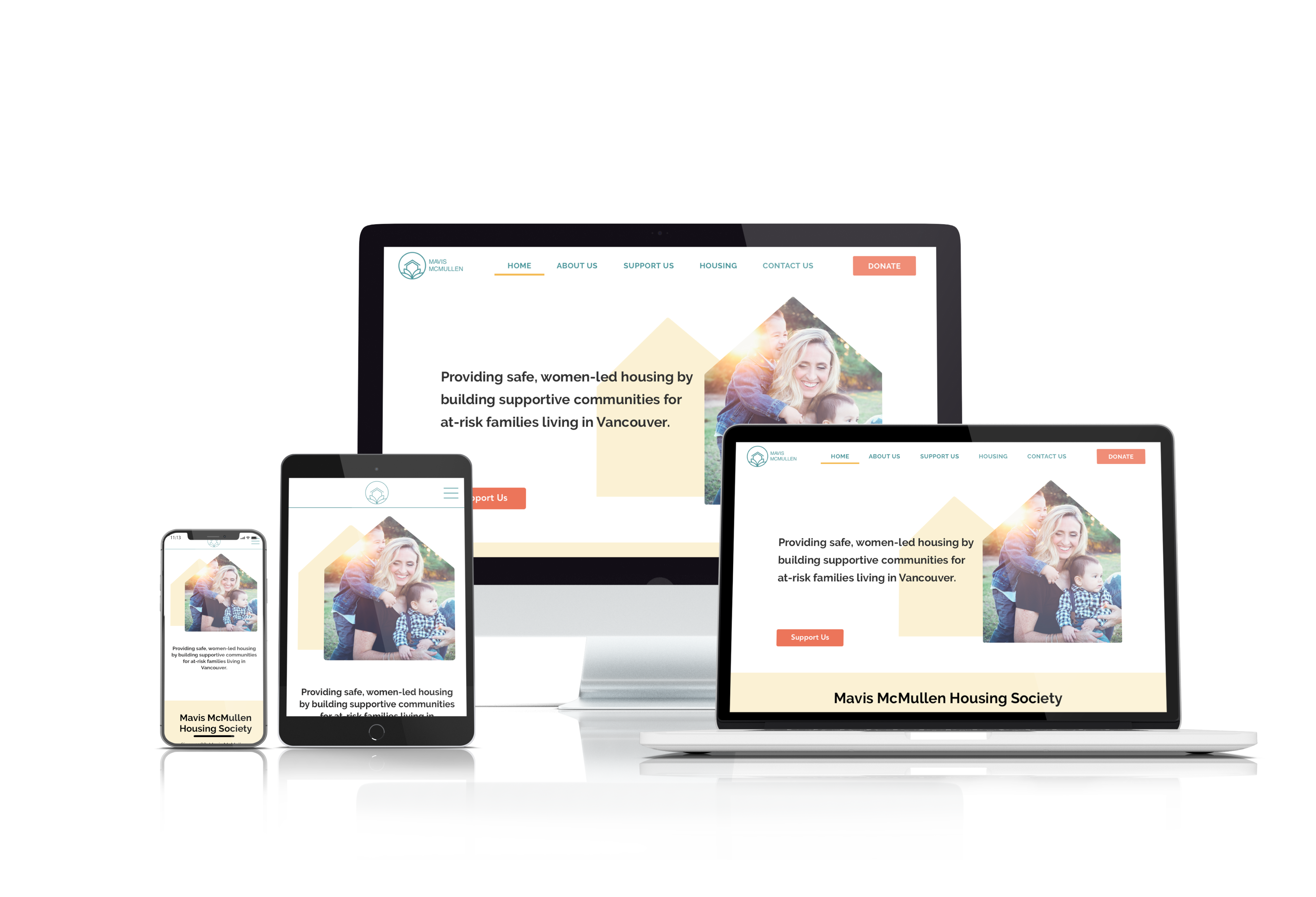
Mavis McMullen Housing SocietyResponsive website, UX design
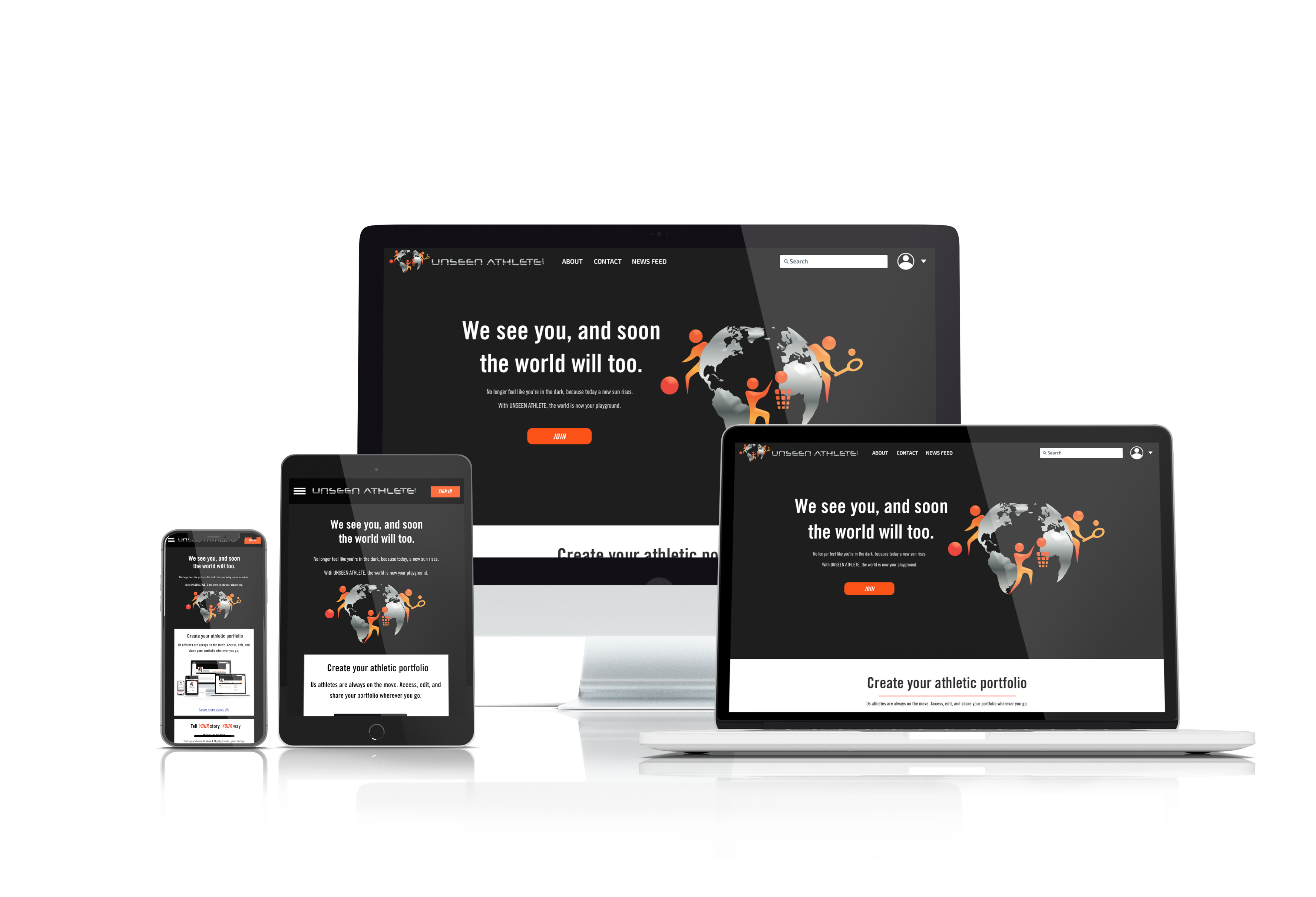
Unseen AthleteResponsive website, UI design
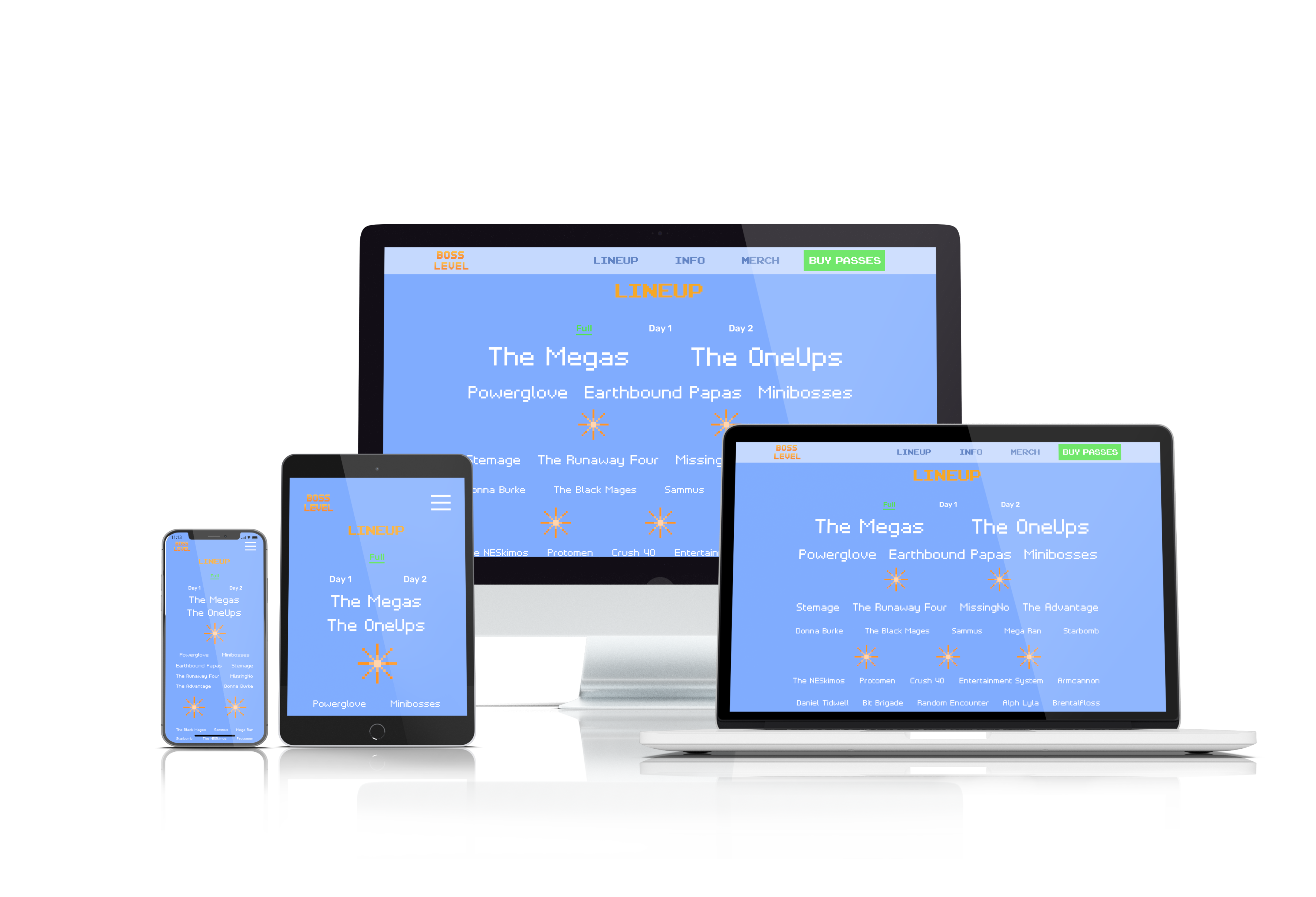
Boss LevelResponsive website, UI design

Copyright 2021 Luke Yin. All rights reserved.